We are a bit past the midpoint of the development cycle for GNOME 3.8. That seems like a nice time to take a look at what new things are coming – most new features are visible at least in rudimentary form at this point.
First of all, Settings !
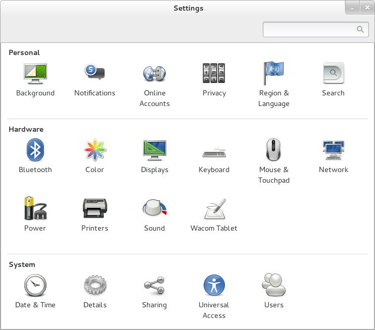 The control-center and settings-daemon have seen a flurry of activity which has resulted in several new and refreshed panels. In other words, plenty of screenshot material — I’ll get to that soon.
First I want to mention a few things that are not easily shown in pictures, but are still going to have a significant positive effect:
- Tests. Martin Pitt has done great work in mocking up services and creating tests for the functionality of many modules, from udisks and upower to glib and gnome-settings-daemon. Bastien has also added many tests, and fixed the bugs that were uncovered by them. Here is an example.
- Speed. The control-center panels are no longer loadable modules, but built into the control-center. And all of the .ui and other data files are loaded as resources. Opening the control-center should be faster, as a result.
- Standards. Bastien added a tiny plugin to gnome-settings-daemon which implements the org.freedesktop.ScreenSaver D-Bus API. This should make it even easier for media players and other 3rd party applications to keep the screen from dimming at inopportune times.
On to screenshots.
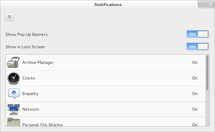
 Allowing you to focus on your task and minimizing interruptions has been an important aspect of the GNOME 3 design from the start. So far, we just had a global switch to turn off notifications. The new Notification panel expands on this and allows fine-grained control over what applications get to annoy you, and how much.
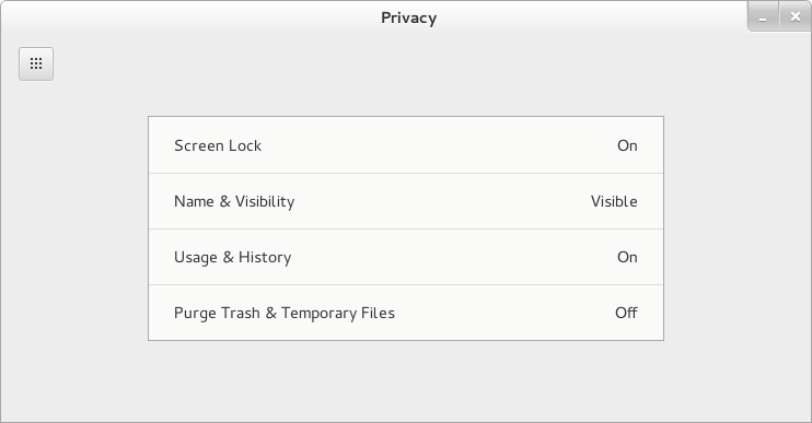
 The new Privacy panel collects various settings to control who may get to see your personal data, etc. Some of these settings, e.g. the Screen Lock settings were previously available elsewhere, but have been moved here because they are related to privacy.
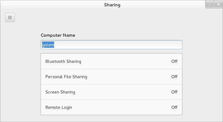
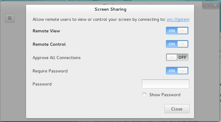 Similar to the Privacy panel, the Sharing panel collects settings that used to be available in other places, in this case the individual preference dialogs for gnome-bluetooth, gnome-user-share, vino, rygel, etc. It also lets you turn sshd on or off.
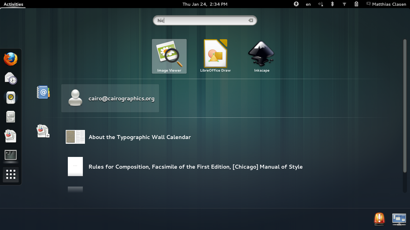
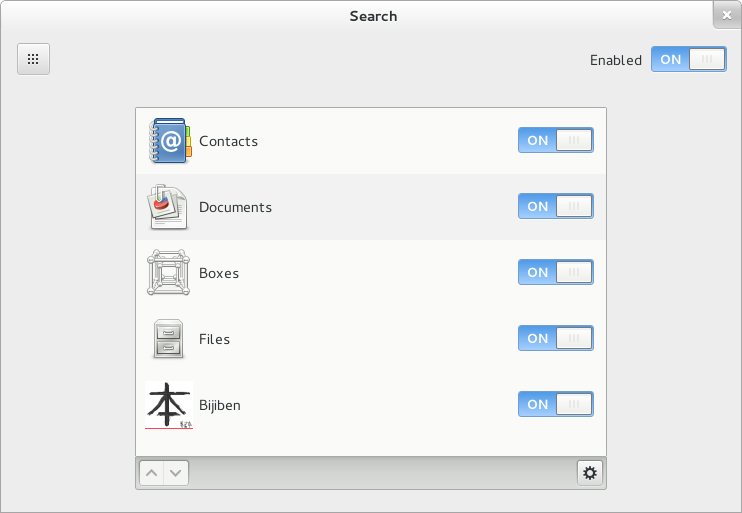 The new Search panel controls which applications get to show search results in the GNOME shell overview and the order in which they appear. there. Cosimo recently explained the various search improvements in GNOME 3.8 in great detail.
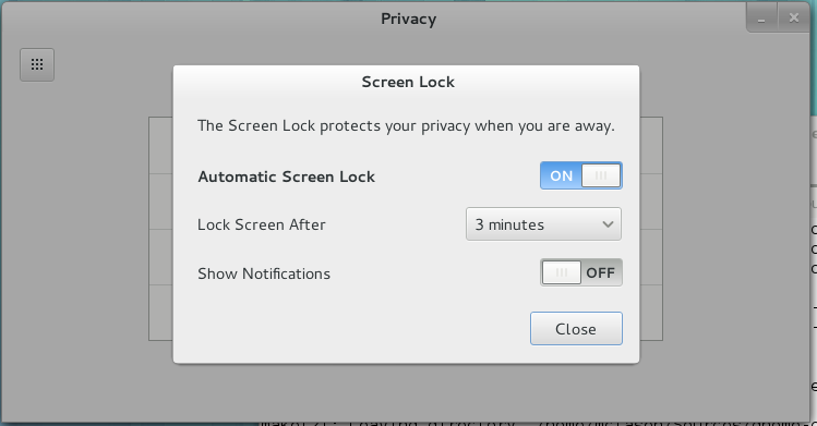
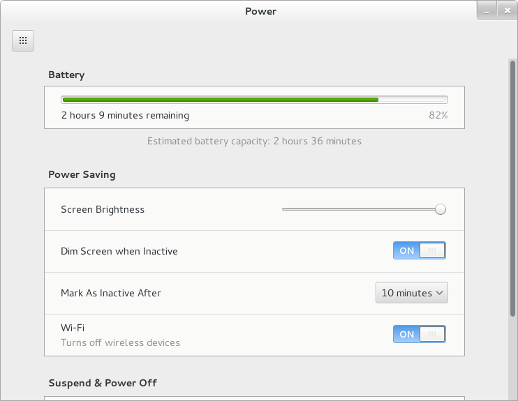 As mentioned above, the screen lock settings were subsumed by the Privacy panel. This left the Screen panel with very few settings, which all turned out to be related to power saving. Thus, they have been moved to the power panel, and the Screen panel has been dropped — which is a good thing, since three panels with monitors in their icon were a little too much.
There are more new things to discover in the control-center. I haven’t mentioned improvements to the user panel, or the color panel, or the rewritten network panel that will be merged soon. But enough about settings for now.
Next, some GNOME shell improvements:
The shell is being ported XInput2. Together with new pointer barrier features in the next X server release (1.14, expected in March) this will let us improve the somewhat annoying dwell-on-the-bottom-edge way to bring up the message tray. It also paves the way to improved side-by-side tiling and gesture support later on.
Keyboard shortcuts will work more consistently. E.g., it will be possible to take a screenshot while in the overview.
 The shell overview is displaying search results in a new layout, using the order of search providers as configured in the search panel. I again point to Cosimo’s post for the fine points of this new design.
 The algorithm for arranging the window thumbnails in the overview has been fine-tuned to create more pleasant layouts, and the currently hovered window is more clearly identifiable by a strong highlight.
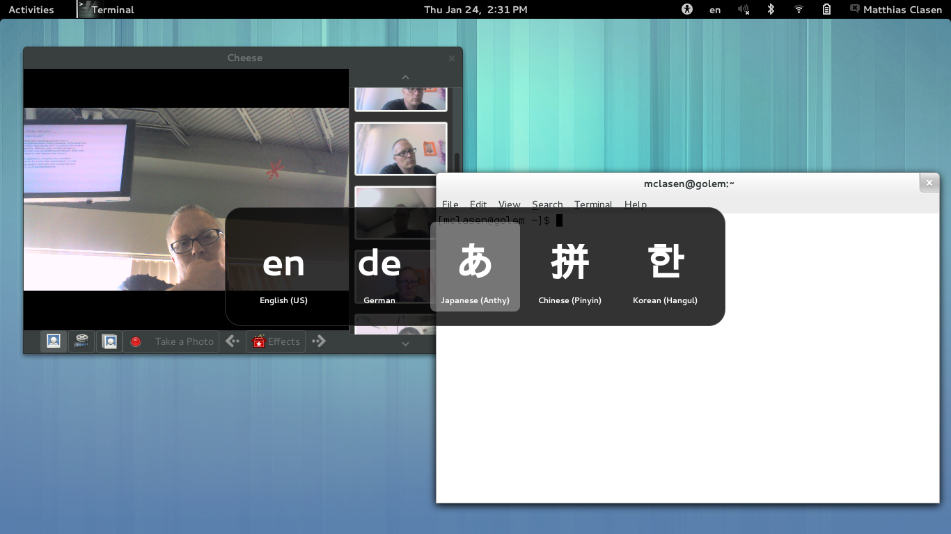 Switching input sources is easier, thanks to a new OSD. This feature was already present in IBus; it has now been integrated in GNOME shell.
A new addition to GNOME 3.8 is the classic mode that is going to replace fallback mode as an alternative for users who want to keep using elements of GNOME 2, such as the minimize button, or the window list.
The reasons for replacing fallback mode have been explained here. In short, it needs to be replaced, because
- it consists of barely maintained modules (gnome-panel, metacity, applets, notification-daemon,…)
- it does not offer the quality and user experience that we want to deliver
- keeping it (somewhat) functional keeps us from making improvements in other parts of the stack
Classic mode on the other hand, is using GNOME shell with a few extensions and few settings tweaks. New GNOME features, like the IBus integration, will ‘just work’ because classic mode is literally using the same code. We are reusing the infrastructure for defining ‘modes’ that was already present in the shell. It is used for the login screen in GNOME 3.6, for instance. The extensions and glue code that make up classic mode are being developed in the gnome-shell-extensions module.
The screenshots below give an impression of the current, preliminary, state of classic mode. We are still working on various aspects of it, and what ships with GNOME 3.8 may look different from what you see here.
 To clearly differentiate classic mode from GNOME 3, we are using ‘GNOME 2 gray’. There is a window list at bottom, and the clock has been moved to where it was in GNOME 2.
 An application menu.
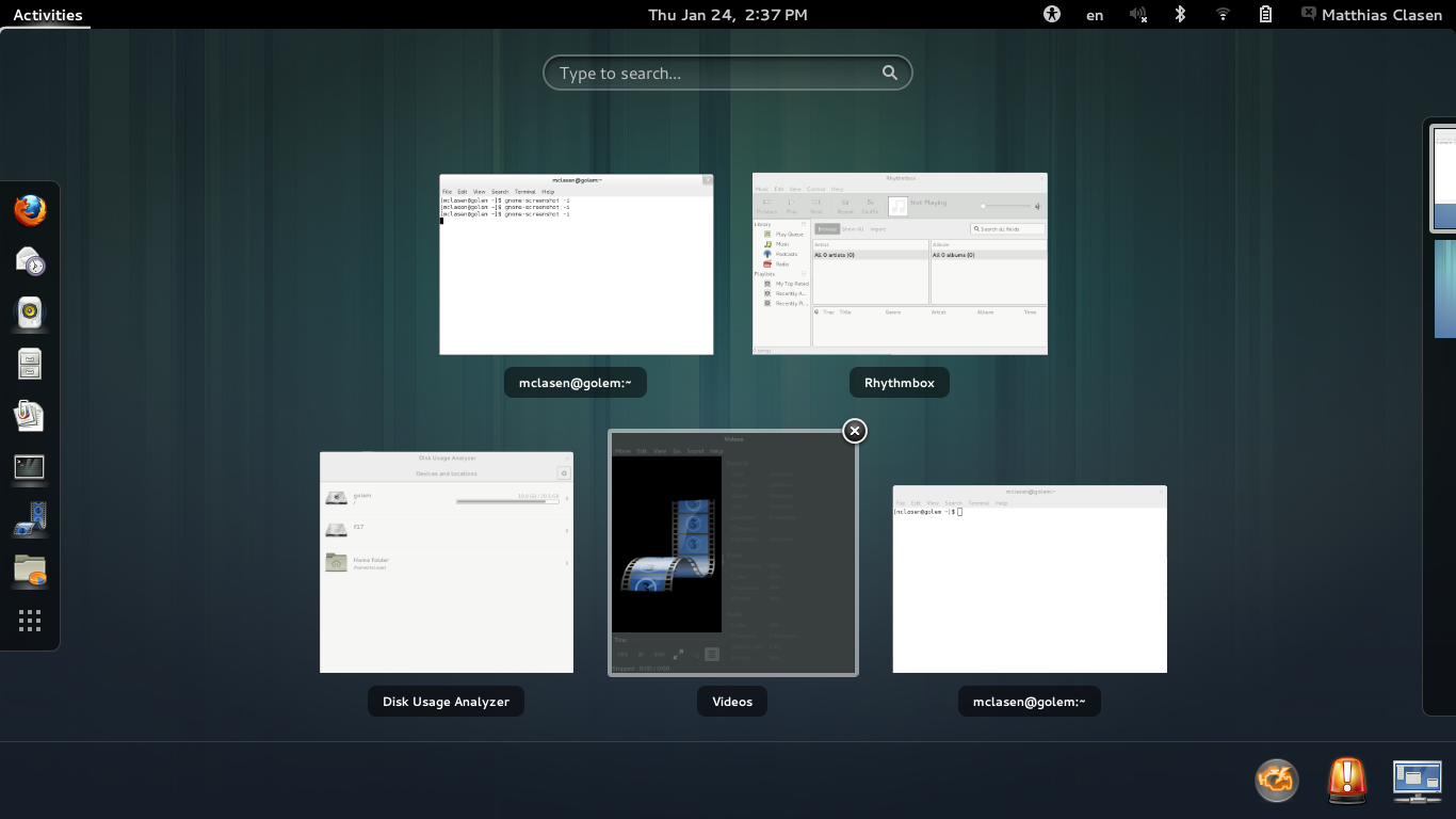
 The message tray coexists with the window list.
Finally, there will be a few new applications in GNOME 3.8. These apps are following the design patterns that have been developed over the last few releases in Documents, Boxes, etc.
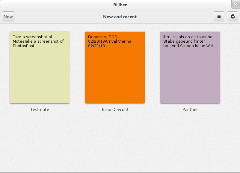 A note-taking application.
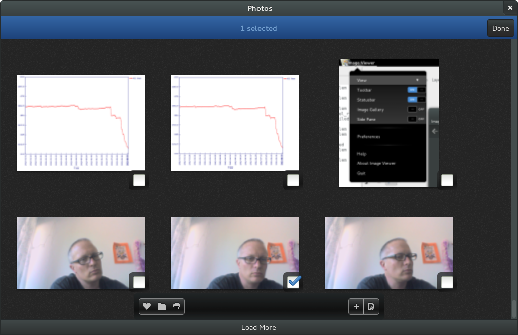 A photo application.
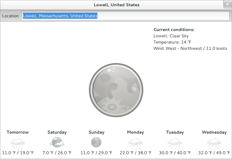 A weather application.
What is with the Privacy icon?
It’s a combination lock.
The new shell overview is very pleasant.
& can’t wait to see final version for classic mode, not to use it, but I’m sure this one will stop one thousands forks a day leading to duplicate efforts.
You mean like Solus OS and it’s fork of Gnome Fallback. The creator of that continuously tried to contribute to the Gnome team with fixes for Gnome Fallback and the Gnome team said no every time. Maybe if Gnome would be open to the community’s fixes for their fuck ups we wouldn’t have all of these forks.
Great stuff! Is Bijiben going to get a generic name like “Notes” or something?
Exciting news!
Will the Notes application be storage-compatible with Tomboy or GNote?
There should be someway to group or show only the windows of a each application. Maybe clicking on the icon of a running application on the dash could show only the windows of that application and right clicking would revert to showing all windows.
Hint: you can use the shortcut “Ctrl + ‘key above tab'” to switch between windows of the same application opened.
Looks good, especially the input method switching, considering this horrible bug in current ubuntu gnome shell that just wont be fixed https://bugs.launchpad.net/ubuntu/+source/gnome-shell/+bug/1045914
You mean the bug that’s Ubuntu-specific so the GNOME developers aren’t responsible for fixing it, that I can no longer duplicate on any of my computers, and that I’ve said 3 times those still affecting by it or similar bugs need to file a new bug report with as many details as possible?
There’s not really that many people working on GNOME Shell in Ubuntu (and no, I’m not the only one). But for any bug, we need a clear way to reproduce it from a clean install.
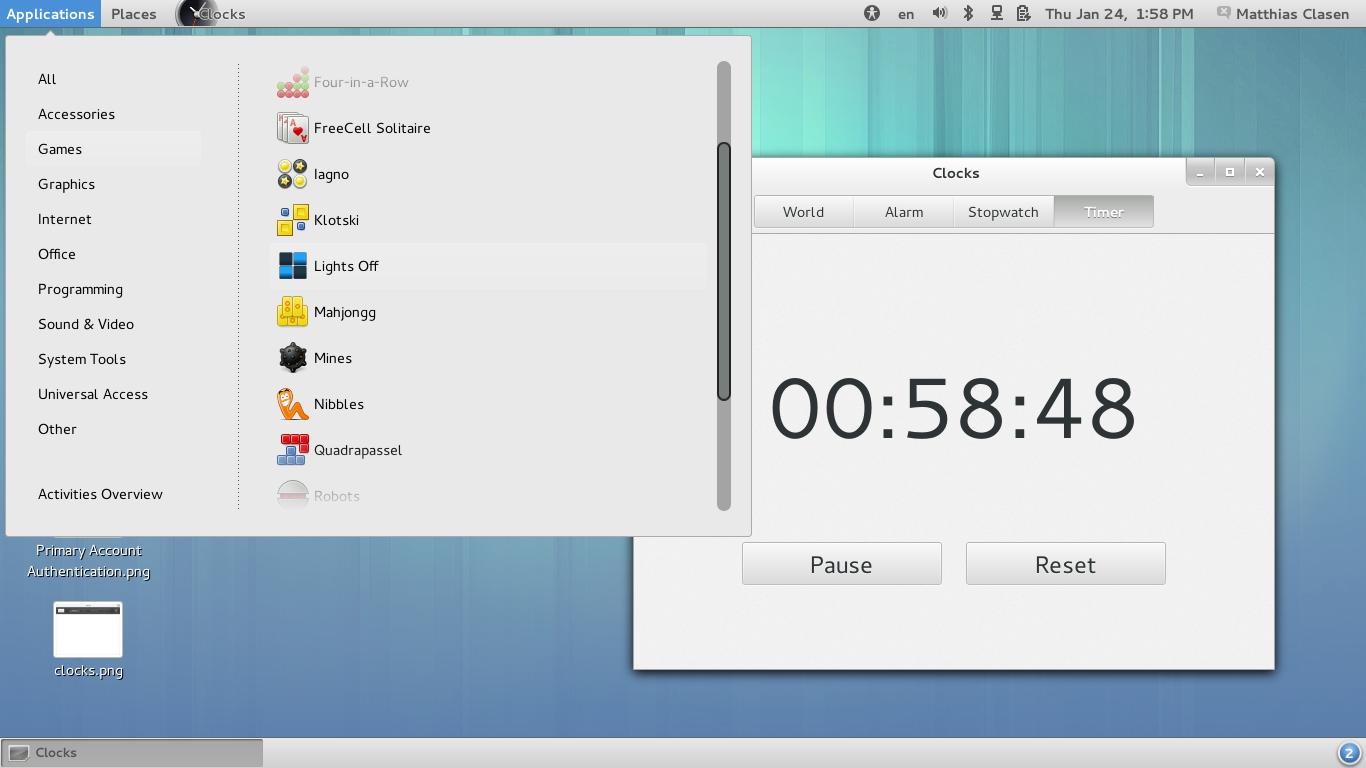
Thanks for the update. What’s the status of the music application? Will it make 3.8 as a preview like others did?
And the problem of drawing pop up menus that have bad geometry and finished back to the top panel when the menu has a lot of items? This problem continue in GNOME 3.6. I recently installed Fedora 18 to test GNOME 3.6 and verify if the problem continues, and, in fact, yes the problem continues. This problem is the main reason that i have to leave GNOME and use KDE. Some people say that GNOME 3xx is for small displays and that is incorrect, on the contrary, GNOME has poor performance in small displays.
This is a bug, there is a bug open (which is marked as a 3.8 target) and has a patch that is currently being reviewed which will hopefully land soon:
https://bugzilla.gnome.org/show_bug.cgi?id=633620
Old GNOME Fallback is great.
This new Fallback extension sucks.
The “Applications” doesn’t utilize my screen real estate, prevents me from seeing all applications and instead forces me scroll. Also, it is much less compact.
It still forces me to use these stupid GMenu instead of having the menus where they belong – in the application itself.
[WORDPRESS HASHCASH] The poster sent us ‘0 which is not a hashcash value.
@Anonimous (“It still forces me to use these stupid GMenu instead of having the menus where they belong – in the application itself.”).
Just use my Remove Panel App Menu extension 🙂
https://extensions.gnome.org/extension/32/remove-panel-app-menu/
Cheers,
Gabriel
I wonder if the settings-panel support the shy html-entity for linebreaks of long words in translated panel-names?
[WORDPRESS HASHCASH] The poster sent us ‘0 which is not a hashcash value.
Im glad to see that some work is being done in the fallback mode for Gnome 3. Now i wonder two things:
1. Will the fallback mode have more acceptance than the shell?
2. Will the fallback mode eventually be the default? This due to all the critics Gnome Shell has received.
Eiterway, I’m surprised with the update.
Regards
No way!!. There is like atleast 1,000,000 shell passionates/fans/enthusiasts (including me) for every classic/legacy/’old school’/’hate change’ users.
That’s not even remotely possible, look at Mint’s usage trend over time and you’ll see not even Unity is doing good in comparison.
Cinnamon > Unity > Gnome Shell.
Ok, I’ll bite.
How many million users does Mint have? You are aware that Mint does not claim to have more users than Ubuntu?
Also, the Mint developers split their userbase by refusing to choose either Cinnamon or MATE to be the default for their flagship release. In fact, the arbitrary decision to place MATE first on http://www.linuxmint.com/download.php instead of Cinnamon (which would be first alphabetically) casts doubts on your implication that Cinnamon has more users than either Unity or GNOME Shell.
Mate and Cinnamon each have their place. Mate works great on systems where you can’t run or don’t want the gross, bloated substructure that is Gnome3 (and we’re not talking about gnome-shell, although that is bloated enough in itself). Cinnamon on the other hand is good for where you *can* run the Gnome3 substructure, but would actually like to get work done rather than spending all day playing fiddle-fussing games with the desktop environment.
I’m just amused how when someone complains about the gnome-shell and lump it in as Gnome3 in general, the gnome faithful will get in an uproar about how the shell is separate from the underpinnings and that you can run any sort of shell on top, yet when someone wants to run a different shell than the holy shell passed down from on high those same folks will bitch as to how efforts towards anything other than the officially blessed shell spells doom for the whole of unix/linuxdom.
The top-down approach to UI design that Gnoms has adopted doesn’t work. I say, let the users configure their desktop, share config files. Then look at the download stats on gnome-look or whatever and you’ll get a pretty accurate picture of what the users want. Make that the default.
“Then look at the download stats on gnome-look or whatever and you’ll get a pretty accurate picture of what the users want”
it’s a known fact that IT engineers did watch how users managed their phones to design arpanet. Err… no.
Are there any improvements planned to Nautilus’s UI ? Gnome 3 is really a great improvement in terms of usability for people not used to computing. But with the new interface of Nautilus, where menubar was removed, some critical features are hidden to the average user. For instance, simply copying a file is accessible only with a right click on the file. Right click is not intuitive for many people, and even Gnome Human Interface Guidelines advise not to “depend on input from the middle or right mouse buttons”, which is the case for Nautilus 3.6 with the “Copy” feature. A contextual bar with actions related to the files selected (something like what is used in Documents) would solve this issue. I think it would be a very useful addition to the global application menu and the “gear” menu, because only those two menus can’t cover all the use cases of a menubar.
Apart from that, congratulations to everyone involved in the development of Gnome 3.8, the improvements presented here really look great.
Wow!, using contextual (cut/copy/paste) bar in nautilus will be awesome. Fantastic idea, anyone (developers/designers) reading this?
Yes, you are totally right. The goal is not to depend on right click. Same applies for double click.
And a contextual action bar is indeed direction of the design, take a look: https://live.gnome.org/Design/Apps/Files#Tentative_Design
But it takes time to get all the planned changes. It was not possible to do everything for version 3.6. And the transformation will probably not be completed in 3.8 either. But it’s getting closer.
Why not use 2 nautilus windows to cut and paste ? You can easyly arrange them with either win + left, or by “snapping” them on the side, and them move everything between them, all just using the mouse. People complain about “gnome do not follow traditional metaphor”, but this is the metaphor from win 3.11 or even the old mac os, you can hardly make more traditional than this.
Judging from the screenshots, there doesn’t seem to be any support for multiple workspaces in the new Classic Mode. That would be a serious disadvantage.
I love Gnome Shell, but I do hope the new classic mode will pacify a lot of those who want their Gnome 2.x layout back. I have a feeling that MATE and Cinnamon will continue to make inroads, though. Neither the Classic Mode nor Cinnamon are very customizable, so people who prefer a single bottom panel will still not be happy with Classic Mode. And bad drivers for older graphics cards will drive some users to MATE no matter what.
I think you should not judge with 3 screenshots but rather try it. I have seen there is 4 default desktop in the overview , but cannot find any reference. To it.
For the bad drivers, there is also a plane to reduce the desktop effect gracefully when the performance are not good enough, out of the box.
@Dag
bijiben can import Tomboy/Gnotes, the export feature is still to be written. i suppose it’s not an emergency, on the other hand it should be really easy.
@Marius Gedminas
there was no formal request to include bijiben as an official gnome module, I just though requesting it for next release but don’t have real opinion on this. Renaming to Notes might be done at that time, I guess.
will the notes app be able to sync over ssh. thats one of the most useful features in tomboy for me.
will the classic mode feature the old applets? not having a system monitor visible all the time makes me sad.
[WORDPRESS HASHCASH] The poster sent us ‘0 which is not a hashcash value.
Yes – I think its a huge loss. There is an extension, but its a bit poor compared to the old panel one. I think that Debian have dropped Gnome as the default UI for the next release – that’s quite shocking & is an indication that the Gnome project isn’t paying enough attention to its users. It wouldn’t take many improvements as Gnome 3 is great, just needs to be a broader church, a bit less puritanical about the UI scripture 🙂
Not quite – there isn’t a default desktop in Debian. It used to be that you could get all of Gnome or KDE + applications on the first CD. If you really must have an X Windows desktop AND you’re installing from one CD, XFCE is now the only thing that will fit.
A network install of Debian 7.0 should allow you to install whichever desktop you want after installing the minimum needed to pull the rest from the ‘Net.
DVD 1 should work, Blu-Ray disk image 1 would work even better – 16GB or so should be enough for anybody 🙂
Is there an effort afoot to try to determine in some manner or fashion which of the Gnome3 extensions are most used, most useful, indicate some unmet need and to try to incorporate what they do in the main body of the Gnome code? If so is this process formalized or is it just an organic part of how you guys think about your future plans?
Also almost the same question regarding gnome-tweak-tool? Couldn’t this be officially integrated into the main settings instead of being relegated to the status of a “tweak tool”.
When Gnome 3 first came out it’s philosophy and vision seemed good to me but there were many unfinished details left to be filled in. This void was filled with things like extensions and the tweak tool.
Now that things are maturing it seems to me that there would be an effort to fill in the details in the main body of the code.
I totally agree with you! Since the the early days of Gnome 3 I keep wondering why desktop font change was taken off and turned to a tweak-tool. I’ve used to use gnome at huge displays, so how to change font size in a vanilla install and without internet? And to be more precise, the gnome-tweak-tool font size part is worse than the old one found in gnome-control-panel. Why stepping back and not evolving a great software? Changing the font size should be faced as changing background, never taken off gnome. It should be “core component” even in its user-customization-spartan-design.
What is displayed on the screen behind you (as seen in the input source switcher screenshot)?
Thanks a lot for this update! Really nice to see GNOME maturing further, keep up the good work! It would be great if the classic mode could bring the disappointed people and the forks back into the fold, but personally I’m fine with GNOME Shell.
When can we expect to see a Photo-slideshow screensaver? At home, we love seeing photos of our family from years past — when we’re not actively using the computer. For the time being, we’ve switched to KDE until Gnome 3 gives us this compelling feature.
The new classic UI looks nice, but what happened to the Shell search? Can’t Shell search be integrated into the Applications menu or somewhere else, so it can be used without going to the overview?
One improvement for the control-center is missing. Please make it resizeable. It’s really annoying to work on 24”+ Displays, fiddling with tiny windows and viewports.
Another feature I really would appreciate is a ‘left-handed’ keyboard shortcut theme. Most important shortcuts are one the left-hand side. That’s suboptimal for left handed people, because it interferes with the mouse usage. An easy left-handed keyboard theme switch just like the left-handed mouse switch would be a great improvement.
I’ll second the request for fixing Nautilus. The new “improved” version is unusable. There has been no shortage of good suggestions for improving the file manager but they have all been ignored in favor turning it into a smart phone app. I’ve compiled and installed Nemo to get around it but I shouldn’t have to be doing that.
Also, how about moving the All Applications button on the Dash to the top where it belongs?
Yes, please move ‘All Applications button’ to the top again, or -even better- make it moveable.
There’s an app for that – https://extensions.gnome.org/extension/472/apps-on-top/
Why is the Photos’ UI black ? I don’t understand, it’s a flagrant inconsistency within the theme.
Apps that focus on colorful content (photos, videos etc) use the dark theme to reduce light pollution.
In the Notifications dialog screenshot, what does “Show Pop Up Banners” option do? Maybe it’s the wording I’m not used to. Is it just asking if I want to see notifications or not? In which case since I’d expect it to be consistent with the dialog and be called “Show Notifications” ON/OFF.
I hate to be negative, but sometimes we have to say ouch. When a person such as myself spends a good 4-6 hours per day doing a) programming, b) emails c) Web browsing, d) writing, and e) some card games or chess,
we end up at the end of the day with muscle pains, otherwise known as carpal tunnel pain. This pain occurs because it takes too many mouse clicks to switch from window to window, or to initiate applications when the name is not fully known.
There is a competing product called cinnamon. It does not compete as eye-candy, but, with cinnamon, with one click, I am in my programming environment, one click to start my favourites, one click to open the menu and to slide across the screens to start any application. One click versus three is for me a usability question. One click for me is at the end of the day, absence of muscle or carpal-tunnel (repeated action) pain.
Dear Gnome developers. Eye Candy is nice, but having good functionality is even better. After 8 years staying with Gnome, I have switched to Cinnamon. No more muscle cramps at days end for my forefinger overdoing mouse clicks.
Fedora18 with Nautilus was my justification to change. Give me a reason to return.
Opening applications:
E-C-L (opened Eclipse)
T-E-R (opened terminal)
etc…
Number of mouse clicks: 0
Switching applications:
– (Duh!)
Number of mouse clicks: 1
Gnome 3 should actually be better for people with carpal tunnel syndrome, as you need to use your mouse LESS than with Gnome 2. And when you do use the mouse to switch or open applications you are aiming for larger targets (icon/window) which should mean less stress for your hand.
Give it another try, and I think you will notice this.
Settings is starting to look nice, but how about adding a REAL themes / color / font selector and dropping Gnome Tweak Took. GWT has the feel of some 3rd party Windows app, changing themes really should be an actual supported Settings pane, and not some external hack like GWT.
Other than having to use GWT, looking good.
@Leslie Satenstein
You don’t have to use the mouse for chancing application, both Alt+Tab, Alt+(key above Tab) and overview application search (which doesn’t need to spell the entire application name) can be used for switching between application windows.
Personally I like have er persistent place for my application so I usually place the applications which I always use on workspace for itself (in full screen). Then use “Switch workspace” to switch to those applications (for me this is: email, browser, terminal and Emacs).
If you REALLY want to use the mouse, you are right that it isn’t possible with a one click, but you can activate the overview by moving the mouse the top cornor (no clicking required) folowed by a click on the desired application icon on the side bar (where you can pin the favorite/most used applications).
Keyboard shortcut that opens User menu?
@Leslie – put your com apps on one desktop, and your dev apps on another, and your brows (“It’s compiling!!!”) apps on a third. I think you will find switching to be quick & easy and mouselessly pain free.
ack! switch with up or down
the paradigm is ‘wheel of fortune’
wtf – it stripped off the important parts
cord the Control and Alt keys with the Up Arrow or Down Arrow to switch desktops – and avoid less than key and greater than key on this blog
UI looks like a real shit.
Gnome 3 is your shame. BTW, thanks for Gnome 2.
Will there be a workspace switcher in Classic mode?
If so, will the workspace switcher support the grid workspace layout?
I like that the classic desktop is returning somewhat to Gnome. Once 3.x hit I switched off to XFCE. If classic look was there from the start I would have stayed. Maybe if it gets to the point where it works just as good as it did in the 2.x line I might switch back. For me, the 2.x style just worked with anything I threw at it.
On the whole I like Gnome 3
The latest release of Nautilus, however, is causing me problems and for now I’ve switched over to Nemo. My problems areas are:
1. Please add an “Open in Terminal” option – some of us really need the shell. Why do you instead on hiding this essential tool?
2. there needs to be “up” and “refresh” buttons – I know clutter….
3. adding the Files menu to the top bar is very annoying when using two large monitors, especially when you have multiple windows open – please keep this with the application itself. Have you tried getting to the “Connect to Server” option these days?
4. Can we edit “Places” – I don’t want Videos, Music, Photo entries – just takes up real estate and adds to the useless clutter. Places will be different for each user – either make them easily editable or get rid of them and just use bookmarks.
Finally I still can’t work Gnome 3 without adding back in the standard maximize, minimize and close buttons. I know your logic but it’s not practical on a “old style PC” – remember those? – the ones with a keyboard and mouse.
Keep up the good work – change can be good.
‘Please add an “Open in Terminal” option’
nautilus-open-terminal extension should still work, and is packaged in several formats.
Do you plan to design meaningful icons ? When I see (on the notifications settings) a roll of toilet paper I don’t think “archive manager”, or when I see 3 monitors, I think multiple displays and not Network.