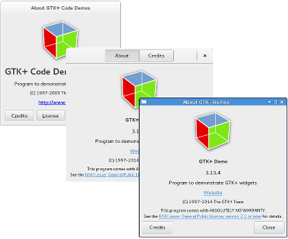
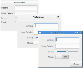
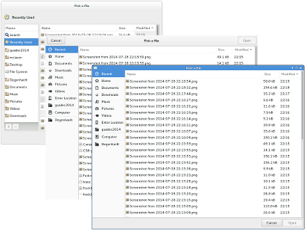
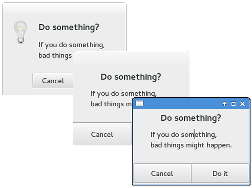
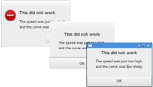
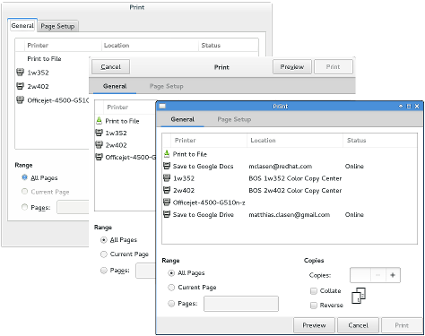
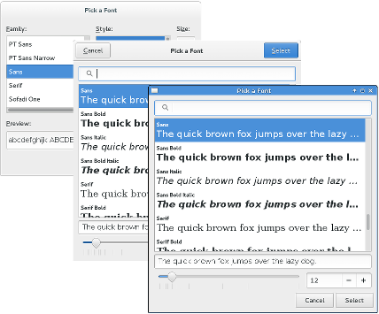
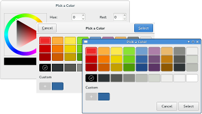
My talk at GUADEC this year was about GTK+ dialogs. The first half of the talk consisted of a comparison of dialogs in GTK+ 2, in GTK+ 3 under gnome-shell and in GTK+ 3 under xfwm4 (as an example of an environment that does not favor client-side decorations).
The main take-away here should be that in 3.14, all GTK+ dialogs will again have traditional decorations if that is what works best in the environment it is used in.
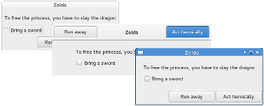 The second part of my talk was discussing best practices for dealing with various issues that can come up with custom GTK+ dialogs; I’ve summarized the main points in this HowDoI page.
The main take-away for me is that the Linux Desktop story is still messed up until we can get rid of “custom” window managers and just stick with one (I would love for this to be gnome-shell, but whatever works best – the point is having only ONE and not many window managers, or all window managers agreeing on the same layout, client-side decorations, etc.. – something I don’t see happening :/). Sure, it looks like you have figured out how to run GTK+2 and GTK+3 apps well with and without client-side decorations, and that’s nice, of couse (seriously, good work – does that mean that I can write a GTK+3 app and “port”/run it on OS X or Windows and expect things to be equivalent to GTK+2?).
So, you’re writing documentation for your application or giving phone support to a computer user for a given application. Do you say “Click on ‘Save’ in the top right corner of the window.”, or do you start a conversation about which window manager they are running, then explaining what a window manager is, and where to click to find out, telling them to open the Terminal, explaining what a Terminal is, asking them to enter some cryptic command which they mistype at first try, then waiting for them to read back the info, only to then guess what that window manager does and what settings it has, and how it could potentially look like on the other end of the phone line?
… which is why I really think buttons on top are really not a wise choice.
Having the buttons on the bottom does not change anything to the touch-enabled devices story: it’s still instantaneous to tap the button and to locate it. Whether on top or bottom they will move depending on the dialog size anyway, so the users eyes are prone to movement and scanning before action.
Also, I think having buttons on bottom makes it the same for all dialogs, including action dialogs. The arguments in favor of having them on top only in some cases is very weak compared to other toolkit/shell experience.
I especially do not like a header-bar followed directly by tabs, there are too near each other and difficult to click/tap, whereas at the bottom the buttons are such a better target.
Buttons-on-top and the app-menu are the only two outstanding items that I do no like in Gnome 3, all the rest as been shaping up nicely, version after version.
Anyway there is room for improvement and this is a refreshing experience none-the-less 🙂
Well, way back when everybody agreed that server-side was the only sane way to draw decorations, there was absolutely no such problem.
(I also think you’re exaggerating said problem, as someone unfamiliar with the concept of window manager probably runs the default environment from their distro, and the distro is likely to be a Ubuntu flavor anyway)
It’s GNOME that decided that applications prettiness was more important than desktop consistency, and I think it’s only fair that GNOME has to repair the mess created by opening the CSD can of worms.
As someone who uses several GTK+ apps but not GNOME, I welcome this step in the right direction.
Unfortunately nobody uses Linux – it’s windows and Mac. And users from those platforms wouldn’t be able to learn how to use something as convoluted and weird as Unity or GNOME Shell without training and frequent explanations of functionality so this probably won’t change. Maybe Chromebooks have a shot, considering they use a familiar layout.
And that’s not even talking about all the mobile devices – Android, iOS etc that people use.
If you want to target end users with a UI, use a mature cross-platform toolkit (Qt) or build a web app…
That is surely a point, people love the familiarity of Windows, but this is not always the way to go. If nobody ever thought out of the box we would not have computers at all. Windows for example is in some ways severely broken and beyond repair, because people expect it to still be Windows. Microsoft did a brave attempt with Windows 8, finally getting their UI touch friendly, but that -as you might know- backlashed.
Anyhow, I don’t want to sound like a Windows basher, and therefore back to gnome-shell. Gnome shell tries to do things differently, rethinking how we use the desktop (Honest question to you, do you know why it is called a desktop? And why one of the icons on a Windows desktop is the recycle bin) so that it can involve into a better UI. Thats a rocky road and involves a lot of criticism. Key in creating that perfect UI is however listening to that criticism, which is something that is adressed here!
On the subject of Qt, yes Qt has better support for other platforms, but it being the sole toolkit is a horror situation. If a toolkit/application/desktop enviroment/web browser gets to be the only one of its kind bad things happen, and development of that component stalls because it doesn’t have to compete anymore. And GTK vs Qt is a discussion that is endless, some people (like me) feel that the desktop metaphor as it currently stands is broken and we need revolution in our desktop environments/toolkits to fix that, other people like the desktop metaphor and stick to it, its your choice.
Anyhow, being free software and all, it is your choice, if you like Qt, stay with Qt, if you like GTK, stay with GTK.
Finally some sense! But I hope fallback app menus still appear as a button on the toolbar and not on the menubar.
Hi, I use Gnome 3.12. Some application I used has this new GTK3 design. I have no real pb with button on top even if it felt strange the first time.
But, as shown in the screenshot 3 (“save as” dialogbox), we have loose the possibility to use “search” to find the good directory to save our file.
The version on the left has this option (left frame, “search” is just before “recently used”) but on the other one, this option is removed.
I really like this indexing “search” fonction. I use my linux in my job activity and I have a lot of different directory… I hope it will come back…
Não! Por favor, não tire a beleza dos recentes diálogos.