smarter status hiding

In heavily populated IRC channels such as #debian on Freenode, a lot of idle IRC users are joining and leaving every couple of seconds. At the moment, we display a status message for every user in the room which in some cases results in a lot of visual noise.
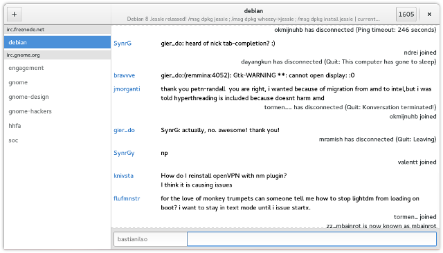
06-30-15 visual-noise-thumbanother busy day on #debian. 9 out of 17 messages in the chat view are status messages..

This problem is filed as bug 711542 in GNOME’s bug tracker. I have decided to try addressing this issue with some logic.

The main purpose of status messages is to indicate activity concerning a user, such as the user joining a channel, disconnecting or being renamed. The two primary use cases I see for displaying status messages in the chat view are:

  • ..when a user on a channel is actively participating in a conversation, but then the user’s status suddenly changes. For anyone reading the conversation, it is interesting to know what has happened with the participating users as a change in their status can affect the conversation itself.
  • ..when a channel is idle and no conversation is happening. In this case it is a convenience to display status messages. You might be waiting for someone particular to join the channel for example and thus is checking the channel occasionally to see if the person has joined the room. On the other hand, we also want to avoid flooding the chatView with status messages as it creates more unnecessary extra text to scroll through between conversations in log history.

To adress point one, I have implemented the concept of “active” users and “inactive” users. An active user is any user on the channel who has sent a message to the room within the last X* minutes. If the user is considered active, we allow any status messages related to this user to be displayed in the room.
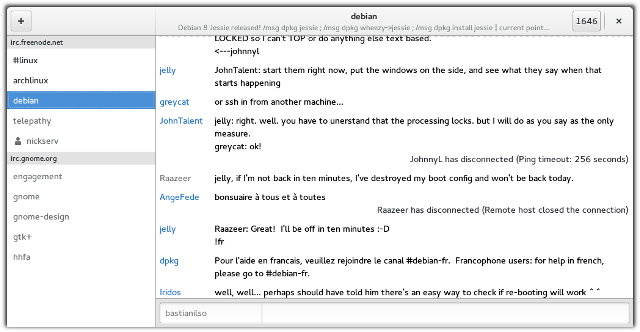
06-30-15 only-active-users-thumb Only recently active users emit status messages.

So because user Raazeer wrote “jelly, if I’m not back in ten minutes, I’ve destroyed my boot config and won’t be back today”, Polari will allow Raazeer’s status messages to be displayed the next X minutes. As can be seen in the screenshot above, a status message indicated that Raazeer disconnected shortly afterwards.

To address point 2, Polari will display status messages for any users provided there hasn’t been any conversation in the channel within the last X minutes. However, if more than 4 status messages are emitted while the channel is idling, Polari collapses the status messages and displays a single line summary instead. The summary can be expanded to reveal the details at any time.
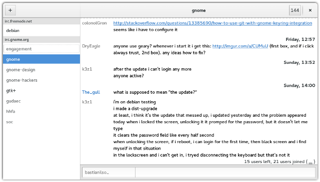
06-30-15 compressed-status-message-thumb Screenshot of a status summary in action. Clicking the “…” can be clicked to reveal the status messages.

With these changes I hope we’ll have less visual noise from status messages in Polari. Feel free to have try my current branch. With problems like these, I think the best way to find out if it’s solved, is by trying it over a longer period of time.

*duration to be discussed. It’s currently set to 5 minutes, which is unfortunate for Raazeer since he said he would return in 10 minutes. Maybe a good indication that I should use a higher number? d:
more menus

Since last blog post I have been designing and implementing a room menu for Polari.
06-25-15 polari-room-menu-thumb
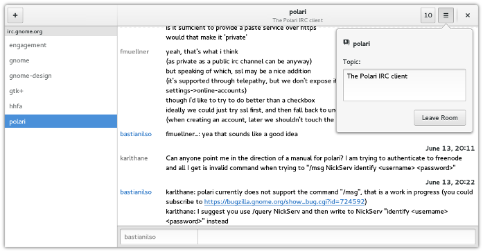
Screenshot of current implementation of the room menu in Polari.

The goal of this menu is to provide actions for the current room you are viewing. The menu will help solve some problems:

  • Makes it possible to read the room topic in full and change it if you have the permissions to do so.
  • Creates a more obvious way to leave a room which is also touch friendly.

These points have been implemented and are available in the branch wip/bastianilso/room-options. I am still considering what other actions are necessary to have in the room menu. My plan is also to expose whether the room is on a private/public network and relevant channel permissions as well as your own status. For private conversations, the room menu could also be an ideal place to expose extra information about the recipent you are talking to if available.

Feel free to share any other use cases you think is the room menu could cover.

a digest from polariland

Aside from larger items on my list like the previously covered Initial Setup experience, I am also working on a lot of smaller items in Polari. After finishing the GNOME 3.16 release video, I have been submitting small patches to Polari with great assistance from Florian.

06-14-15 polari-pile

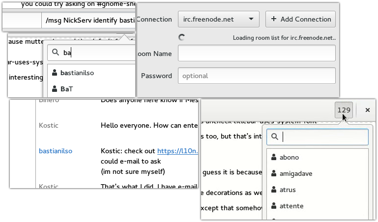
First, I recently submitted a patch to Bug 724592, which adds support for the /msg command. A lot of IRC guides mention using the command “/msg NickServ identify username password” but at the moment writing this in Polari will just result in a “command unknown” response. Any results matching your search term is now also highlighted accordingly in the user list (bug 745743). Furthermore, when opening the user list, the search entry always receives focus so you can just type ahead (bug 750689). Users who are offline are now indicated in the chat history by color (bug 710792). Finally, the “join room” dialog now validates the user’s input against the server’s room list and provides auto completion (bug 709846).

Some of the patches still lie around in bugzilla. Others you can enjoy from Polari’s master branch already. I look forward to work through more small details like these. Being able to shape a user experience like that is simply great.

A first time Polari experience

The flags have been raised, summer has kicked in and GSoC is happening. I’m here to share with you what I have on the harddisk at the moment. I am working here and there on Polari, an IRC chat application.

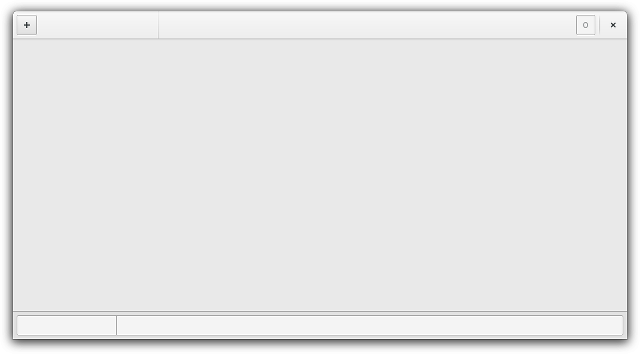
Some days ago I picked up the task of revamping Polari’s first-time-usage state. In Polari 3.16 a new user is presented with an empty window first time he opens Polari such as the figure below. The reason is that no rooms have been joined and no connections have been setup.
before-gsoc-thumb
Polari’s current way of saying “please add a connection and join a room to chat”.

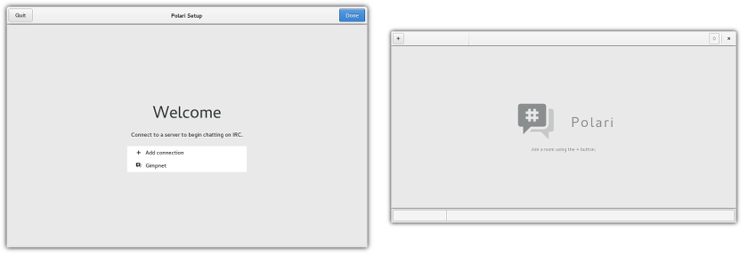
It might not immediately be obvious how to get started chatting with this thing, however. I took some inspiration from Calendar’s recent initial setup designs by Allan Day and whipped it up with an old prototype by Carlos Soriano. Here’s a video of the work so far.

initial-setup-thumb
Screenshots of the implementation in my initialSetup branch.

First time you open Polari, you will now be presented with a welcome dialog which will help you connect to one or more IRC servers. Furthermore, the empty main Window has been made more welcoming to newcomers. The Polari logo and title is there to communicate that this weird looking window in fact is the Polari app. Below a small hint presents the almighty ‘+’ menu, so the user can start adding some rooms.

Existing Polari users won’t see any of this of course. Once you have joined your first rooms, Polari will automatically join them next time you open it.