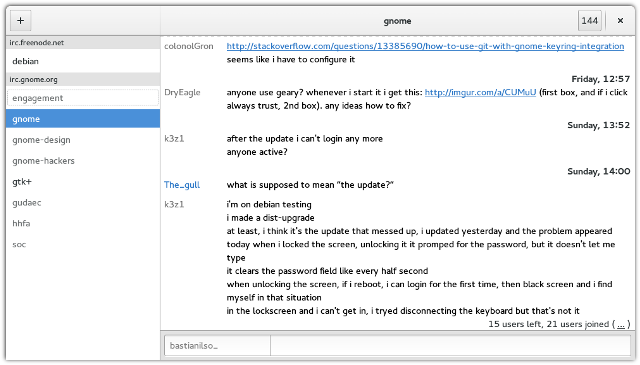
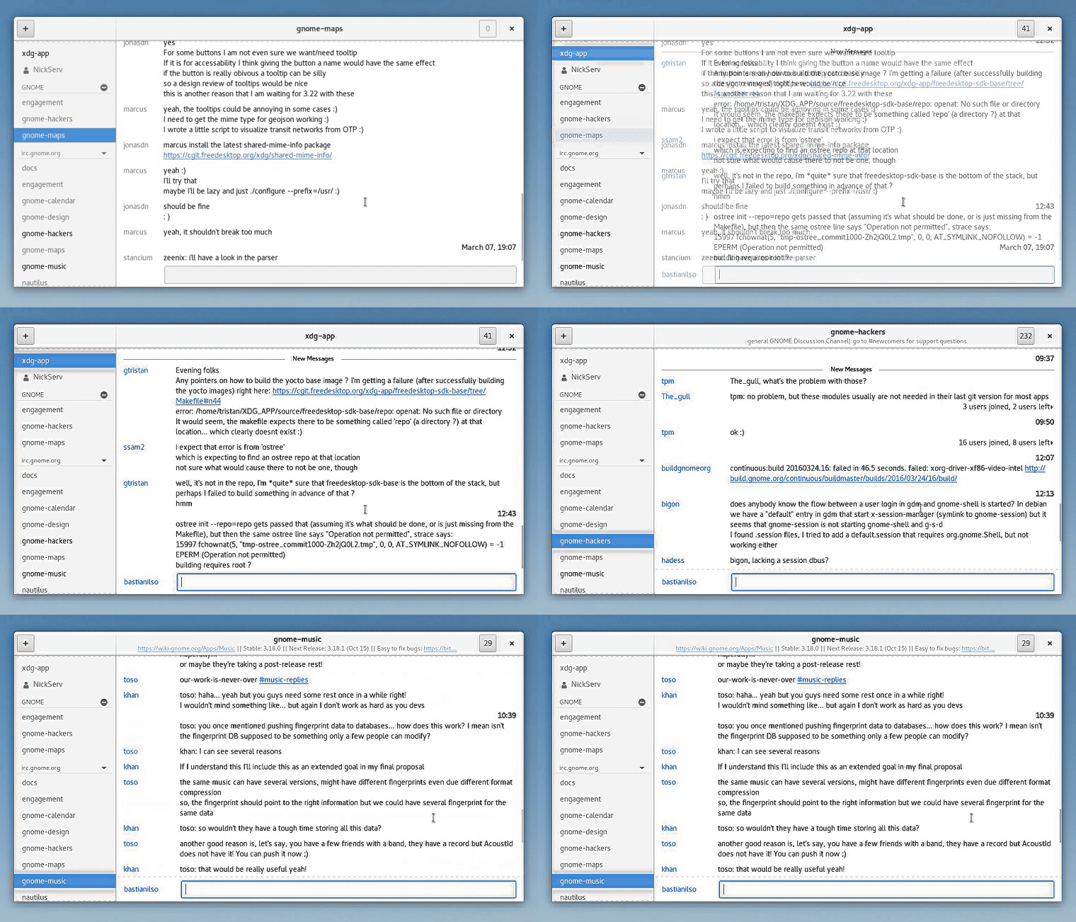
It’s a little more than two weeks since GNOME made yet another release. Having a release video to go alongside with it is almost a tradition by now. I’m slightly frightened and super excited about it at the same time. (-:
 Press the picture to watch the video on Youtube or download it here.
 A crude approximation of my time distribution while working on the GNOME 3.20 release video.
Doing those videos is some work. Since my GSoC internship on Polari, my motivation has shifted heavily towards the realms of interaction design and involving new contributors to GNOME in general. That and a want to create videos beyond just during every release has encouraged me to look into creating release videos more effectively. Yet despite that mindset I’m still very satisfied with the outcome and I feel I have evolved yet again from last cycle’s video.
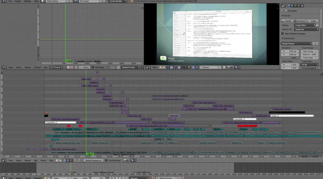
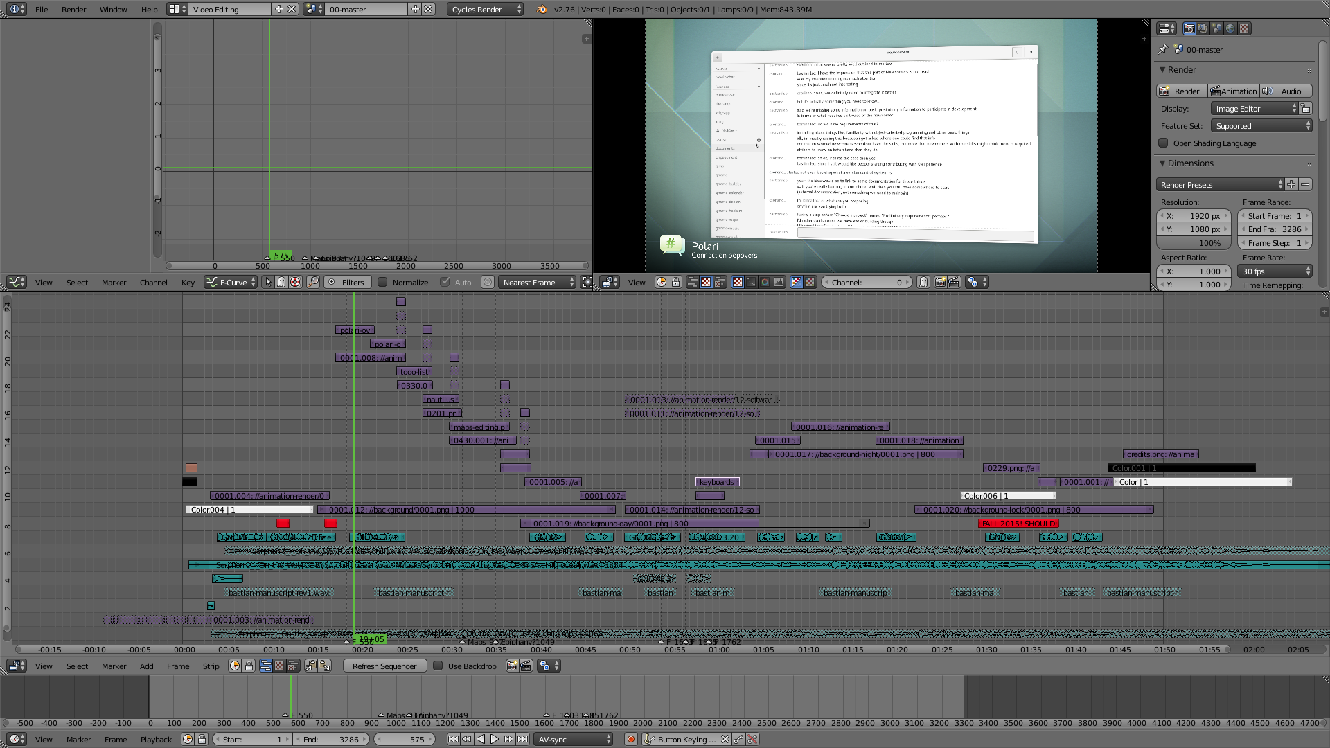 The final release video as edited in Blender VSE.
Animating empties
By animating empties rather than the objects themselves, I’ve managed to create a collection of animations I can reuse at any point in the future. Not only does this save me time, it also means that objects in two different scenes can share animation and have consistent timing.
Camera Imperfections
As an experiment I played with adding camera imperfections to the video such as grain, slight vignette and dispersion. The aim here is to let the virtual camera feel more “real” – adding to the perceived quality (it’s something that we subconsciously expect). If everything went well, hopefully these effects should have gone unnoticeable through. It is definitely something I want to study further.
Applied Film Theory
Last semester I had a course in Screen Media, which introduced much useful film theory to me. For the GNOME 3.20 release video in particular I’ve been more aware of the rhythmic relation between the music and the editing. Cuts and animations are timed to the pace of the music giving the video a more natural feel.
I also had the chance to play with the use of ambient sound – you may have noticed the sound of an ocean in the background. The purpose of the ambient sound is together with the picture to cue the viewer of a location, season and time of day. I thought the ocean would be a fitting choice with the music to put the viewer in a calm mood.
There’s definitely more to explore within film theory that I can applying to future release videos – I got 47 pages of notes from Screen Media to practice. (-:
Kudos to the team behind Blender for such a powerful tool I can use in my Free Software pipeline. Same goes to GIMP, Inkscape and ffmpeg.
I have Karen Sandler and Mike Tarantino to thank for providing such a professional voice-over. Good sound has incredible influence on the perceived video quality. With help from Petr Kovar and the GNOME Translation Team the video is also avaiable in 13 different languages. The Engagement Team gave feedback and coordinated the release. The GNOME Design Team has made the vast amount of visual assets that I use. Finally, a big pad on the back to all the developers and contributors in GNOME! Every cycle we advance free desktop technology further and that’s an important message to send to the world.
I’d like to credit the following authors for their assets which I have used:
- Serphonic for his single “On the Way” which was the background music in this video.
- Cheeseheadburger for his “White Sands Footsteps” sfx.
- JarredGibb for his “Sub Rush 1” sfx.
- gnrja for his “ocean waves” sfx.
The GNOME 3.20 release video is licensed under CC-BY-SA 3.0 and can be downloaded here. The source .blend file can be downloaded here. To keep the file size down I’m not including any animation assets.
