EOG development is going a litle bit slower than I wanted but it’s going very well actually. As I said before, The heavy development is taking place in eog-ng branch which we plan to merge in the beginning of 2.20 development cycle (aka 2.19.x). See eog-ng wiki page for more information. I’ll try to list the nicest recent news.
Tangofied themable EOG icon
Thanks to Ulisse we now have a new official tango compliant icon.

New beautiful EOG icon.
As a wonderful surprise, Carol, my wife, managed to get a brand new t-shirt with the new EOG logo as christmas gift. Isn’t she lovely? :-)

T-shirt with EOG icon. Awesome hun!?
Printing
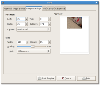
Thanks to Claudio EOG now have a simple, user friendly and powerful way for printing image. You can define exacly how you want to print the image in the paper and you do this in WYSIWYG way. Side note is that it’s been commited trunk and eog-ng branch. So it will be available already in GNOME 2.18.

New EOG printing UI. Easy and powerful!
EOG website
Thanks to Trond Danielsen we now have an EOG website online. The website uses the project template for consistency. Click here to check it out!
New collection pane
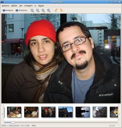
I’m experiment some new things in the collection pane. Basically, I’m trying to use a one-row-with-horizontal-scrolling aproach. Thumbnails now have a context menu with common used actions. Also, Inspired by the Fickr Organizr I added some buttons to smothly scroll through the image collection. Of course it still needs some polishing and I’d like to get some feedback about it. Comments?

Collection pane experiment.
Image properties
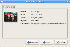
I chose to replace the image information side pane with a image properties dialog. It’s less invasive than the side pane and has navigation capabilities which means you can easily check images info and metadata without having to close-and-open dialog for each image. This is a work in progress. Ideas/comments/suggestions should be posted in bug #313676.

Image properties dialog.
EXIF automatic orientation
As some of you probably noticed, since 2.17.3 (patch still to be ported to eog-ng branch) EOG has support for automatic orientation of images based on EXIF info. One issue stil needs to solved but the general funcionality is already working.
New code base
The code base in eog-ng branch brings a lot of stability to EOG and the code is much more maintanable. Also, in theory (I still need to do some profiling to confirm) the eog-ng code should use less memory and should be faster than trunk. Some useful command-line options were added to start EOG in fullscreen mode (-f), slideshow mode (-s) and with collection pane disabled (-c).
Contribute!
Grab the eog-ng code now and participate! Go go go!
svn co http://svn.gnome.org/svn/eog/branches/eog-ng/

Would be great if someone could port that EXIF fix to nautilus thumbnailing as well :)
What do you think about designing EOG together with some nautilus collaboration to completely replace gThumb?
Good work on EOG. It is one of my most used apps. I deal a lot with images in my lab and eog gets used most because it is just so lean and handy.
Along that line I urge you to not nuke the contact sheet-like collection view. I often invoke it on the command line with find and xargs or with a wildcard like *r-theta*+06.ras to get a quick overview of a lot of images. No other viewer is that practical especially since you can use it as a proxy for d’n’d into Gimp.
I hate to be the reactionist but I like it the way it is; (quite) fast and minimal.
Awesome! I can’t thank you guys enough for all this hard work.
I remember first using this app many years ago now, and I thought it left a lot to be desired. Looking at this post now makes me smile, it really looks great – much more clean simple and beautiful than what I remember.
Regarding the info pane, this blog post may give you some interesting insights into presenting EXIF metadata: http://blog.duncandavidson.com/2006/09/aperture_vs_lig_1.html
cheers
This is truly wonderful stuff. Thanks to everyone involved.
One question: can you load SVG files and zoom in properly yet? I always used to find the fact that EOG converts them into bitmaps and scales the bitmaps amusing.
Brilliant! The collection viewer was difficult to use when it scrolled in two dimensions.
Full screen mode with translucent icons/collection overlay
I like the collection pane experiment. One thing that would really be sweet, especially in full screen mode, on media center PCs or pda screens, is a translucent icon overlay, like the application called ‘Entice’ in this old screenshot:
http://www.enlightenment.org/Main/Home/images/_images/rephorm-desktop.png
The collection would also be overlaid on the image itself.
seems odd to use a slider instead of a scollbar
it will look especially odd when EoG is embedded inside Nautilus
it would be better if you could use the standard widgets.
I wish MArk Finley was around. I remember he bashed out several iterations of mockups on the collection view and various other ideas on Nautilus I can only vaguely recall.
I agree that the slider is strange, it should be a scrollbar there IMHO.
otherwise, each of the changes seem a progress to me.
Wonderful. Thanks.
Yes, the freaky eye with the silly hat is finally dead! ;)
I think that you should include these scrrenshots in http://www.gnome.org/projects/eog/screenshots.html
Will it support XMP metadata? http://f-spot.org/Imported_tags
Nice icon but shouldn’t the image behind the magnifying glass be bigger than the bit that isn’t ? ie: magnified :)
I want such a T-Shirt!
yay, finally a real icon! ;-)
lucas, merging eog-ng for 2.19 probably means that http://bugzilla.gnome.org/show_bug.cgi?id=379919 and http://bugzilla.gnome.org/show_bug.cgi?id=320020 won’t be fixed for 2.18, but for 2.19, right?
then we should remove the gnome target milestone… tia
My suggestions is:
– open directory in recorsivley mode
– key for random advance and concerning “mode” for go to back
– folder tree panel in the left (or right)
@Andreas, I know you meant the icon, but that comment is not so funny in the context of Alan’s comment about Mark Finlay, he passed away some years ago…