Hildon Desktop + FreeDesktop.Org

We’ve been trying to put some effort on making Hildon Desktop more compliant with FreeDesktop.Org standards. We have some nice news on this direction.

Desktop Notifications

I added a service that implements the Desktop Notifications draft standard. It’s not complete yet, I still need do some changes on one of our widgets, but it’s working like a charm. Also, support for multiple notifications at the same time is pending. In practice, this means that applications using libnotify (or any other compliant client library) will have their notifications shown on Hildon Desktop! Here is the result:


Hildon Desktop showing a notification using libnotify.

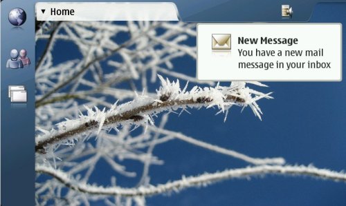
Notification area (aka system tray)

Moises rocked our world by adding support for system tray standard in Statusbar. This means that if you use GtkIconStatus (or any other compliant implementation of the client-side) it will appear in Statusbar. Of course, still the usual Statusbar plugins can be loaded in Statusbar too. There are some pending issues with the theming of systray items (as you can see in the screenshot) but we expect to have it fixed soon. Here is a (mandatory) screenshot of Hildon Desktop running inside Scratchbox:


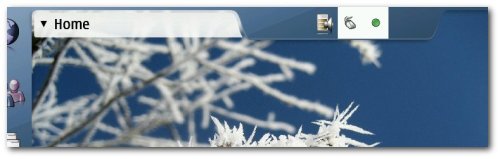
Statubar showing Gossip and Network Manager systray icons.

Update: Moises has just fixed the theming problem. Yay!

Hildon Desktop Scalability

So, as I posted some days ago, one of our goals for the future Hildon Desktop releases is scalability. We want to be able to easily configure/adapt the desktop to different displays with different resolutions. As a proof of concept, I made some very small code changes and some adaptations on the development theme (aka Plankton) – created by MDK and tigert – and made Hildon Desktop usable on a 1024×768 resolution on my laptop. It would rock even more if I had a tablet PC here to use finger for interaction. Here’s the result:


Hildon Desktop running on a 1024×768 resolution.

Error/Warning UI in Eog-Ng

Currently, EOG is really crappy on reporting errors/warnings to the user. Basicaly, you only get feedback about errors on image loading, nothing else. Also, it uses dialogs for this which is kind of invasive and specially annoying on a collection-based UI application like EOG. I really like the UI aproach adopted by gedit with this cute yellow message area. So, I borrowed gedit’s code to use the same aproach in eog-ng. If something goes wrong with the image loading, you can easily browse other images from the same directory without needing to close EOG. Here’s the result:


New UI for errors/warnings in EOG.

I still need to add the code for different kinds of error/warnings for cases like opening a directory with no images, opening unrecognized formats, not found files, etc. This will be piece of cake with the new code base though.

—-

Claudio pointed me to this blog post from this italian guy who seems to be really excited about eog-ng. Good to know that users are enjoying the EOG development news. :-)

—-

Update: don’t worry about the odd “Cancel” button. I’ll fix this ASAP. :-)

EOG statubar

I heard very often that there are some EXIF info that users are really interest in having easy/quick access to. EXIF presentation was really improved as I already reported before. EOG’s statusbar could be used to show really common EXIF values like date and exposure values. I wanted to do this in a way that not much noise is added to statubar. Here’s the result:


Statubar showing most common EXIF info: date and exposure values.

I haven’t commited this yet because I’d like to get some feedback first. Some additional related issues:

  • Is there a way to show exposure values in a non-photographer-friendly way? I’m thinking in adding a GConf key to optionally enable something like “exposure info in statubar”. End-users would free from those evil info then.
  • Should the time reside on statusbar?
  • Show simplified date/time (“23/12/2007, 12:48”) or a full descriptive one (“23 December 2007, 12:48”)?
  • What do you think is missing in statusbar?


Comments?

Selection bytes

Some weeks ago, I posted about how could it would be to have the GtkIconView selection looking like this. So, the first step was done: I cooked a patch. I guess when/if the patch is integrated into GTK (I’m still waiting for the feedback from the maintainers), the next step will be to do some rocking theming work in GtkIconView selection. Comments on this subject should go on bug #382544.


GtkIconView selection: first step for a potential selection eye-candiness.

Update 1: don’t pay too much atention to this checkbox in this screenshot. This is just part of GtkIconView test program with some weird layouts.
Update 2: for those interested, the rounded borders will come the theme engine, not in GTK itself.

Attribution-NonCommercial 3.0
This work is licensed under a Attribution-NonCommercial 3.0.