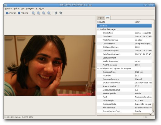
I’ve been working on replacing the image info sidepane in EOG with an image properties dialog. IMHO, this is a less invasive and more consistent aproach. The sidepane takes too much space of the image view mostly when you want to visualize the image EXIF data. Also, just dumping all EXIF data is not very user-friendly. Therefore, another goal here is to make it more user-friendly.

Current image info sidepane: invasive and unfriendly.
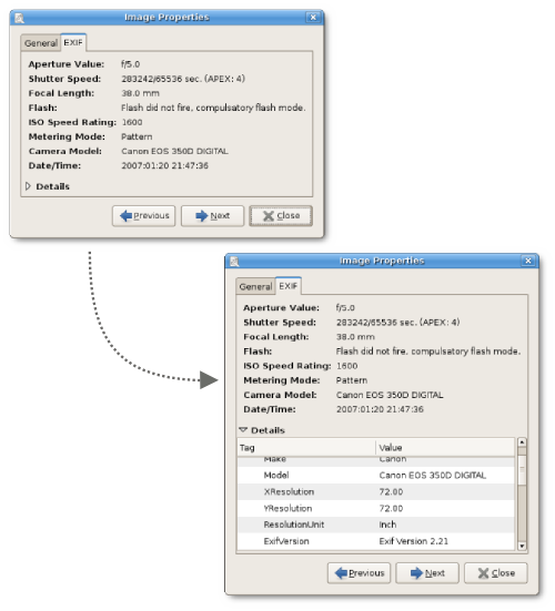
So, in eog-ng there’s an EXIF tab in image properties dialog which at first sight only shows a summary of the most common things you want to see in EXIF (aperture, shutter speed, flash, ISO, date, etc). But I still want to give the possibility to view the whole EXIF data for advanced users. So, just click on the “Details” expander and you can view all EXIF tags. With the navigation buttons in the dialog, you can easily check EXIF data from each image.

EXIF tab in image properties dialog: balance between user-friendlyness and power usage.
I still want some feedback about it and some help on which EXIF should appear in the summary and in what order. Discussion about image properties should take place in bug #313676.
I’m in doubt about this one. I can see one use case that is now not available :
Say that you want to browse all your pictures and EXIF data. With the side pane, you just open it once and the click “next”, “next”, “next”…
With your solution, for every picture you would have to open the properties dialog (might require a right click) then details.
I personnaly don’t be in this usecase but I can understand someone who needs it. I’m also a big properties windows hater ;-)
Anyway, thanks for your work on eog-ng, I’m impatient to see it in distributions.
Cool, the embedded list has been bothering me ever since. Thanks for working on this!
The sidepane is unfriendly but this allows focusing on the nice girl :)
I myself found the sidebar to be extremely useful. I agree it was quite cluttered, so a cleanup is indeed a good thing. But don’t make the sidebar go away. After all it was a sidewindow, which I just could make disappear if I didn’t want it. If I just wanted to see the image, I would be in slideshow-mode anyway!
So I would propose the following: Remember the sidebar-width. So if a user just makes it go away, it stays there and won’t bother the people who where bothered with it.
@Ploum
Can’t you see the Previous/Next buttons ?
I really like this idea and I would leave the sidepane in there too.
Hi all,
The advantage of a dialog is that you can place the dialog anywhere you want (even “outside” EOG’s window if you have a screen big enough. If not, you can just resize the window to best fit your needs). You have full control over the image list navigation through the dialog therefore you don’t need to do the annnoying operation of close-then-open-again for each image.
Please, post your valuable comments in the bug report if you think it’s worth.
CMoi: yes, you’re right she’s a nice girl. This is why I married her. :-)
In general, for all applications of this kind, sidebars are a lot more user friendly; there are no focus problems, no clutter in taskkbar (if it’s own window) or lost windows (if not in taskbar), it gives perfect overview in one, collected window and there is no doubt about what is happening or why.
Property dialogs are, in general, unfriendly if you have to use them more than very rarely and this looks about the same.
What sidebars (at least in GNOME) often have as a problem is how they are presented, handled, etc. They need to have good code for how wide they should be, and easy to show/hide. I suppose that could be one reason some people don’t like them (in GNOME), because this is often poorly handled. I’d say that would be energy much better spent than moving it to something with obvious(?) usability problems.
The other design decisions with better presentation of EXIF etc. looks very promising though, keep at it. Maybe some info, at the very least date/time taken, should show up already on the general tab? That’s one piece of info I often go look for, and it’s a bit annoying that it should be on another tab. I would suppose this is interesting to more people than me. :)
Don’t kill the sidebar!
I think it is important that the property dialog does not prevent clicking on the main window. So with it open, you could still browser your picture as always, and the property dialog would just update to match whatever picture is being shown.
In addition, just to make every body happy, what do you think of making it an undockable sidebar. It would work similarly to the actual one, but you could somehow drap it out of the window to turn it into what you’re proposing now.
just my 2c
Why sidebar vs popup?
isn’t better a sidebar that comes up on demand clicking on an icon? (like konqueror)
You would save space and You would avoid to remember a shortcut like ctrl+I, F9,..
http://www.bengalinux.org/screenshots/kde/konqueror.png
I for one love what you are doing with EOG, and I can’t wait to see it in Feisty(?). Keep up the good work!
I agree, the example for the sidepane is bad. You just focus on your wife and get extremely jealous. Maybe that was your intent, right? Tell it!
More seriously, it’s always difficult to choose what should appear and not, how many clicks… Personnally, I like to have some EXIF data available while browsing the photos, but for me it will be aperture and focal length, for another user other fields… It’s difficult to find the compromises. Good luck :)
One often overlooked point is that there is only one field in the EXIF data that the vast majority of people care about: the date and time the picture was taken. Once in a rare while people might care about the other strings, but any GUI that makes you see all of the EXIF data when you only want to know the date is obnoxious.
Looks good. Although, in the name of usability :P, perhaps you could change the way the shutter speed is shown: 283242/65536 is not a number most people are going to have an intuitive ability to recognize. Perhaps it should show as 4-1/3 seconds or whatever (even if it’s a slight approximation). You could probably simplify the conversion because most cameras (I think? all the ones I’ve tried) will snap to 1/3 EV steps between shutter speeds – so round the value to a shutter speed that would be shown on the camera.
I think everyone will agree that 90%+ of people (myself included) open EOG to look at pictures, and not look at exif data. Yes i know you can turn it off but that is not the point. I like the new design. Less clutter. I wish more gnome projects would move in this direction, less technical info and more usability (while still allowing access to the same info).
A mini photo preview in the exif data window wouldn’t hurt, so when you are browsing from one photo to the next you know which photo’s exf data u are looking at.
Oi Lu, não entendi muito a parte técnica do post e muito menos a discussão nos comentários rsrsrs, mas queria dizer que essa foto de Ca está linda!!! Adorei mesmo, quero uma cópia pra mim! Me manda!! :) Beijão!