I’ve just completed the GNOME 3.5.2 development snapshot. It is still early in the cycle, and many of the planned changes are either still being developed in branches, or are still ‘under the hood’. However, while smoke-testing the release, I managed to capture a few glimpses of improvements that I wanted to share:
 Application menus are now very well adopted.
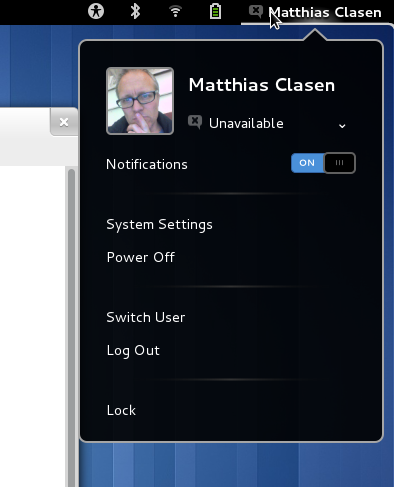
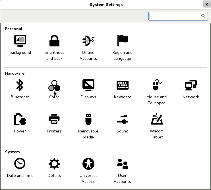
The user menu has been streamlined. We don’t show ‘Online Accounts’ separately anymore, you can just use ‘System Settings’ to get there. ‘Power Off’ is back. The ‘Switch User’ and ‘Log out’ items are only shown when they make sense.
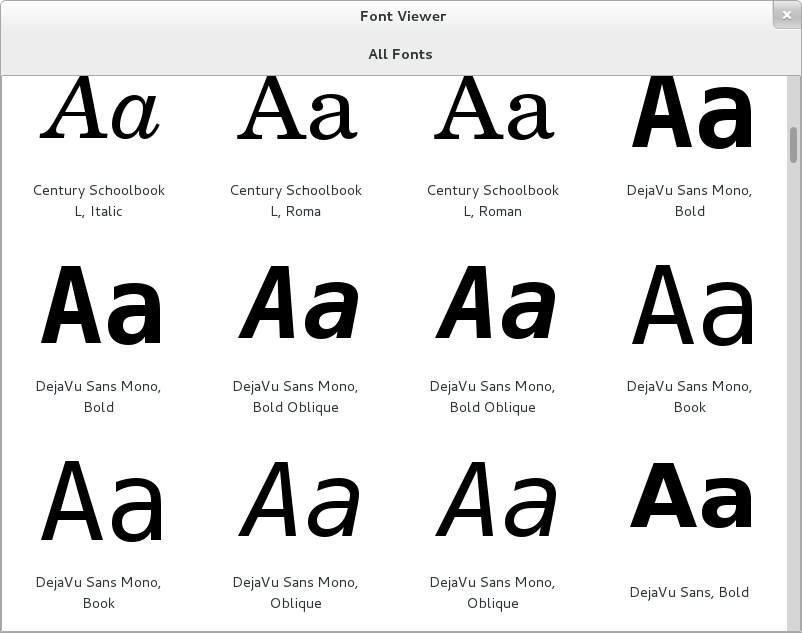 A rewritten font viewer application has appeared. It uses the same patterns that we have seen in other GNOME 3 applications: An overview with a top bar, optimized for maximized windows, a detailed screen for individual fonts, etc.
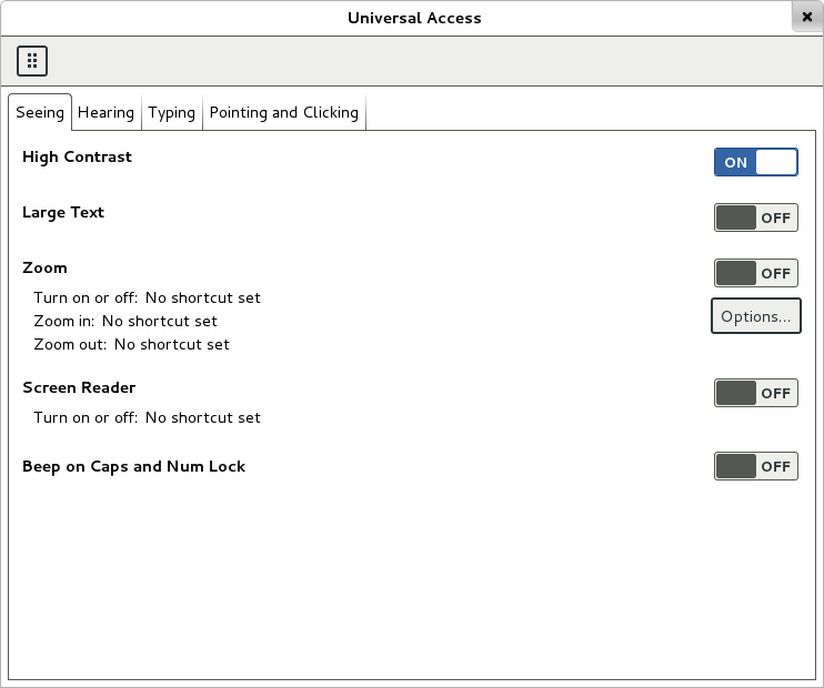
The accessible high-contrast theme has been greatly improved.
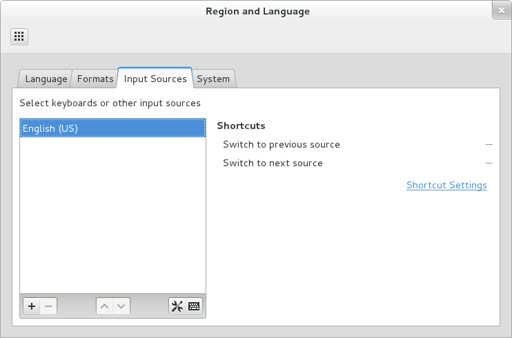
Finally, the beginning of Input Sources support has landed.
See the feature list some other things that will appear in GNOME 3.6, if things go as planned.
s/Switch Off/Switch User/ ?
yeah, that confused me too
Looks great! I won’t see these changes until 3.6 is out, but I’m looking forward to it.
I know it’s not new, but since you’re working in the user menu…the “Unavailable” and “Notifications” ON/OFF options baffle me. I understand toggling Available/Unavailable. But shouldn’t toggling my status to Unavailable turn Notifications OFF? I’m confused.
Unavailable refers to IM status, but turning off notifications means turning off notifications in gnome. If you turn off your notifications while Available (logged into IM), it sets you to busy in IM.
Crikey. I’m all on board with Gnome 3’s mission to be a simple desktop. Having two options that do related but slightly different things is too much. Squish them together.
Hmmm, really?
I wonder how one would suspend or hibernate then…
I’d also like to know that one. Suspend/hibernate aren’t visible in the menu in this screenshot – under what circumstances do they appear/disappear?
I’m hoping the answer isn’t “just close the lid if you want to suspend”, because desktop machines don’t typically have one…
Here is the design page where the user menu redesign is discussed in some detail:
http://live.gnome.org/GnomeOS/Design/Whiteboards/SystemStopRestart#Design_Updates
That doesn’t look promising…
Uh, wrong? I don’t want to “leave it to go to sleep”, since the main occasion when I want to suspend the desktop is that *I* want to go to sleep. Which means I want to silence the noisy fan *now*, i.e a via user-initiated action.
I think you can just press the power button, that will suspend.
[WORDPRESS HASHCASH] The poster sent us ‘0 which is not a hashcash value.
The design also mentions “Power Off switches to Suspend on Alt modifier”.
@mclasen: Is this actually the case? Because I’ve grown to like the Suspend menu item in the meantime :).
I agree, I want to be in control of the computer and decide for myself when it should suspend. Waiting for the computer to suspend itself means electricity is wasted. I have no problem with closing the lid to make my laptop suspend, but this solution is no good for desktops.
Using Alt as a modifier to turn ‘Power Off’ into suspend (which I can’t read in the link) is not a good idea because it isn’t easily discoverable that you have to use Alt. Pressing the power button to suspend would be strange, because power buttons are usually used to shut stuff down.
So that option to suspend has to be placed in the user menu if it’s a desktop. I don’t care about hibernate because I think it’s a useless compromise between shutting down and suspending, but that could also be included.
Regarding the other news, thanks for this blog post Matthias. Personally I hope they also manage to implement the application menu for Evince so that it will gobble less vertical screen space in 3.6.
“Suspend is typically activated by closing the lid on a laptop or with a power button on a tablet .” Except when it doesn’t activate it (http://bugzilla.gnome.org?show_bug.cgi=657201). At least it can now be fixed in gnome-tweak-tool, but that is still “hidden”.
I don’t want my laptop to suspend when I close the lid! I use my laptop in my office (daily) with an external monitor (and a keyboard and a mouse), with the lid closed the whole day. When I finish my work, I suspend the machine, disconnect all wires and take the laptop home. It’s great that there’s the suspend option in the menu – it’s the fastest option for me. I’m fine with pressing Alt but for newbies it may be hard to discover. I don’t use shutting down any more (too slow) unless I need it after system upgrade.
The reasons given on the wiki page a flawed.
– Laptop: My laptop is docked and the lid is already closed
– Desktop: Waiting can be pretty noisy and is the opposite of energy efficient. My workstation is configured to not shutdown automatically at all because it runs some time-consuming tasks like long chain-builds.
– Tablet: We have no control over the hardware or how it behaves.
Thanks for the screenshots!
As somebody with a computer that Linux’s power management can’t put to sleep successfully, I’m so happy to see the Power Off option come back!
But not only the power management problems – I never understood the logic behind hiding an option that people need to use, in a way that beginner users would never be able to find by themselves…
I never understood the logic behind hiding an option that people need to use…..
because
beginners absolutely no clue about what is sleep to RAM or hibernate to HDD
I’m very excited to see how widely adopted the application menus have become. Also, it seems some authors are allowing the menus to retain their former structure when GMenu isn’t present (everywhere but GNOME-Shell for the time being).
A lot of intelligent and thoughtful people are really getting on board with the new design philosophy and putting in the effort, which I find very encouraging.
“The ‘Switch User’ and ‘Log out’ items are only shown when they make sense.”
I guess there is no point in “Switch User” if there is only one account, but what about “Log out”? it should be always available when you are, ehm, logged in… 🙂
On a single user system using “Lock” is more og less the same as “Log out”… no need for a “Log out” as well.
@Jacob:
Untrue. I lock the screen so that passing colleagues don’t mess with ongoing processes. I log out when I’m finished using the machine and it isn’t playing music for me or whatever.
Thanks for the summary, Matthias! I wish the release team (or anyone else in the community really) did this kind of thing for each development release 🙂
the “power off is back” part. hibernation anyone? and also combined with the user accounts settings “automatic login”
Sounds good, but what does “make sense” mean in this context?
If there are other users on the system to switch to I believe.
Also on a single user system with several sessions (GNOME, KDE,…) you will have a “Log out” and a “Switch session” items.
At least that’s what I saw yesterday night in my jhbuilt GNOME 3.5.2.
[WORDPRESS HASHCASH] The poster sent us ‘0 which is not a hashcash value.
What Andreas said..
with the exception of April 1st. On that day it’ll do the exact opposite of what you want, as it makes most sense to fool you on that day.
Can I ask what the deal is with the title bar in the font viewer?
http://blogs.gnome.org/mclasen/files/2012/06/new-font-viewer.png
Does no one else find it jarring that there are effectively TWO titles for this window? Huge amount of wasted vertical space and two equally-weighted titles – it’s actually hard to look at.
Here’s my ideal GNOME menu mockup.
/———————————\
Available/Busy/Invisible/Offline
———————
System Settings
———————
Lock
Log Out
Suspend
Shutdown
\———————————/
*Notifications ON/OFF is removed from the menu. I’d put it somewhere in the System Settings.
People: “It’s stupid we have to press one otherwise unused button, in one menu, to make one option change to another option.”
GNOME response: “Let’s swap which option the ALT button reveals!”
As fror myself. I love the current version, but I’m looking forward to the next iteration. I realize that the developers and builders are some of the most dedicated people in their field! To have to sit through and sift through the “Laundry List” of complaints or suggestions must be enough to drive one mad! LoL! I cannot wait for it to become available! Here’s to the best the Gnome community has to offer!
Cheers!
We desperate with Gnome 3….just bring back the greatest Gnome 2 please! you ruin our life, seriously dude. You guys never listen the user anymore, sorry for my bad english.