It was my turn this week to do the GNOME 3.5.5 development release, and I took some screenshots while smoke testing the release. 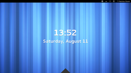
The big feature that is new in this release is the new screen lock implementation. It sports a ‘shield’, which can be lifted by hitting Escape, or by dragging it up, to reveal the unlock dialog.
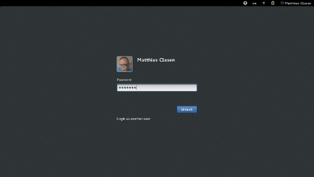 We had a BoF session on the new screen lock at GUADEC, and identified a number of issues that still have to be addressed.
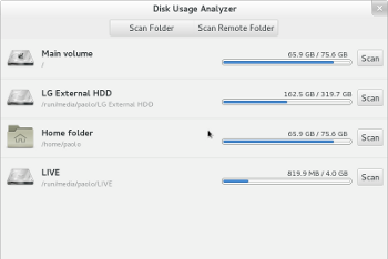
Some applications have received more love, here is a screenshot of Baobab that shows its new location list.
In the System Settings, several panels have been improved.
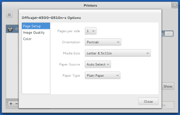
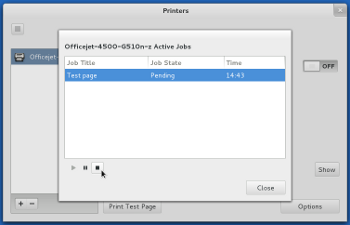
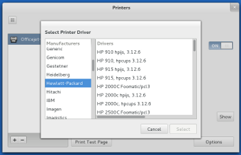 First, here are some screenshots of the printer panel, showing that it is now possible to select drivers, set default options and control queued jobs.
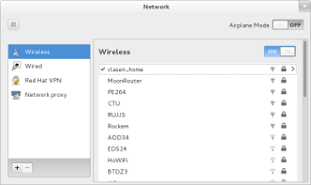
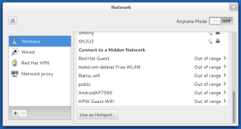
The network panel sports a new design for the wireless page.
The network combo box has been turned into a list that shows not only access points 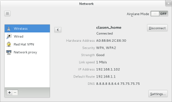 that are in range, but also saved connections.
Connection details are available for active and saved connections, and it is possible to forget saved connections.
Looks really good, especially the screen shield! I’m a bit sad that I haven’t heard anything about modeswitch removal lately, wasn’t it supposed to be worked on as a GSoC?
“Login as another user” -> “Log in as an other user”? 🙂
Bug report or it didn’t happen. 🙂
“Login as another user” is correct.
What’s your point?
Is there 3.5.5 live media?
Not yet. I’m on vacation, so not actively pushing it atm.
Setting the combo boxes on the printers option to have the same width would look perfect.
Also, I alwayse whanted to suggest this but didn’t knew where. It would be great if you implement a refresh button, at least in the network manager window. In the gnome would be excellent.
All the reste is seems excellente. Good job done here.
THANK YOU GNOME! I live in an apartment building with literally every neighbor having their own wifi. I’ve not yet found a way to make it permanently forget those connections. This is a very welcome addition!
mclasen: one question about lock screen dialog: old gnome 2.14+ had a tiny feature no os ever had at that time – there was a button in unlock dialog suitable for corporate env. and even home usage – label was “leave a message” and everyone could type msg and after user unlock the screen it had been revealed! Is this withdrawn by the latest design and what do you think about that – is it worth filling the bug?
Oh men! I miss too the “leave message” button.
> is it worth filling the bug?
Yes, it is!
Looking very nice, can’t wait to put my hands on it!
Looks awesome. How about the “leave message” feature that used to be there? There could also be an option available for the user to enable/disable this.
For the network list for wifi connections — I’d say the hotspot button should be outside of the scrolling box so it’s always visible. That was really useful to me this past weekend and wouldn’t have been visible hidden away at the bottom of the long list of networks where I was.
I’ll try to remember to file a bug if it sticks around until it hits fedora.
Looking forward to it all!
It would be better to have the unlock screen present all the time.
The “shield” is unnecessary and having to remove it is quite annoying.
Do you guys really need “leave message” on a lock screen? How is this any better than sending the missing person an instant message? At least they’ll know who its from with an instant message or an email?
I do like the new Gnome changes. Its shaping up to be a pretty sweet release. 🙂
Wait… You literally have to “drag” it up? You guys really are tossing the desktop to the lions and becoming card carrying members of the Tablet Party.
The other remarkable thing… It looks almost but not quite just like Windows 8. Good job guys.
“Using the Escape key to raise the curtain works – but only the first time. After entering a wrong password, the curtain comes down again… and Esc no longer works”
That one will be fun. I am going to run around the office hitting everyone’s escape key and enter when there away from their computer.
Love it. Are you guys making all this up as you go along?
Hi!
Thanks for your work! Looks nice and like a real improvement, more features and style for the GUI 🙂
Two proposals:
a) The trinagle at bottom, well – it doesn’t fit – it is the only thing which looks ugly on your screenshots.
It does not fit in the enviroment and break the Look&Feel. Also “dragging things up” is not a usual mouse or touch movement. Dragging “right to left” or “top to bottom” feels normal, but not “bottom to top”.
I think you would offer with this a extended “unlock” for touch devices?
So keyboard interaction alone will not be enough, because we can’t assume a physical attached keyboard. I would prefer a regular slider “from right to left”, on the base of Clutter/MX-Toolkit 🙂
b) I would appreciate also the “leave the message” feature. It was simple, awesome and a really unique Gnome-Feature 🙂
Thank you!
What’s the practical purpose of the shield?
Awesome!!!!
Love Gnome3 more everyday 🙂
The blog does not render as the author intended it on Chrome 21. See Screenshot.
My suggestion is to alter the templates and wrap each story in an article, and divide the article into sections. Trying to space out everything using “  ” is almost like styling your pages using tables and breaks.
http://i.imgur.com/sePjs.jpg
Other than this, nice article, keep on posting 🙂
AWESOME!…I’ve been using Gnome since I started with Fedora (I believe I started with FC15) and I haven’t been able to stop! I’ve had other machines with different DE’s on them….(Ubuntu’s Unity……Linux Mint’s MATE….Saline Linux’ XFCE..etc.) but to me, NONE of them can equal the wonderful, enlightening, and unique “User Experience” that is Gnome 3! I am LOVING these new features you describe….when will it be available for download and installation on Fedora 17/18?…I’m DYING without it!…LoL! Congratulations….and please….whatever you do…DON’T STOP THE GREAT WORK ON GNOME!!!…
Cheers!
Eddie G.
Pressing escape to get to the unlock dialog sounds wrong. Every other lockscreen lets you start typing your password even before the dialog is on screen.
Has the ‘up’ button been restored to Nautilus yet?
“How about the “leave message” feature that used to be there? ”
The Gnome team only removes features, not adds them.
using a 12.04 derivative ..
and using fallback gnome classic for work 24/7.
And yes it has to be stable to use it and IT IS.
Gnome 3.x tried using and kept crashing. THe desktop would’nt hold 4 hours.
Unity is stable but uneasy to use.
So they revamped everything but is it usable and reliable?
Will OS integration spring up bugs??
Gnome 2 is very nice 3 is …. WTF It is SUCKED before and still SUCKED now.