We are a bit past the midpoint of the development cycle for GNOME 3.8. That seems like a nice time to take a look at what new things are coming – most new features are visible at least in rudimentary form at this point.
First of all, Settings !
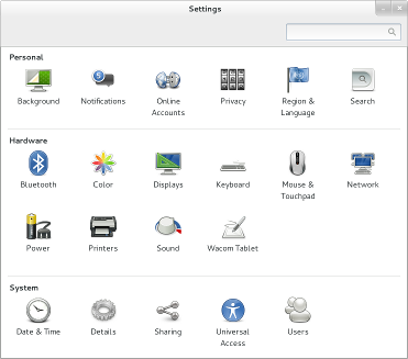 The control-center and settings-daemon have seen a flurry of activity which has resulted in several new and refreshed panels. In other words, plenty of screenshot material — I’ll get to that soon.
First I want to mention a few things that are not easily shown in pictures, but are still going to have a significant positive effect:
- Tests. Martin Pitt has done great work in mocking up services and creating tests for the functionality of many modules, from udisks and upower to glib and gnome-settings-daemon. Bastien has also added many tests, and fixed the bugs that were uncovered by them. Here is an example.
- Speed. The control-center panels are no longer loadable modules, but built into the control-center. And all of the .ui and other data files are loaded as resources. Opening the control-center should be faster, as a result.
- Standards. Bastien added a tiny plugin to gnome-settings-daemon which implements the org.freedesktop.ScreenSaver D-Bus API. This should make it even easier for media players and other 3rd party applications to keep the screen from dimming at inopportune times.
On to screenshots.
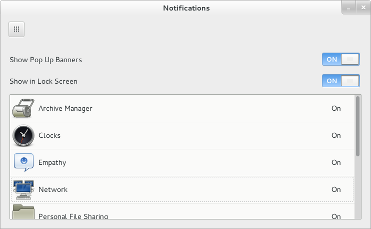
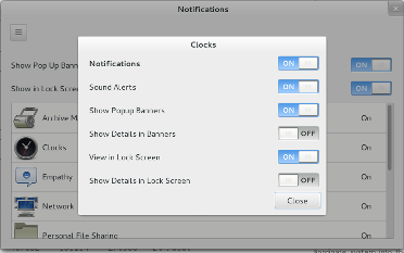 Allowing you to focus on your task and minimizing interruptions has been an important aspect of the GNOME 3 design from the start. So far, we just had a global switch to turn off notifications. The new Notification panel expands on this and allows fine-grained control over what applications get to annoy you, and how much.
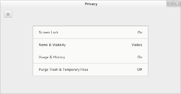
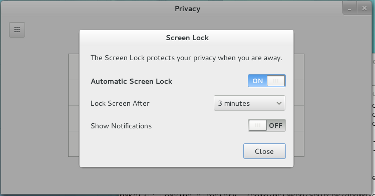 The new Privacy panel collects various settings to control who may get to see your personal data, etc. Some of these settings, e.g. the Screen Lock settings were previously available elsewhere, but have been moved here because they are related to privacy.
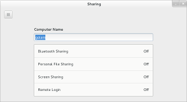
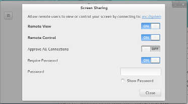 Similar to the Privacy panel, the Sharing panel collects settings that used to be available in other places, in this case the individual preference dialogs for gnome-bluetooth, gnome-user-share, vino, rygel, etc. It also lets you turn sshd on or off.
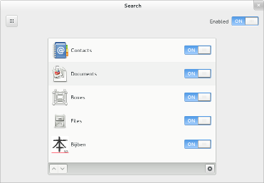 The new Search panel controls which applications get to show search results in the GNOME shell overview and the order in which they appear. there. Cosimo recently explained the various search improvements in GNOME 3.8 in great detail.
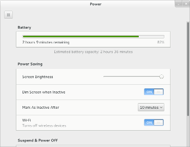 As mentioned above, the screen lock settings were subsumed by the Privacy panel. This left the Screen panel with very few settings, which all turned out to be related to power saving. Thus, they have been moved to the power panel, and the Screen panel has been dropped — which is a good thing, since three panels with monitors in their icon were a little too much.
There are more new things to discover in the control-center. I haven’t mentioned improvements to the user panel, or the color panel, or the rewritten network panel that will be merged soon. But enough about settings for now.
Next, some GNOME shell improvements:
The shell is being ported XInput2. Together with new pointer barrier features in the next X server release (1.14, expected in March) this will let us improve the somewhat annoying dwell-on-the-bottom-edge way to bring up the message tray. It also paves the way to improved side-by-side tiling and gesture support later on.
Keyboard shortcuts will work more consistently. E.g., it will be possible to take a screenshot while in the overview.
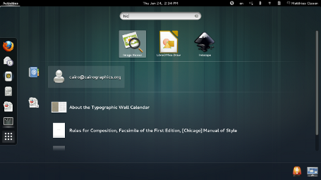 The shell overview is displaying search results in a new layout, using the order of search providers as configured in the search panel. I again point to Cosimo’s post for the fine points of this new design.
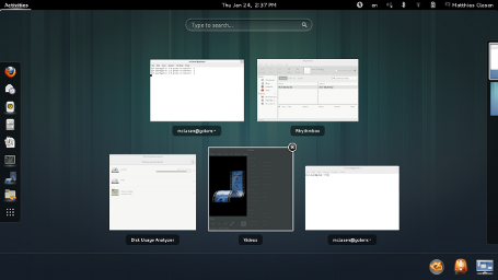 The algorithm for arranging the window thumbnails in the overview has been fine-tuned to create more pleasant layouts, and the currently hovered window is more clearly identifiable by a strong highlight.
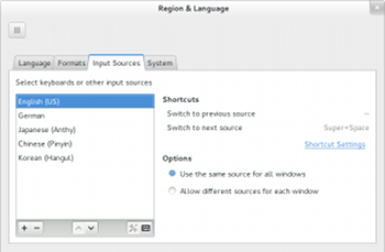
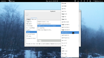
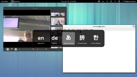 Switching input sources is easier, thanks to a new OSD. This feature was already present in IBus; it has now been integrated in GNOME shell.
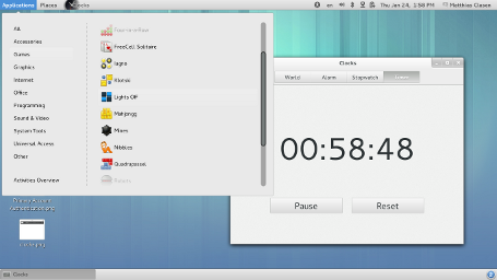
A new addition to GNOME 3.8 is the classic mode that is going to replace fallback mode as an alternative for users who want to keep using elements of GNOME 2, such as the minimize button, or the window list.
The reasons for replacing fallback mode have been explained here. In short, it needs to be replaced, because
- it consists of barely maintained modules (gnome-panel, metacity, applets, notification-daemon,…)
- it does not offer the quality and user experience that we want to deliver
- keeping it (somewhat) functional keeps us from making improvements in other parts of the stack
Classic mode on the other hand, is using GNOME shell with a few extensions and few settings tweaks. New GNOME features, like the IBus integration, will ‘just work’ because classic mode is literally using the same code. We are reusing the infrastructure for defining ‘modes’ that was already present in the shell. It is used for the login screen in GNOME 3.6, for instance. The extensions and glue code that make up classic mode are being developed in the gnome-shell-extensions module.
The screenshots below give an impression of the current, preliminary, state of classic mode. We are still working on various aspects of it, and what ships with GNOME 3.8 may look different from what you see here.
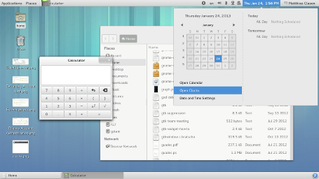 To clearly differentiate classic mode from GNOME 3, we are using ‘GNOME 2 gray’. There is a window list at bottom, and the clock has been moved to where it was in GNOME 2.
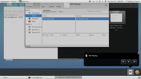 The message tray coexists with the window list.
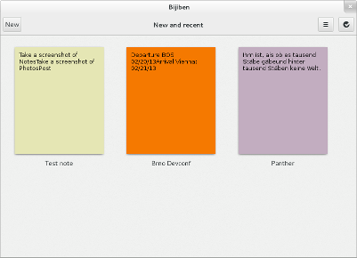
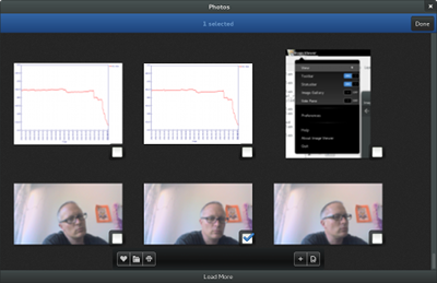
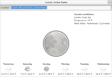
Finally, there will be a few new applications in GNOME 3.8. These apps are following the design patterns that have been developed over the last few releases in Documents, Boxes, etc.
