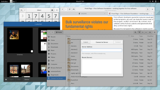
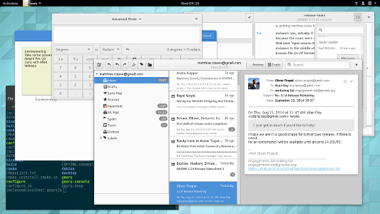
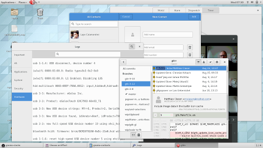
As part of the release preparation, I’ve done some smoketesting of GNOME 3.14 – looking good! As I usually do, I’ve taken some screenshots while testing things, to share some impressions. 

 Now back to final release preparations.
12 thoughts on “GNOME 3.14 impressions”
Comments are closed.
Nice to include some Geary’s screen ! that’s fair 😉
Why do some applications have black UI while others have white one?
we use the dark theme variant for ‘content applications’ (which is admittedly a somewhat vague term)
Nice, though in the last screenshot I find it quite disturbing to have 3 different title bar styles on the same screen.
When gnome 3.14 will be released? i cannot wait
today
That’s so cool! i just saw the phorenix news. Gnome is amazing! best accessibility options. you guys are awesome
Thanks for all the effort put into this by the GNOME team!
it’s great so far, arch packed 3.14 quite well.
Thank you for the hard work 🙂
Simple question: what’s the email client I see on the second screenshot?
I usually use Evolution but in 2014 I still find strange behaviors like the pop-up window that checks new emails may never close… No time-outs?! Something so important still buggy? So, I may try something else…
thats geary
Hello Mr. Clasen! First of all thanks a lot for all the effort you and the entire gnome-team put into this beautiful piece of software.
Though I appreciate the integration of touch support I’d like to know whether you guys are thinking about implementing the same gestures for touchpads? Would absolutely love to see that. Keep on with your great work! Cheers!