An increasing number of GNOME applications take advantage of new possibilities with GTK+ header bars and client-side decorations.
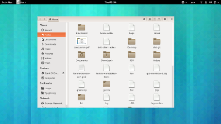
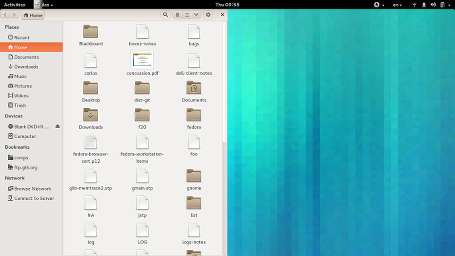
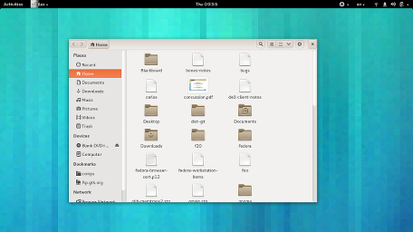
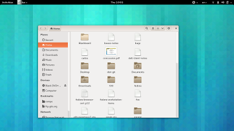
Today I was asked if it is intentional that applications like nautilus cannot be moved or resized by border drag anymore when using themes such as Ambiance. Of course not! But client-side decorations move the responsibility for theming the titlebar and window borders from the window manager theme (which basically ceases to exist) to the toolkit theme. So, some adjustments are needed to make GTK+ themes take advantage of this.To figure out how this works in practice, I took a look at the Radiance theme. Here is how current nautilus looks with it: Very pointy, and neither shadows nor invisible borders – resizing the window is only possible via the window menu.
As a first step towards improving the situation, I added the following snipplet to the Radiance css:
.window-frame {
    border-color: darker(@bg_color);
    border-radius: 7px 7px 0 0;
    border-width: 1px;
    border-style: solid;
    box-shadow: 0 2px 8px 3px alpha(black, 0.5);
    margin: 10px;
}
.window-frame:backdrop {
     box-shadow: 0 2px 5px 1px alpha(black, 0.5);
}
.window-frame.tiled {
    border-radius: 0;
    background-color: @bg_color;
}
A few explanations are in order here: window-frame is the style class that GTK+ uses when deciding how to render the frame part of a client-side decorated window. The box-shadow gives our window a visible shadow, and the margin determines the ‘invisible border’ around the window where it can be dragged. We set a less promient style for unfocused windows (in GTK+ parlance, that is called backdrop). Finally, we set a style without invisible borders and shadow for half-tiled windows. You may wonder why we don’t do the same for maximized windows: GTK+ enforces no borders for maximized windows, so the theme doesn’t have to do anything.
 As a small refinement, I’ve added a some more css to make the title bar a little rounder:
.titlebar {
    border-radius: 7px 7px 0px 0px;
}

.tiled .titlebar {
    border-radius: 0;
}

.maximized .titlebar {
    border-radius: 0;
}
There is of course a lot more refinement that can be done here, like adjusting the padding around the titlebar buttons, and fixing the broken Home button. If you are interested in this, you should check out the relevant CSD section of the Adwaita theme.


Is there a way to move the close button to the left (“close:”) with apps that use csd?
NOOOO. Client Side Decorations are a huge can of worms and they make every application behave sligtly different than the other, why, whyy?
http://blog.martin-graesslin.com/blog/2010/05/why-you-should-not-use-client-side-window-decorations/
I don’t like client-side decorations, these updated applications in GNOME feel weird and confusing and awkward and unpredictable.
They all feel different.
I think it decreases the usability.
How will client-side decorations on GNOME apps work in Xfce and other desktop environments?
Actually, client-side decorations are the reason I quit using Gnome. They broke user themes (again) and stole customization options (again) with those huge fat title bars.
+1 for devvar comment…Is there a way to move the close button to the left (“close:”) with apps that use csd?
You can move the button to the left by setting the decoration-button-layout style property of the window. In css, that looks like this:
-GtkWindow-decoration-button-layout: “close:”;
Gnome should really provide more documentation for theming, as it’s very hard to keep themes up to date between gtk versions. I think it’s a needed responsibility as an upstream DE project.