In the third part of my recap of the GNOME 3.12 development cycle, I’ll talk about some of the changes in GTK+ that I have been involved in.
Popovers have already been discussed quite a bit. Most of the popover implementation has been done by Carlos Garnacho, generalizing his earlier work on touch selection popups that has been in GTK+ since 3.8.
One of the nice things about popovers is that they are just normal containers – you can put any widget into them, and keyboard navigation and input works like everywhere else. This is a marked contrast to menus, which are very specialized. Attempts to put entries, sliders or buttons into menus usually end badly.
I recently acquired a laptop with a touchscreen, so I can say with confidence that popovers are also much easier to use with touch than menus.
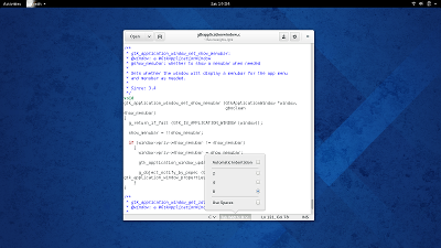
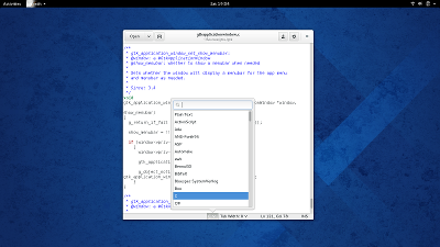
Here are some examples of popovers in gedit:
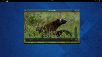
My own contribution to popovers has been to convert GtkVolumeButton to use a popover:
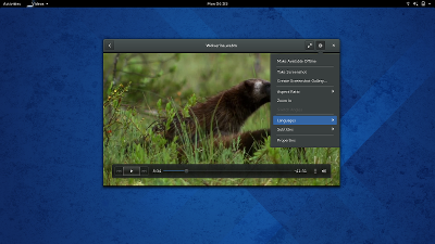
I also made it possible to populate popovers from a GMenuModel, giving you instant popover menus:
Popovers are still very new, so their adoption in GNOME 3.12 will be somewhat limited. But we are in the lucky position that we already have quite good design guidance for popovers, so this will probably change soon.


I love these. Just the whole direction GNOME has been heading in the past few releases. I don’t have the right vocabulary for this but I’ll give it a shot: GNOME has just enough whitespace to feel calm, and just enough layering to be exactly as useful as you need it to be. If that makes any sense. 🙂
Is that popover in the gear menu of videos going in for 3.12? Will Files & others follow this trend?
Nice work,
This has me excited! I used to really dislike GNOME 3 / Shell, but after installing it over the weekend, on my laptop, I have started to thoroughly enjoy it. Working in it all day yesterday was one of the most productive in a long time.
Keep up the fantastic work, guys!
some popovers are round, some are not. Why? I think this looks inconsistent
I love it. Gnome and Gtk 3.12 are shaping up to be great releases!
Very NICE !!!
So are “popovers” basically popup menus? How are they different from just normal menus?
Whatever it is, I love where Gnome is going!
The way I understand it is that a menu can only really a list of text-entries whereas the pop-overs are just containers that can hold any kind of widget – even a menu.