Dialogs are getting a face-lift in GTK+ 3.12.
Most of the work on this was done by Jon McCann, I’ve only helped out here and there. The main visible change is the switch to client-side decorations and headerbars.
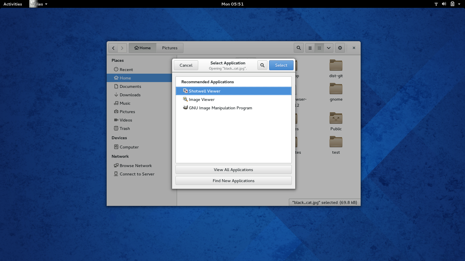
Here are some examples of GTK+’s built-in complex dialogs with their new look:
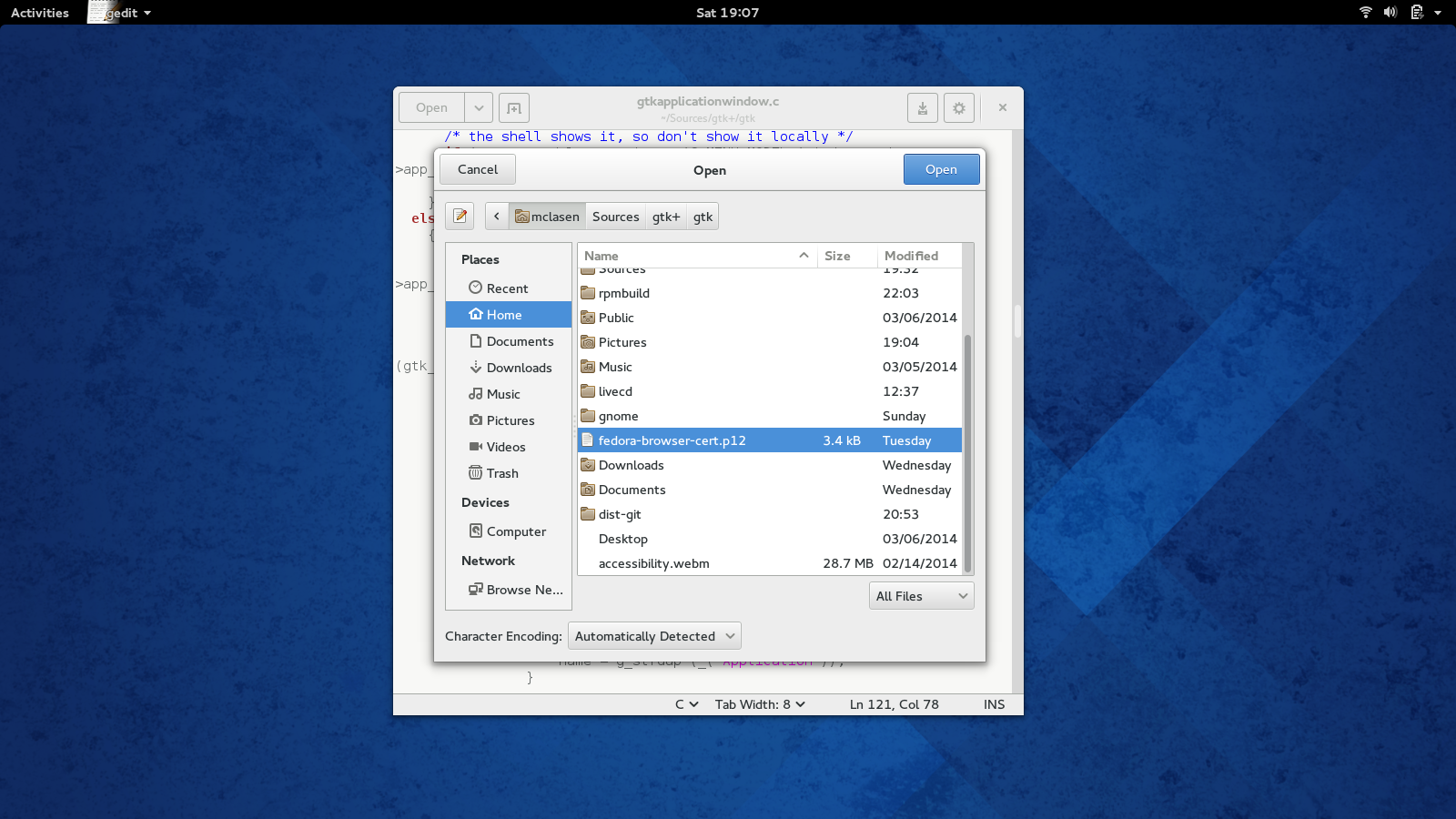

The application chooser has had a bit more work done – we have a search button in the header bar, which makes a search bar appear when clicked.
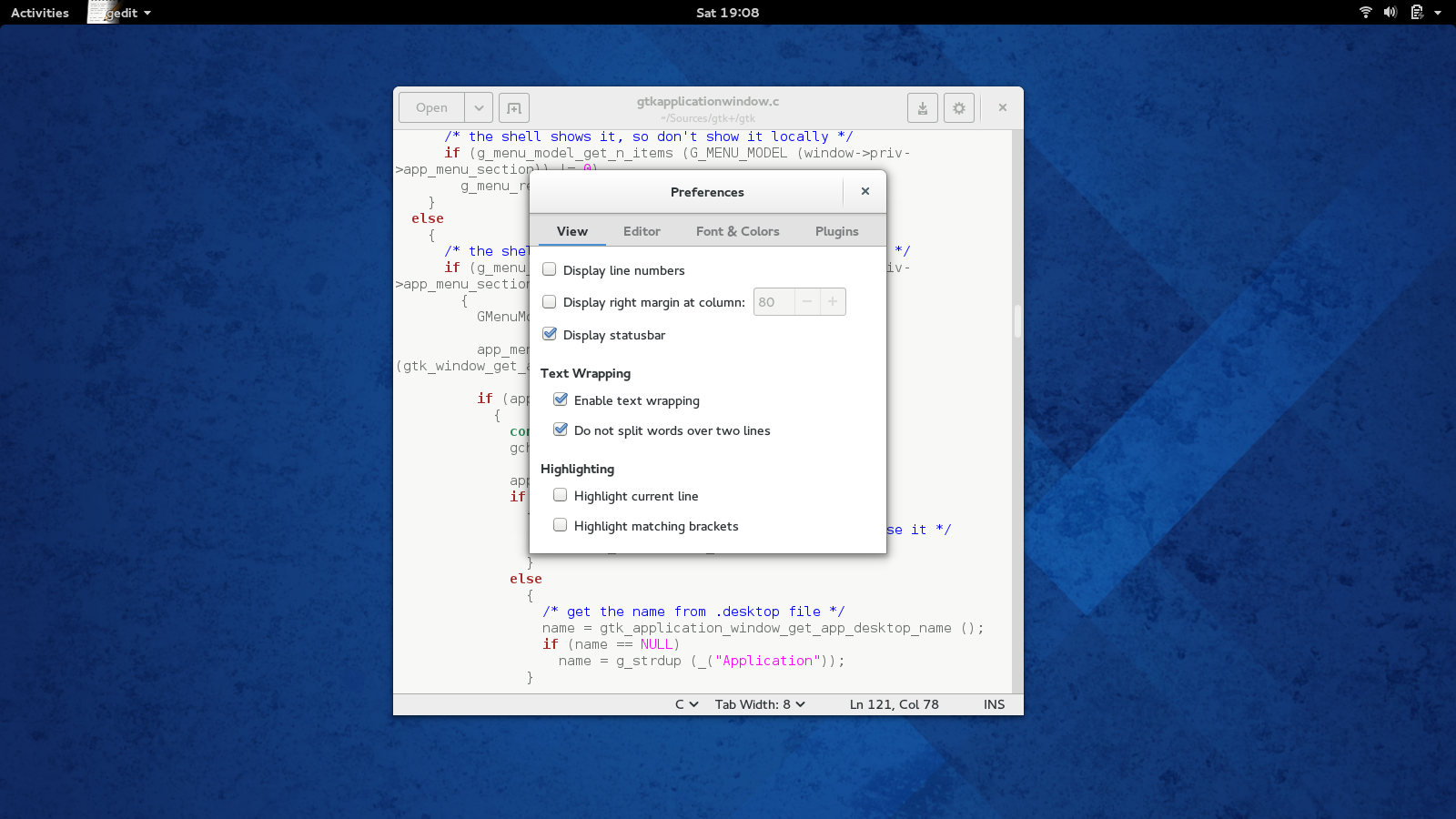
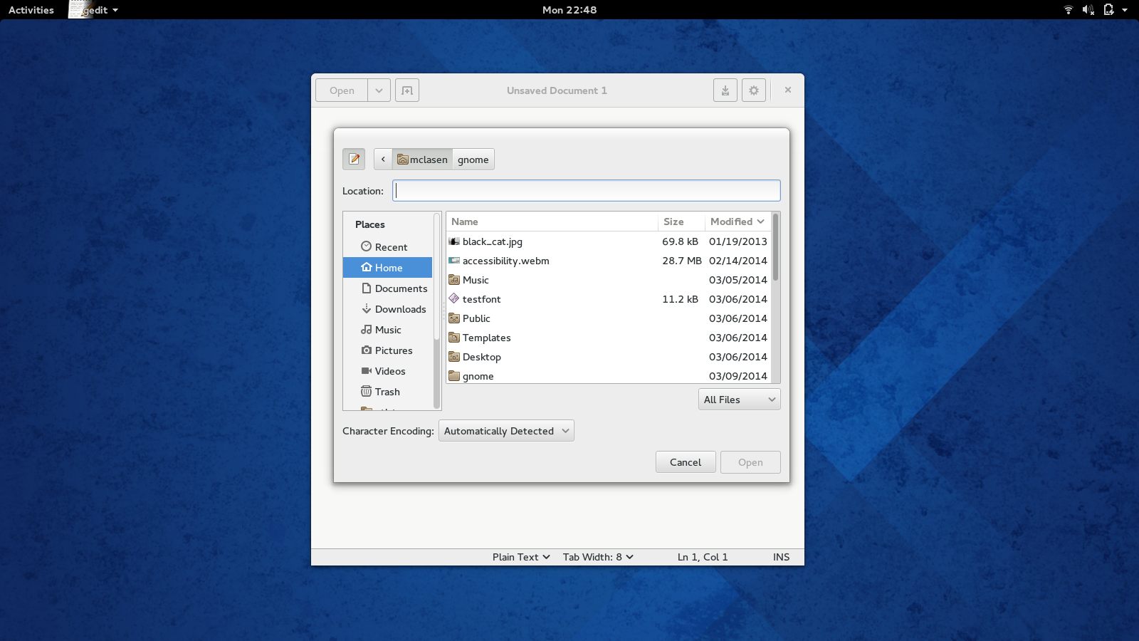
The most common dialogs in applications are preference dialogs. gedit shows how these can look with client-side decorations.
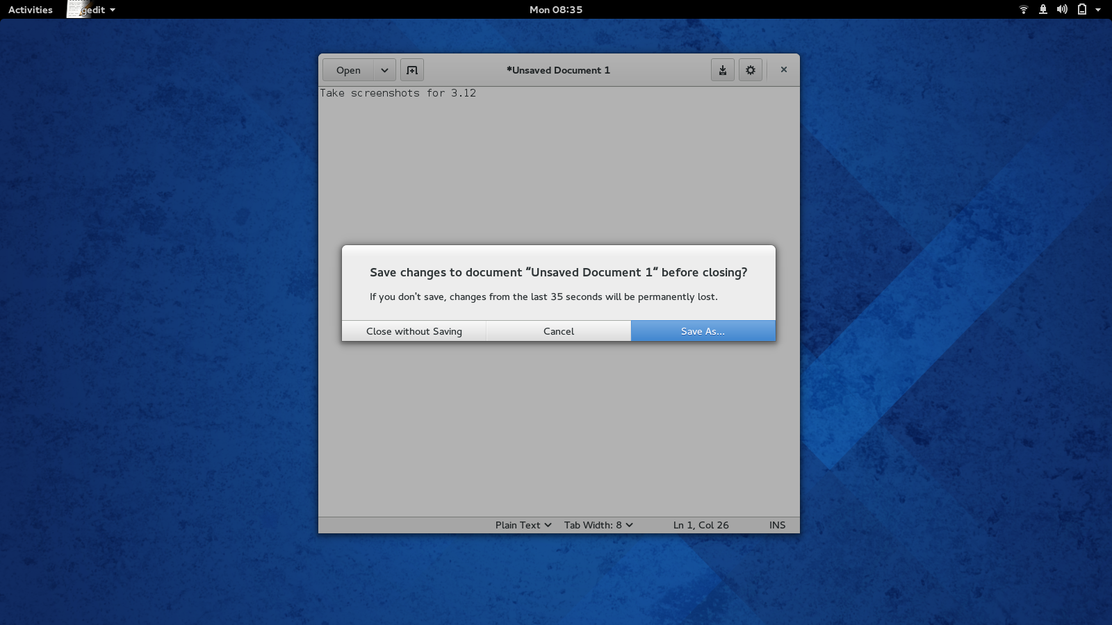
And then there are simple prompts. GTK+ has the GtkMessageDialog class for these. Their new look is maybe the boldest part of this refresh.
Of course, GTK+ is used in many places, and client-side decorations may look foreign in some of them. Together with these changes, we introduced a dialogs-use-header setting. Built-in dialogs will fall back to a more traditional appearance if it is not set:
Note that some of the details in my screenshots, such as the blue color for suggested actions, depend on the theme. What you see here is how dialogs will appear with the Adwaita theme in GNOME 3.12.
The GNOME HIG contains a lot of helpful advice on how to make best use of dialogs in your application.
GtkMessageDialog looks weird, but everything else is pretty nice.
Yeah, the GtkMessageDialog looks *very* weird. Those funny “sort of buttons” at the bottom just look wrong… they don’t actually look much like buttons, and they’re completely inconsistent with everything else in the toolkit. I don’t think that’s a good change to make…
doesn’t look that weird to me, but I’m used to both Android and iOS.
Well, it’s two things. One, they don’t look anything like the buttons used anywhere else in GTK+, or in any other desktop toolkit. And two, they’re quite inconsistent with all the other dialogs depicted here, where the buttons look like buttons, and are placed in the title bar, not in some flat blocky bit tacked on to the bottom of the window…
I have to agree. I think what makes it look weird is that you expect a dialog to have regular buttons like all other apps and buttons should always have some padding and not touch the edges. Maybe a flat theme like Numix would make the dialog look better, since they would look less button-like.
Very nice, except the message dialog in gedit. The vertical space seems somewhat unbalanced there (yes, I know that it is just an illusion). Also, may I suggest a wording change: “Don’t close” instead of “Cancel”?
nice!
Thanks for these awesome blog entries mclasen! I’m totally hyped for the 3.12 release now. ^^
I agree with Tom, everything looks pretty except for the GtkMessageDialog.
I like the new GtkMessageDialog. It’s a step in the right direction; it will look well together with
https://raw.githubusercontent.com/gnome-design-team/gnome-mockups/master/content%20selection/v2/multi-select-files.png
and
https://raw.githubusercontent.com/gnome-design-team/gnome-mockups/master/file%20chooser/file-picker-312.png
Thanks on clarifying the state of non-Gnome dialogs. Removes lots of frustrations i was experiencing recently when watching where Gnome is heading.
Everything (include GtkMessageDialog ) is nice. But FileChooser should be redesigned a bit. CharacterEncoding and FileType ComboBox need be aligned.
It’s a bit weird with buttons at the top of dialogs that you need to read and track the mouse in a V pattern. At a glance, this seems less efficient than the traditional Z pattern with buttons in the bottom-right (assuming L-R languages).
Has any usability testing been done with the new dialog design to see it is still as effective as the old layout?
I’m not sure how having action buttons on top is consistent with a well-known UX rule that users read from top to bottom.
It seems quite comforting to me to choose some file and then let my attention continue follow down until it finds buttons and click one of them.
New position seems like counter intuitive, breaking a lot of habits formed by years. I wonder are others really comfortable with this? Has UX testing been done on this?
I agree with this: the new GtkMessageDialog looks like a great refresh of the actions-on-bottom look, but the actions-on-top approach with the new header bars seems quite suboptimal for usability and familiarity.
+1
I have also asked for some kind of rationale for this design decision but have not seen any. It seems strange that such a radical design that has no prior art in other GUIs (what I know), is not supported by any explanation of why it is better than the current approach of having the buttons at the bottom. Many of the other GNOME designs mentions “prior art” and tries to justify the chosen design but I can not find anything related to this. I’m not opposed to changes, but they should be done for a reason, not “just because”. I would be grateful if we could get any response to this. Thanks.
Why some dialog has buttons on top and some other buttons on bottom (even spaceless and borderless)? I think it’s confusing…
IMO top buttons are uncomfortable, both on a pointer-base and on a touch-based interface: the pointer is often on the bottom of the screen and on a touch-based interface you’ll cover the dialog with your hand while touching buttons.
Great job guys!
I’d like to point out just one thing that looks quite odd to me in GtkFileChooser: The GtkComboBox that says “All files” on the screenshot should be at the same line as the character encoding combobox. IMHO that would look a lot cleaner, especially with the non-CSD dialog, and leave more screen estate for the actual file chooser.
quick and dirty mockup to demonstrate: https://www.dropbox.com/s/cwfof7dedpq6ahv/gedit-filechooser.jpg
I must also admit I don’t really like the look of new GtkMessageDialog. I think I kinda get what you’ve tried to achieve with it, but it really don’t work as it is imho
Also, while I’m at it, maybe the “View all applications” and “Find new application” buttons in the application chooser could be at the same line, next to each other. You’d probably have to change the wording to something shorter, but again imho, that would look cleaner and save some effective screen estate.
Apart from that, everything looks nice and clean 🙂
keep up the good work!
Agreed, for me it’s not perfect vertical aligned in message dialog of gedit :
Tested with a zoom on the screenshot & use screenruler :
That’s still a horrible open dialog as ever. You people really need to take a look at Windows 7 open dialog and take some design inspiration out of it, mainly the locationbar breadcrumb and places sidebar.
Is there any way in the API to restore buttons on the bottom?
Agree with many others here. I really don’t think it’s a good idea to put buttons on the top of the header bar. Inconsistency, first. Then, button in the bottom of the dialog is a natural way from top to bottom to make the decision whatever accept or cancel. Finally, it breaks the UE on almost all desktop environment including Mac OS X and Windows.
Please consider a possibility to rename files and folders directly from within the File Chooser Dialog.
On Windows you can rename, delete files and create folders in the file dialog. This is handy if you want to save in a new folder, or rename a previously saved file on the fly. In the GTK file browser, you can only create new folders, but you cannot rename it if you mistyped the name.
If you right click on an item in the file list, you get a menu with three options: ‘add to bookmarks’, ‘show hidden files’ option and an option to turn the size column on/off. The add to bookmarks option is particularly bad, because if you want to add a folder to you bookmarks you have to go one level up and right-click on the folder, instead of an ‘add current folder to bookmarks’ button on the dialog.
Improvements are looking awesome!
Except for the GtkMessageDialog. The buttons are rectangular and have no padding between the dialog border nor the other buttons. To me that looks uncomfortable and inconsistent with the rest of GNOME design.
GtkFileChooser also needs a long awaited overhaul. The existing mockups look great.
Thank you for all the hard work!
It finally looks modern. I hope GTK components will keep getting better in next gnome release and that it’s not just a temporary effort. Every detail matter 😉
Good work everyone !
Hmmmm…. I don’t get it, why the default action is on the top-right now. That used to be the place for “Close” (i.e. Cancel) since mid of last century. Amiga had it there !
Best example is the first picture:
– Background (gedit): Open on top-left, Close (Cancel) on top-right.
– Foreground (Dialog): Open on top-right, Cancel (Close) on top-left.
And what happened to the neat “Dialogs enflate out of parent window’s title-bar” that was just recently introduced ? Why is it changing completely again ?
I’m not trying to be annoying or judgemental (I do appreciate all the efforts put into this), but I do not understand the rational for these (preceved) inconsistencies and the (preceved) change in UI-story after just 1 year.
I don’t get it. Why should we have an open & close buttons on top of the window? In my world, we read from left to right side of the paper and from top to bottom.
The workflow when opening a file is: select folder, find file, open. So how it is better to start reading labels from the middle of the the screen (select folder and file) and than jump right to the begining to skip cancel and than click on open? It would be more natural to continue on next line.
I think the internet will get slow depend on suppose when we use in desktop means , depend on the web page size, it takes time to load . when you use the mobile like iphone, android or anything it should be load depend on their application which are in the phones. So, the Development of the application is does not matter in pacewisdom . They are making high resolution websites and also latest applications developed in the company. We have many companies are doing the applications and websites, i ever have seen like this company which is doing quickly more works in the perfect period.