Hildon UI Development News

As you probably (don’t) know, we, from the Hildon UI Framework team, have been working hard in the new code for the next releases of Maemo (The “don’t” is because even though the development happens in a public repository, sometimes we’re not very good in communicating about what we’re doing). Now, the heavy development work of maemo-af-desktop is taking place in a separate branch called hildon-desktop (the new name of maemo-af-desktop).

Our main goals for the next releases is flexibility, scalability, maintainability and developer-friendliness. The code of “maemo-af-desktop” received a lot of improvements for the N800 and Bora release (As you with a N800 in hands have probably noticed!) but still it has some serious problems. The layout of the UI is hardcoded (is was done for a specific display with specific resolution) and the plugin infrastructure is fragmented and (kind of) duplicated for each UI component (Home, Statusbar and Tasknavigator). Also, the plugin API is not very developer-friendly because it doesn’t take full advantage of the GNOME Platform knowlegde that developers interested in Maemo already have (this is my personal opinion). So, what are we doing to target those issues? Let’s see!

Separating the generic parts from the specific ones

We detached the “generic” parts of the UI into a library called libhildondesktop. This lib has things like different kinds of panels, a generic widget for Home, and interfaces for different kinds of desktop items that will reside in the panels and Home. The window management code has been put into a library called libhildonwm which is intented for very specific cases where the developer need some control over the windows behavior. For example, libhildonwm is used by application switcher to show the list of active windows in the Task Navigator panel.

So, what does this mean? This means that out future UI will be just a specific application of libhildondesktop and libhildonwm for a specific device. In hildon-desktop branch, we’re about to finish the UI (based on libhildondesktop and libhildowm, of course) that reproduces exactly what you have in N800. Also, it’s good to remark that this aproach makes it easier/faster to prototype different UIs and increase the hacking possibilities for the UI! Yay!

New plugin system

We now have a common plugin system for all UI components. The new plugin system is based on plugin loaders. Each type of plugin loader is reponsible for loading desktop items from different “sources”. For example, we have a plugin loader that loads (Task Navigator, Statubar and Home) plugins written with the current plugin API (To keep backwards compatibility). However, we’ll have a new GTypeModule-based API for developing desktop plugins so obviously we have a plugin loader for this kind of plugin too. This aproach give us flexibility enough to even have plugins written in different programming languages. We already have a Python plugin loader and the bindings for libhildondesktop (libhildonwm bindings yet to come).
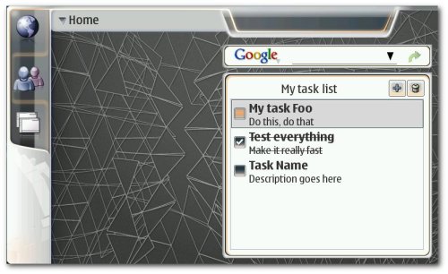

Task List plugin written in Python running in hildon-desktop

Plugin loaders can be dynamically loaded without needing to rebuild hildon-desktop. We did this way because in the case of plugin loaders for plugins written in programming languages other than C, we cannot ensure that the runtime requirements will be available in the device by default. For example, the Python loader resides in a different module together with the libhildondesktop bindings so that in the future, if you want to add support for Python desktop plugins, you just need to install the bindings, the Python loader and Python debian packages. That’s it!

The hildon-desktop Python support code is available, of course. We’ve written some really dummy example plugins with the new API and Python API just to give a taste of what is coming.

Contribute!

Any suggestions, comments, ideas, construtive critics and (specially!) patches are welcome. Get the code from Maemo repository and play, brake, adapt, change, etc. If you want to use the latest pre-built packages, you can always use Sardine.

Important note!

This is unstable-under-heavy-development code. You should not rely on this code for anything. At this moment, hildon-desktop should only be used by courageous developers who want to contribute/use the very latest UI framework stuff.
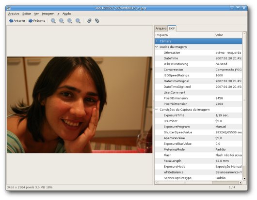
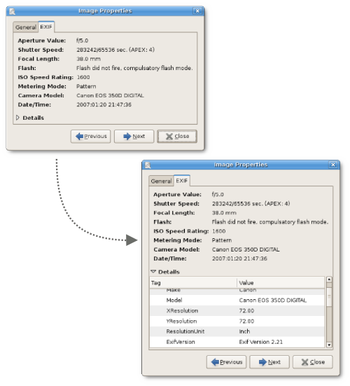
Image Properties in EOG

I’ve been working on replacing the image info sidepane in EOG with an image properties dialog. IMHO, this is a less invasive and more consistent aproach. The sidepane takes too much space of the image view mostly when you want to visualize the image EXIF data. Also, just dumping all EXIF data is not very user-friendly. Therefore, another goal here is to make it more user-friendly.


Current image info sidepane: invasive and unfriendly.

So, in eog-ng there’s an EXIF tab in image properties dialog which at first sight only shows a summary of the most common things you want to see in EXIF (aperture, shutter speed, flash, ISO, date, etc). But I still want to give the possibility to view the whole EXIF data for advanced users. So, just click on the “Details” expander and you can view all EXIF tags. With the navigation buttons in the dialog, you can easily check EXIF data from each image.


EXIF tab in image properties dialog: balance between user-friendlyness and power usage.

I still want some feedback about it and some help on which EXIF should appear in the summary and in what order. Discussion about image properties should take place in bug #313676.

EOG bits

EOG development is going a litle bit slower than I wanted but it’s going very well actually. As I said before, The heavy development is taking place in eog-ng branch which we plan to merge in the beginning of 2.20 development cycle (aka 2.19.x). See eog-ng wiki page for more information. I’ll try to list the nicest recent news.

Tangofied themable EOG icon

Thanks to Ulisse we now have a new official tango compliant icon.


New beautiful EOG icon.

As a wonderful surprise, Carol, my wife, managed to get a brand new t-shirt with the new EOG logo as christmas gift. Isn’t she lovely? :-)


T-shirt with EOG icon. Awesome hun!?

Printing

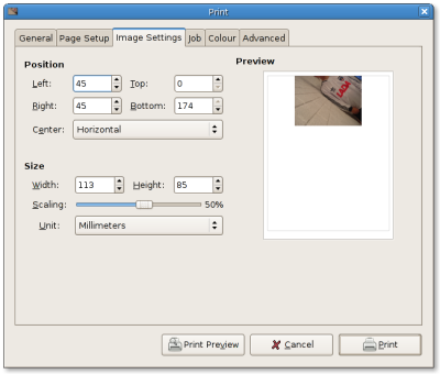
Thanks to Claudio EOG now have a simple, user friendly and powerful way for printing image. You can define exacly how you want to print the image in the paper and you do this in WYSIWYG way. Side note is that it’s been commited trunk and eog-ng branch. So it will be available already in GNOME 2.18.


New EOG printing UI. Easy and powerful!

EOG website

Thanks to Trond Danielsen we now have an EOG website online. The website uses the project template for consistency. Click here to check it out!


EOG website. Cool!

New collection pane

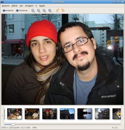
I’m experiment some new things in the collection pane. Basically, I’m trying to use a one-row-with-horizontal-scrolling aproach. Thumbnails now have a context menu with common used actions. Also, Inspired by the Fickr Organizr I added some buttons to smothly scroll through the image collection. Of course it still needs some polishing and I’d like to get some feedback about it. Comments?


Collection pane experiment.

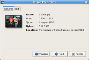
Image properties

I chose to replace the image information side pane with a image properties dialog. It’s less invasive than the side pane and has navigation capabilities which means you can easily check images info and metadata without having to close-and-open dialog for each image. This is a work in progress. Ideas/comments/suggestions should be posted in bug #313676.


Image properties dialog.

EXIF automatic orientation

As some of you probably noticed, since 2.17.3 (patch still to be ported to eog-ng branch) EOG has support for automatic orientation of images based on EXIF info. One issue stil needs to solved but the general funcionality is already working.

New code base

The code base in eog-ng branch brings a lot of stability to EOG and the code is much more maintanable. Also, in theory (I still need to do some profiling to confirm) the eog-ng code should use less memory and should be faster than trunk. Some useful command-line options were added to start EOG in fullscreen mode (-f), slideshow mode (-s) and with collection pane disabled (-c).

Contribute!

Grab the eog-ng code now and participate! Go go go!

   svn co http://svn.gnome.org/svn/eog/branches/eog-ng/

Selection bits

I’d love to see this mockup (by tigert) implemented in GtkIconView. It would be a great improvement for Nautilus, EOG and all other GtkIconView users. See bug #382544. Actually, the current selection visual feedback (selection border on label and “darkened” icon) of GtkIconView is not good at all. So, it would be more than an improvement. It would definitely be a bug fix.

New toy

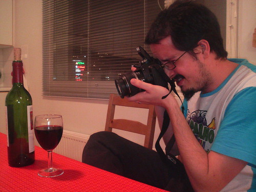
After, reading a lot about digital cameras, I’ve got a new camera today: a Canon EOS 350D. Of course this nice camera doesn’t make me a good photographer at all (I really suck as a “photographer”) but I’ll give my best to improve that with this new awesome toy. :-) Big thanks to Ross, Hub, Tiago and Tassia for the suggestions and tips. Thanks to tigert for telling me about that nice camera store in Helsinki.


Canon EOS 350D: nice!

Some brazilian bits in GNOME

I remember a couple years ago the brazilian presence within the GNOME community was quite small. On the code development front, there were only Guilherme and me. The brazilian l10n team was lacking new contributors and the heavy translation work used to be concentrated among just a few people.

Today, ~2 years later, we have many more brazilians hacking on GNOME. Here are the new heroes:

  • Carlos Eduardo Rodrigues Diogenes: co-maintaining gnome-mag;
  • Bruno Boaventura: bugsquad member, hacking on metacity and helping EOG;
  • John Wendell: hacking on vino;

On the l10n front, our team has some good news too. The brazilian l10n Ubuntu team is joining efforts with us. Now they will contribute translations directly to upstream (GNOME) and then import their work with Rosetta in Ubuntu. Because of this, the GNOME brazilian l10n team received new contributors. I’m sure this will have a direct (positive) impact on the quality of the brazilian portuguese translation of GNOME 2.18. Special thanks to:

  • Og Maciel, for the great effort to integrate the Ubuntu and GNOME teams;
  • Leonardo Fontenelle, for the great effort to make the brazilian portuguese translation rock.

I’m sure I’ll be bringing more good brazilian news for GNOME from now on! Go Go Go Brazil! :-)

Attribution-NonCommercial 3.0
This work is licensed under a Attribution-NonCommercial 3.0.