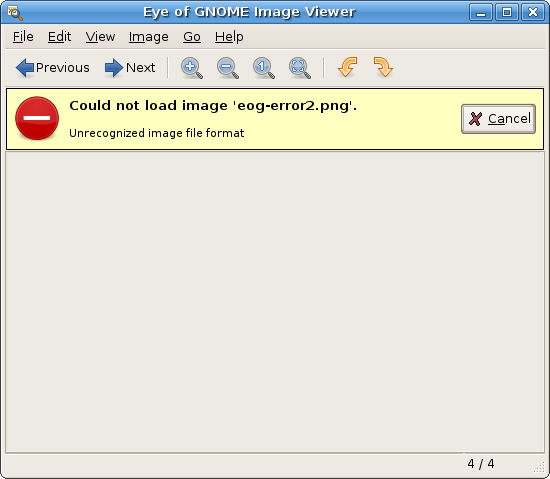
Currently, EOG is really crappy on reporting errors/warnings to the user. Basicaly, you only get feedback about errors on image loading, nothing else. Also, it uses dialogs for this which is kind of invasive and specially annoying on a collection-based UI application like EOG. I really like the UI aproach adopted by gedit with this cute yellow message area. So, I borrowed gedit’s code to use the same aproach in eog-ng. If something goes wrong with the image loading, you can easily browse other images from the same directory without needing to close EOG. Here’s the result:

New UI for errors/warnings in EOG.
I still need to add the code for different kinds of error/warnings for cases like opening a directory with no images, opening unrecognized formats, not found files, etc. This will be piece of cake with the new code base though.
—-
Claudio pointed me to this blog post from this italian guy who seems to be really excited about eog-ng. Good to know that users are enjoying the EOG development news. :-)
—-
Update: don’t worry about the odd “Cancel” button. I’ll fix this ASAP. :-)
Nice!
The one part I’m not a fan of is the Cancel button. Cancel usually means “don’t do this operation”, or “stop this thing that’s running now”. I’m not sure exactly what it means in this context.
Also, would I hit alt-C-A to activate it? I’ve never seen a button with 2 underlined letters. :-)
What does the “Cancel” button do in this case?
I think we need to look at standardizing this in-app notification area stuff in the HIG. Gaim is doing something similar in 2.x as well.
I think users always love Dev news, especially when they include pictures of the apps and when they ask for advice, it brings a certain level of humanism to software development. Thanks for taking your time to share with us what you’ve been working on. :)
This looks great, but as stated by other readers, there is no reason to have a cancel button.
“Can not load foo…” is a statement and not a pending operation. As such, there is nothing to Cancel. You might add a “More information” button that gives any debug output or something like that.
Nice work.
Nice nice… I hate errors displayed with modal dialogs.
There is SO much wasted space in there. Make the yellow part the whole image widget. (take up all the window size), and center the the text.
I dont know what the cancel button is for, it seems stupid.
The yellow there is excellent, to catch users’ attention, but make it take up the whole screen.
Hey,
The Cancel button looks odd. Also, this yellow area does not work correctly on Gtk in some cases. Try to resize the window making it smaller, something like 640×480 and put a larger message on it. The window would resize or the message would ellipsize (if the property is set) but the line won’t break without resizing the window.
To be clear, while I don’t like the word “Cancel” here, I do agree that it’s useful to have an acknowledgment button here. (“Cancel” isn’t horrible by itself, but it already means something else in GUIs.) Ideally, it should be a 1-word synonym for “ok, that’s nice, now please make this yellow box go away” :-).
That is, unfortunately, not in my thesaurus, but I have faith that you will come up with the correct word by the time this is released!
Love the progress of eog and the visual feedback to users.
The new Error/Warning UI looks great.
Close or Hide button instead of Cancel maybe ?
The current error messages in gedit and now eog are nice but the visual presentation doesn’t really fit.
I agree with Marc for the size of the message. Maybe the way firefox displays error message can be used for inspiration?
Anyway, thank you for the latest great improvements on eog. I very much like them.