The GNOME 3.12 cycle was a little lighter in terms of screenshot-friendly feature work, with lots of effort going ‘under the covers’: Wayland porting, developer documentation improvements, application installation infrastructure, etc. But I still managed to find a few things worth showing while smoketesting the 3.11.5 release this morning.
System status refinements
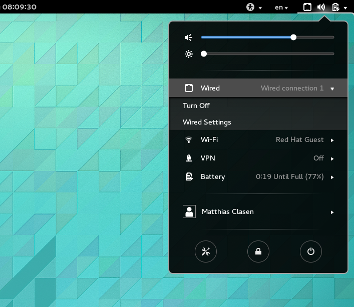
The system status area was all new in 3.10, so naturally, there was some follow-up to incorporate feedback that we’ve received on the new implementation. One point that was raised by many people is that they rely on the system status area to know about wired network connections. So, we’re bringing it back:
Airplane mode improvements
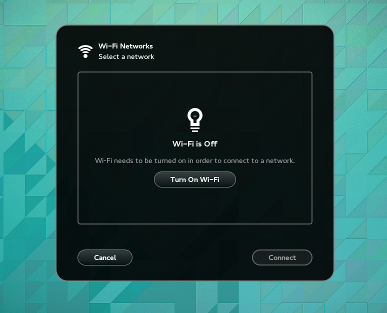
Another thing we’re correcting is the subpar integration of airplane mode in the wifi submenu. In 3.10, the ‘Select network’ dialog was unaware of airplane mode. Now, it offers to turn wifi on when needed:
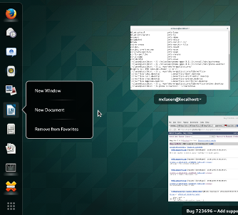
In another corner, applications can now provide ‘static actions’ in their desktop files. This is useful for actions that are meaningful when the application is not running, mainly alternative ways to launch the application.
These actions are now included in the right-click menu of applications in the overview:
 It looks like this in the desktop file:
[Desktop Action NewDocument]
Name=New Document
Exec=libreoffice --writer
X-TryExec=oowriter
Thats all! GNOME 3.11.5 will be out later today, so you can try these things out for yourself.


Is it so difficult to add “Exit” item in right-click menu for applications?
I suggest you to look at most popular extensions and implement them by default. It is cool that you add new features, but there are still problems with hotkeys when using non-latin layout (Ubuntu + Gnome-shell) and a lot of other small issues, that requires a bunch of extensions.
Adding a default « Quit » action actually sounds like a good idea. 🙂
It could close all windows, just like the current « Quit » entry in the application menu.
Did you try reporting a bug about that, or talking about it with the designers?
> Did you try reporting a bug about that, or talking about it with the designers?
No, but such things are fairly obvious. If GNOME designers/developers are using GNOME by themselves I think no one of them can be satisfied with DE “Out of the box”, so this is the point from which improvements should start.
> Did you try reporting a bug about that, or talking about it with the designers?
One more remark – I voted for bug:
https://bugs.freedesktop.org/show_bug.cgi?id=41169
and
https://bugs.launchpad.net/ubuntu-gnome/+bug/1218322
There are A LOT of people who reported bug, can anyone imagine how much people suffered from this every day? I still can’t set Ctrl_r for layout switching (but Shift_r works somehow…).
Another bunch of default “features” I can’t understand:
– Appindicator support, legacy icons (why should almost every GNOME user google for solution how to show Dropbox, Skype and other icons in tray?)
– User themes
– “Dash to dock” extension behavior – it is pretty obvious to show favorite apps in dock when it doesn’t overlap any app (autohide feature)
– Opening another instance of the same app by middle button click on mouse
– “Native windows placement” extension behavior (I think there are no users who would want to disable this feature, because it is simple, natural and useful)
– “Message tray on bottom right corner” extension behavior – whole bottom side of screen it too much for messages tray
Some of features must be enabled by default, some of them may be optional, but should have GUI for configuring, rather than hidden from regular users keys in gconf/dconf.
P.S. Wondered, that did not received notification about answer to my message (again, obvious and expected behavior).
Does the system status dialog in GNOME 3.11 scale properly in HiDPI mode (i.e. “gsettings set org.gnome.desktop.interface scaling-factor 2”)?
I’m asking because in GNOME 3.10 the dialog’s text is scaled but for example the dialog width is not scaled.
Excellent work. I’m a developer and I happen to find Gnome the most pleasant for all activities (including work). Small but useful features, keep it up 🙂
All good improvements. Even though some of the work during this cycle is less ‘sexy’, I’m honestly more excited by all the refinements and fixes for minor issues in various applications. The little things that bugged me once before going away one by one is about as enticing as a new application being implemented.
I’m also really eager to stress-test the more technical features coming in 3.12. Once the intended improvements to GNOME development are cemented, creating a more fully-realized GNOME will be much less burdensome. Also, the day GNOME on Wayland becomes functional on a daily basis, I’m sure we’ll all have big, stupid grins on our faces. 😉
Great job!
The network status thing is appreciated. In 3.10, if you want to get to the wired connection settings, you had to go via the control panel (or had to know that the “wireless settings” option took you to the same screen). It seemed odd that wired/wireless were treated differently in this respect.
That said, I still prefer the split menu layout from 3.8 and earlier… merging a bunch of unrelated operations into a single menu doesn’t make much sense to me, and by collapsing the wireless hotspot list into a secondary menu, made things just that much more difficult when trying to connect to a new network, or to work out which of 3 or 4 access points in a hostel will give the best connection…
Thanks for bringing back the status icon for wired connections… I thought it was a bug in my Fedora 20!! The boring part is to wait until the release of Fedora 21, with the delay due to all new changes… :/
Awesome, thanks!
What I really look forward is for GNOME taking care of its font bugs. I really can’t stand that ugly percent sign and misaligned diacritics in Cantarell.
I am quite concerned about the other visible side of Gnome 3.12: Extensions. More and more absolute essential extensions are not yet ported to Gnome 3.10 and also not 3.12. Is there a way to check or assist extensions developers that they update their extensions? Or is it possible to include even more extensions in the official extension pack?
I am talking mainly about following extensions which are IMHO absolutely essential:
* gTile (super-essential!): https://extensions.gnome.org/extension/28/gtile/
* https://extensions.gnome.org/extension/121/gcalcsearch/ (or https://github.com/war1025/SearchProviders/)
just to name two!
extension authors can use the virtual machines we build every day; you can run them into gnome-boxes.
There are no essential extensions. That’s why they’re extensions; most people don’t need them.
Good stuff.
Could the airplane mode be made to detect when the physical radio-kill switch on a laptop is engaged? I have observed regular folk accidentally activating this switch when handling their laptop (it’s on the front-left corner on many models, so easy to jog) and then being unable to connect to the network. The interface gives no clues as to what’s happened, and they are stuck because they don’t recall activating a physical switch.
Looks good! I do wonder about ‘airplane mode’. Really if we care about privacy and security then airplane mode should be the default, and we should only refer to its opposite as ‘connectable mode’ or some such.
I’m glad to see this status issue fixed. Now there is only one thing preventing me from switching back to Gnome: I still have not found a way to have Pidgin (or some other IM client) display an icon in the status area that flashes when someone’s typing at me. I’d like my Pithos icon up there as well.
Take a look at .
Hm, the blog ate part of my comment, I meant take a look at https://extensions.gnome.org/extension/150/message-notifier/
https://extensions.gnome.org/extension/495/topicons/
Does the system status area have a keyboard toggle? like the very useful Super+M as documented on: http://worldofgnome.org/gnome-new-keyboard-shortcuts-designs/
I would like:
Toggle System Status area – proposed Super+S