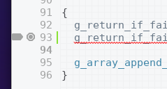
The GtkSourceView library has this handy concept of a GtkSourceGutterRenderer. They are similar in concept to a GtkCellRenderer but for the gutter to the left or right of the text editor.
Like a GtkCellRenderer, you pack it into a container and they are placed one after another with some amount of optional spacing in-between. This is convenient because you can start quickly by mixing and matching what you need from existing components. Those include text (such as line numbers), pixbuf rendering, or even code folding regions.
However, there is a cost to this sort of composition. One is function call overhead, but that isn’t particularly interesting to me because there are ways to amortize that away (like we did with the pixel cache). The real problem is one of physical space. Each time a renderer is added, the width of the gutter is increased.
Builder 3.26.0 added a new column for breakpoints, and so we increased our width by another 18 pixels or so. Enough to be cumbersome. It looked like the following which has 4 renderers displayed.
- Breakpoints renderer
- Diagnostics renderer
- Line numbers
- Line changes (git)
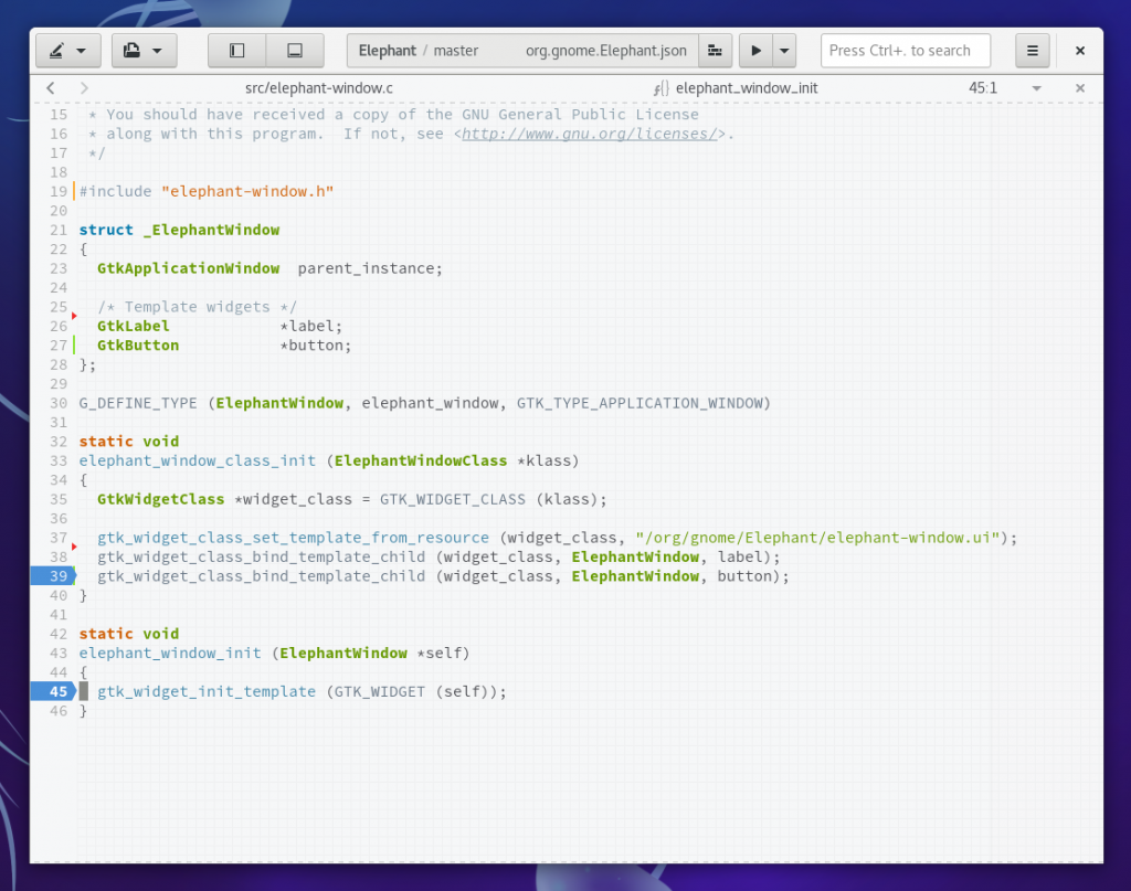
Once you reach some level of complexity, you need to bite the bullet and implement a single renderer that has all the features you want in one place. It allows you to overlap content for density and use the background itself as a component. We just did that for Builder and here is what it looks like.
There are a couple other nice points performance-wise by implementing the gutter as a single renderer. We can take a number of “shortcuts” in the render path that a generic renderer cannot without sacrificing flexibility. Since the gutter is not pixel cached, this has improved the performance of kinetic scrolling on various HiDPI displays. There is always more performance work to do, but I’m rather happy with the result so far.
You’ll find this in the upcoming 3.26.1 release of Builder and is already available in Builder’s Nightly flatpak.


