Just after GUADEC, I made some general comments about this whole “online desktop” idea that was nicely presented by Havoc and Bryan in Birmingham. My main argument is that we should not have a separate “online desktop mode” but try to turn our desktop into a web-aware environment.
Now that Empathy has been proposed for GNOME 2.22, I think it’s time to start thinking about interesting ways of integrating the instant messaging stuff and online desktop stack in the desktop (note that there’s no garantee that Empathy and online desktop will be accepted as official modules but, as a strong supported, I still think it makes sense to bring those ideas at this moment). In my opinion, we should take advantage of the fact that Empathy is a framework-ish aproach for instant messaging (not simply a standalone application) to bring a seamless integration of its features in the desktop environment.
So, I had this idea (that should be more detailed and discussed) of a possible (and feasible) way of integrating Empathy and online desktop stuff in the desktop: a People menu in main menu bar.
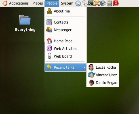
People menu mockup
Some general comments:
- The People menu should be optional and only activated if online desktop and/or Empathy are available. There will be many users who still want to use their favorite messenger and don’t want to use this online desktop thing anyway
- The “About me” would run the “About me” capplet which would need to have some additional features for setting up messenger accounts and defining your web presence on several online services (online desktop integration)
- The “Contacts” menu item could run an application like Soylent with easy access to your messenger and Evolution contacts to start different communication ways (e-mail, chat, video call, etc)
- The “Messenger” menu item would connect you to your configured messenger services and show an icon the notification area
- The “Home page” would open the browser in your GNOME online desktop home page
- The “Web activities” would start the now called Mugshot client which notifies you about the web activities of your friends
- The “Web board” would activate the Bigboard sidepanel with lots of cool web stuff (I think Web board is a more appropriate name from the user point of view)
- The “Recent talks” is obvious :-)
This is just an initial/rough idea with the aim of setting some kind of direction on how we could integrate instant messaging and online desktop in GNOME. There are still many things to discuss and decide.
Comments?
Run, don’t walk, to gimmie. This talk of people just makes it all the more obvious that the current menus need to go.
Please check out Gimmie (http://beatniksoftware.com/gimmie), for an approach that already implements this idea. Gimmie is also proposed for Gnome 2.22 inclusion.
Lucas,
Nicely done, but I think that People should not be a menu.
If people is a menu it should contain people: John, Bert, Frances, and submenus for groups “Friends”, “Family”, “Business,” etc. This could work for some automatically determined “favorite” contacts but even then another dialog would have be presented: What do you want to do: call billy, email billy@billy.com, view logs of your chat with billy, view files sent by billy , etc.
Also, alot of times you don’t want to view by user, you want to see “whos on to talk to, who’s updated their blog, who’s shared new photos.” I want to be able to do that from Gnome, without opening a web-browser.
@Alex and @Luis, I really prefer current menu bar over Gimmie. Actually, I like the idea behind Gimmie but the current UI is too cluttered, looks sketchy (not clean and polished enough for a main menu bar replacement) and doesn’t really improve the user experience. Well, maybe that’s just me.
Please, no more “IM service places icon in the tray” approach. We need a proper applet for this (status icon + dropdown to change statuses/descriptions, a button to open the roster application) – tray is nice for reporting incoming events such as chats or file transfers but not as a permanent storage area for running apps.
@lucasr:
Well why not help out on improving the UI.
There is alot happening now. It was considered yesterday so improve the UI.
e.g: on #irc we were discussing changing the Programs menu to act more like the application menu for. we also have a sketch
http://cgi.tu-harburg.de/~seag0862/images/apps_mockup.png
Gimme could be fine as way to implement this (now that it plans to use telepathy, I believe), but I don’t like having to agree to all the other stuff in Gimmie.
Very inspiring. Although I would suggest “Recent Conversations” over “Recent Talks”. Or maybe unification of the current & past conversations.
Even if you don’t think Gimmie is the right way, stuffing this much into a traditional menu just makes it all the more obvious that menus are a terrible way to organize this much information. When you’re dealing with this much information, you need something (gimmie, novell’s start menu, online-desktop’s taskbar, *something*) that organizes it better than the current menus. They need to die, the faster, the better.
We could have a feature like ‘Connect into lucasr desktop’, which integrates both vnc client and server… maybe as a plugin for a specific IM…
Just as a vote, I’ve been using Gimmie as my main panel for several months now and, when it was broken for a few weeks and I had to use gnome-panel, felt approximately like someone had just chopped off half my fingers, it was nasty. I agree with Luis that even if you think the *current* Gimmie is not optimal, improving it is still a much better bet than trying to shoehorn a ‘web-aware desktop’ into a design from 1995 (the Windows 95-style gnome-panel). From what I’ve looked at, it’s fairly easy to make major modifications to gimmie quite quickly, so you could easily hack up a version that looks how you want.
gimmie guys, I hope you’re working on empathy integration for the People panel? :)
Lucas: you stole my idea! :-)
@Murray: What other stuff in Gimmie are you having to agree to?
@Adam and @Luis, I have to agree that menus are not very good for organizing loads of dynamic information. On the other hand, they are very fast and, yes, there are many cases where they are a very nice and efficient choice.
In the case of the main menu bar, for users who just want quick access points for major desktop features and computer resources, this proposal would work quite nicely, I guess.
From my user point of view, I almost all the time only use launchers on panel to start my most common tasks (browser, terminal, music player, xchat, devhelp, etc). Also, I use the Places menu very often to access certain bookmarked folders. So, in my case, I only use the Applications menu when I want to do something less common (image editor, work editor, calculator, etc). Therefore, I think a menu to access people-related stuff would work quite well for me.
Anyway, I agree that this proposal is relatively conservative but, on the other hand, it (potentially) fits very well on the current menu bar.
You know, Mac OS, in my opinion, does a neat job with the taskbar.
And I wouldn’t feel guilty about taking that idea at all, seeing as they use CUPS, Xorg, GCC, etc.
+1 for this
-1 for Gimmie
Lucas is defenitely right, gimmie seems really cluttered, and looks way too much “fullblown”, for a simple menu, while it doesnt fit into *my* Gnome desktop at all..
Just another opinion :-)
FWIW, I totally agree with your general idea that our current apps should be more net aware, rather than turning the desktop into a thin veneer over the internet. The less I have to deal with crappy web UIs that are running in browsers (“Web 2.0”, “AJAX” or otherwise), the happier I’ll be.
@Adam: Gimmie already supports Pidgin officially…
There have patches lying around for Gajim and evolution support
An empathy support has been started.
However it has been decided to change a bit in infrastructure
plug-in manager is being develeoped so it will be easier for people to decide which IM they want to use and other web app services.
@Alessandro: Well i agree that gimmie doesnt look that sexy yet however as soon as the 0.3.0 is out. I think more work will be done on improving the UI … also a color chooser dialog patch for the gimmie panel is already there however needs some love
Telepathy is the framework; its a good idea. Empathy is a rip-off of Gossip with lots of problems.
+1 telepathy
-1 empathy
I personally love this idea, It adds to the desktop expierience in a non intrusive way (maybey an online menu instead of a people menu would make more sense). I don’t like how everyone is so ready to discard an environment that has been amazing to work with all these years. GNOME rules, lets improve it, not screw it in a rush to be web enabled. No offense to gimmie but it just isn’t what I want.
One thing that seriously pisses me off about that gnome menu bar is that I can’t chop and change the menu entries. You’re simply adding yet another button that I might use, but would rather I could specify what > I WANT
^-TAKES UP TOO MUCH SPACE ON MY PANEL!!!!!-^
Why can’t it just be apps and places or just apps, or just system or just people. It doesn’t make sense that although we are champions of choice we still impose this on gnome users.
why not allow me to add each menu independently, I believe there is already a bug filed for this since something like 2.4, I am however unable to track it down.
Lucas, drop me a line on facebook or email if you’d like to discuss this, and maybe I’ll do the splitting of the applet myself if I can find the time.
last post got messed up because of my daft usage of gt/lt operators.
— should have been like this —
but would rather I could specify what I WANT to use if you get my meaning.
Think about it like this;
-APPLICATIONS- -PLACES- -PEOPLE- -SYSTEM-
^-TAKES UP TOO MUCH SPACE ON MY PANEL!!!!!-^
—
Alex, Gimmie has document and application browsing, and a bunch of other ” All Your Stuff”. But this is just about communicating with people. You need to break it down (and integrate properly with telepathy/empathy) to get any part of it accepted widely. It’s not a new paradigm – it’s just a menu.
Anyway, I agree that this proposal is relatively conservative but, on the other hand, it (potentially) fits very well on the current menu bar.
‘your house is full of cow shit. I’m not going to clean your house, but hey, I’m spending time growing flowers in it!’
The current menu bar isn’t worth saving. Putting more functionality into it gets us further away from the day we kill it, and that is a bad thing.
@Karl, why don’t you just use the main menu applet? I takes very small space. :-)
@Luis, I don’t entirely agree with you as none of the possible alternatives (gimmie, gnome-main-menu, etc) have convinced me that they are real improvements over the current main menu bar. They may look more “modern”, and maybe more “powerful”, but that’s not a valid argument per se. It would be nice to have a rational and objective discussion (a “Main Menu Meeting”?) among directly involved developers, UI designers, and release team to list current issues and potential aproaches. Every time a discussion about changing default panel layout happens in d-d-l, it just becomes a useless/boring/crappy flame war.
Very, Very good idea.
After, the methode of how to to do this is a other question ( gimmie or not, optionaly or not … ) But i dont’t care, it’s a very good idea.
I think gimmie is a good base for that since a plugin manager is being developed to (amongst other features) help to detemine whihc IM and contacts are tu be used. As in Pidgin Gajim empathy or gossip. Also it applies for stuff like evolution or Thunderbird or maybe all.
I know some ppl dont like the UI of gimmie, but if u r going to develop something its easier to help out changing the UI of gimmie that already gives you to features ur looking for then integrating new feautres in an (in my opinion) old dying panel.