A look at gnome-boxes

Too much talk about files, lately… what about VMs ? Our answer to that is to put them in Boxes.

When we introduced GNOME Boxes in 3.4, it was really just a preview, with much more to come in 3.6. Since then, the boxes team has been quietly working on adding features and polishing things.

So lets take a look at what’s coming in Boxes 3.6.

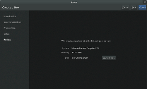
Boxes tries to be smart about choosing good defaults for memory and disk sizes depending on the OS that is being installed (this information is being provided by libosinfo). But sometimes, you know better,  and then that Customize button is coming in handy.

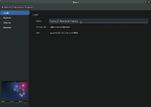
One particular aspect of customization is renaming.

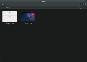
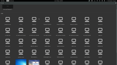
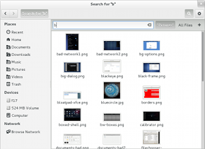
This looks like just a small detail, but being able to give meaningful names to VMs helps when you have many of them, and want to find them again later. To do so, you can now search.

Search in Boxes looks much the same as search in other GNOME 3 applications. And just like for other GNOME 3 applications, your VMs will also appear among the gnome-shell search results in the overview.

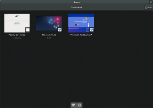
Another aspect where Boxes is picking up patterns from other GNOME 3 applications is selection.

VMs are very convenient to quickly try different OSes or nightly snapshots. Boxes tries to support this by recognizing when you are working with live media. As long as you don’t make persistent changes, Boxes will treat such VMs as transient, and will delete them when you shut them down.

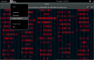
Sometimes, when things go wrong, it may be necessary to shutdown a VM forcefully. Boxes lets you do that.

What I cannot really show in screenshots is how much more fluid and smooth Boxes feels. A lot of work has gone into making libvirt calls async to ensure that animations run smoothly. Resizing the Boxes window very nicely adjusts the display resolution.

The Boxes command line interface has received some attention as well. You can find out if gnome-boxes will work on your machine:

$ gnome-boxes –checks
• The CPU is capable of virtualization: yes
• The KVM module is loaded: yes
• Libvirt KVM guest available: yes
• The SELinux context is default: no

You can also open a VM from the command line, by name:

gnome-boxes f18

In summary, a ton of improvements, many small and some large. Boxes will no longer be a ‘preview’; in GNOME 3.6, it will be solid, useful application. You should give it a try !

There’s also some things to look forward to in 3.7 already. A while ago, Christophe showed a preview of the coming ovirt support (see all your remove vms in gnome-boxes).

On nautilus

Shells // by Christina MathesonA lot of ink has been spilled recently over the fact that nautilus is evolving into Files.

I’d like to present a few facts and thoughts about this, and explain why I am looking forward to the new nautilus.


Here are some examples of what I am looking forward to in nautilus 3.6:

A more usable list view, which focuses on presenting important information in usable form:
List ViewWell-working search, with file search results in the shell.

SearchNautilus search is improved in many ways: it is fast, you just type, like we do in the shell – which has worked out great. It is case insensitive, can search hidden files or directories, can work recursively, doesn’t only do prefix matching, can search metadata, has ranked results based on a weighting algorithm, can work on indexed and non-indexed directories.

Recent files in the sidebar:

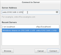
Recent FilesWell-working remote browsing:

Connect to ServerA visual appearance that fits in with other GNOME 3 applications:
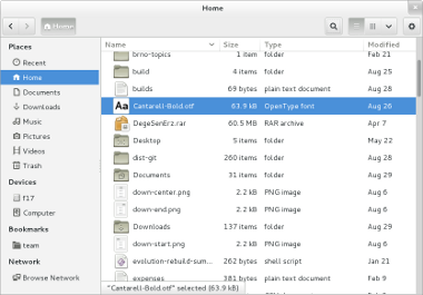
NautilusBut let’s look at how we got to this point, and think a bit about the history. Actually, nautilus has quite a long and involved history. The first commit in the git repository dates back to 1997. In early 2000, Eazel starts to appear in the history. Along the way, ambitious features appeared: zooming with level-of-detail, desktop handling, spatial mode, a vfs, remote browsing…

Many of these things have fallen by the wayside over the years, but they have left scars behind:

A complicated and hard-to-maintain code base: for example, nautilus had a utility library called eel in the early days, which was then broken out as a separate module. Later it was merged back in.

There’s still a stripped-down copy of GnomeCanvas inside nautilus, for handling the desktop drawing.

Remnants of past features showing up in odd places in the UI. For example, the view mode was remembered per-folder until recently. That made a lot of sense in the spatial paradigm, but not so much in browser mode.

Another example is the overlap between search and find.

Nautilus development has been somewhat stagnant; while GNOME 2 turned into GNOME 3, nautilus largely remained the same. But no more. During the 3.6 development cycle, nautilus has seen intensive development, and it is still ongoing.

This makes what has happened this cycle even more remarkable. Not only has there been plenty of new features, but there has also been a massive cleanup operation. Over 500 (!) bugs closed, some of them really old, like 45708 (filed in 2001) some of them crashers, like 668674, some of them hard-to-track-down regressions in other parts of the stack, like 680349.
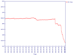
Bug countA lot of controversy has erupted about the fact that early parts of the roadmap removed some features. On some level, this is unavoidable: if you want to put a new coat of paint on a wall or your car, you also remove the old paint first, for best results. But if you read the roadmap in its entirety, you will find many feature additions on the list as well. Some of the removed features will come back in slightly different form, e.g. the split pane.

So give the new nautilus a chance and try it when 3.6 is released, and let us know what you think. We’ll be listening to your feedback, and there will be plenty of opportunity to make further changes in the future.

If it turns out after a test drive that the new nautilus is not right for you, keep in mind that nautilus is just an application. We think you’ll be happy with the new Nautilus, but if you aren’t, there are other file managers that you can try.
Rounding out the 3.6 feature list

Here is the next installment of ‘Seen in this weeks GNOME release’. Todays screenshot gallery is a little more extensive than last weeks. We’re rapidly completing our feature list. Most of the items on that list are now marked as ‘Complete’ or ‘Almost complete’. Good timing, since we are entering the freeze with the 3.5.90 release, and can now focus on polishing these features and fixing the remaining bugs.

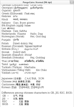
The first feature to show this week is one that I’ve wanted to see for a long time: the harfbuzz 1.0 release is right around the corner, and harfbuzz support has been merged in pango. Behdad has been working on this OpenType implementation since 2006, and pango has been using an embedded copy of an early harfbuzz snapshot for a while.

After a long period of stasis, we will finally see new life in our text rendering stack. The screenshot I’m showing for this looks just the same as it always has, since all the harfbuzz goodness is still under the hood.


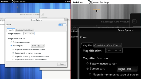
We’ve had a magnifier integrated in gnome-shell for a few releases now. Since 3.4, it was configurable from the universal access panel. In this release, it will be possible to configure various color effects on top of the zoom, such as inverted colors, desaturation and contrast changes. As you can see in the screenshot, we’ve reorganized the zoom options into tabs, and added a tab for the color effects.

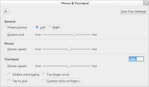
Still in the control-center, we have a redesigned Mouse & Touchpad panel, which was implemented by our Red Hat desktop team intern in Brno, Ondrej Holy. Amongst other things, you might spot the option for ‘natural scrolling’ in here.
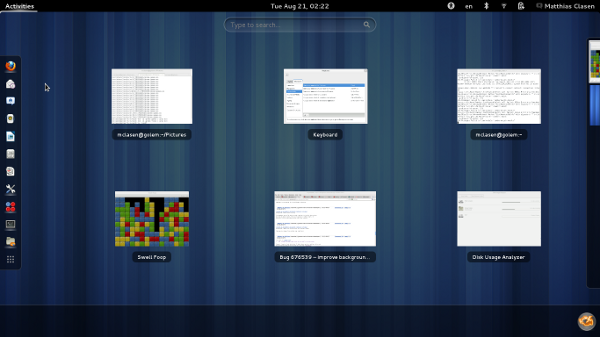
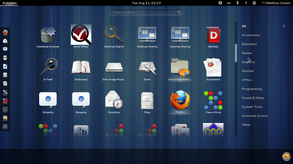
Over in the shell, there’s a new ‘mode-less’ overview. As you’ll notice, the search entry is bigger and centered, and the tabs are gone. To switch from the window view to the application grid, you can use the ‘nine dots’ button that can be seen at the end of the dash.

The new overview is the work of Florians summer of code student, Joost Verdorn, who has written more extensively about it already.

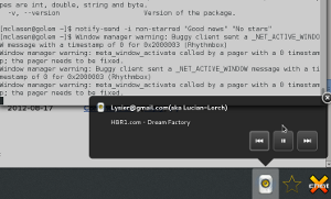
At the bottom of the overview, the new message tray is visible. It received a major redesign to address the problems that people have had with the original 3.0-era tray design.

Beyond the new visuals (bigger icons, no labels, close buttons), there are many subtle behaviour changes here that are hard to explain unless you try it yourself. One notable change is that the message tray is not raised ‘by itself’ anymore, you always have to bring it up explicitly. One way to do that is to use the new Super-M keybinding. Keyboard navigation is generally improved: you can focus individual icons and actions.

Many people have contributed to the message tray redesign, around the core work done as a summer of code project by Ana Risteska.

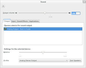
Back in the control-center, the sound panel has gotten its Hardware tab removed. Instead, the device lists now offer more fine-grained choices.

This simplification has been implemented by Canonical. It was made possible by earlier pulseaudio work by David Henningsen that has landed upstream in pulseaudio 2.0.

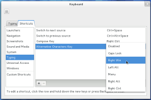
In the keyboard shortcuts section, some useful pieces of XKB layout configuration have reemerged. The frequently used compose key and ‘third level chooser’ variants can be set like other keyboard shortcuts now.


When it comes to appearance, GTK+ 2 applications will look less out of place in GNOME 3.6, thanks to a much improved gtk2 version of Adwaita. This theme was originally developed under the name ‘Bridge’ by Jack Gandy.

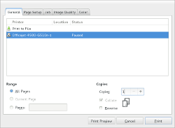
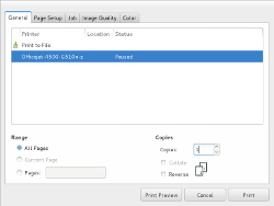
You have to look closely to see the differences between the GTK+ 2 and GTK+ 3 print dialog in these screenshots.

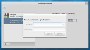
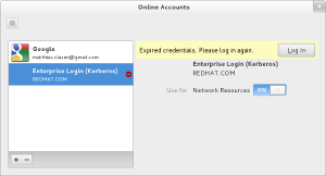
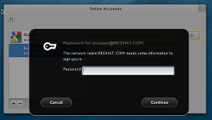
The last thing I have managed to capture in screenshots is the support for secondary Kerberos logins that has been integrated in gnome-online-accounts. The functionality is seamlessly integrated with the traditional krb5 commandline tools: if you run kinit in a terminal, the ticket will immediately show up the online-accounts panel, and you will get notifications before it expires.

This functionality was originally planned to land in the user panel, but the online-accounts panel seems a much better fit.

GNOME 3.5.5 impressions

It was my turn this week to do the GNOME 3.5.5 development release, and I took some screenshots while smoke testing the release.

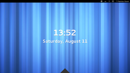
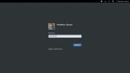
The big feature that is new in this release is the new screen lock implementation. It sports a ‘shield’, which can be lifted by hitting Escape, or by dragging it up, to reveal the unlock dialog.

We had a BoF session on the new screen lock at GUADEC, and identified a number of issues that still have to be addressed.


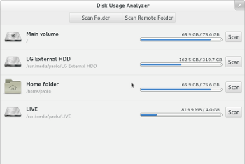
Some applications have received more love, here is a screenshot of Baobab that shows its new location list.


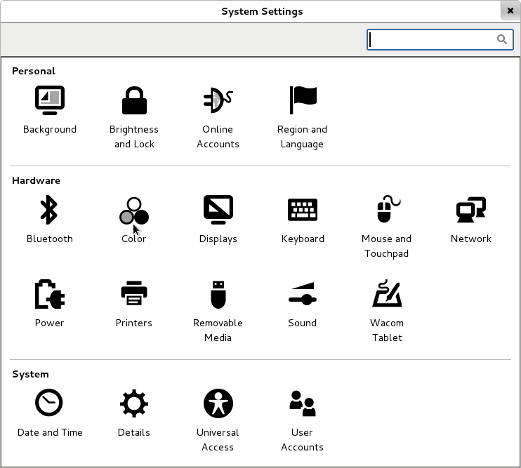
In the System Settings, several panels have been improved.

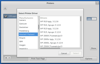
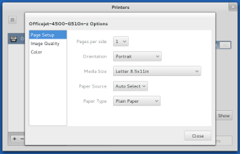
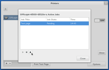
First, here are some screenshots of the printer panel, showing that it is now possible to select drivers, set default options and control queued jobs.


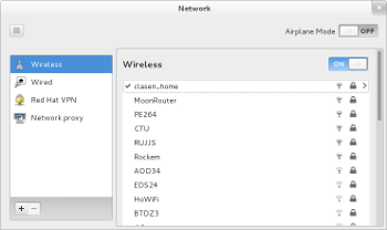
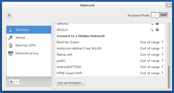
The network panel sports  a new design for the wireless page.

The network combo box has been turned into  a list that shows not only access points that are in range, but also saved connections.

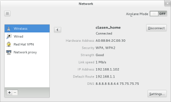
Connection details are available for active and saved connections, and it is possible to forget saved connections.

GNOME 3.5.4 sightings

Here’s another installment of my GNOME updates, showing some of the new things that I’ve seen land since we released 3.5.3 two weeks ago.

Nautilus has received a major face-lift, and looks very much like a GNOME 3 application now.


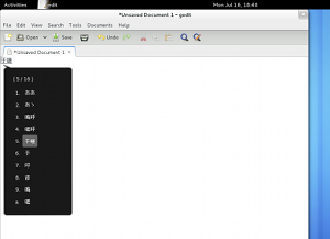
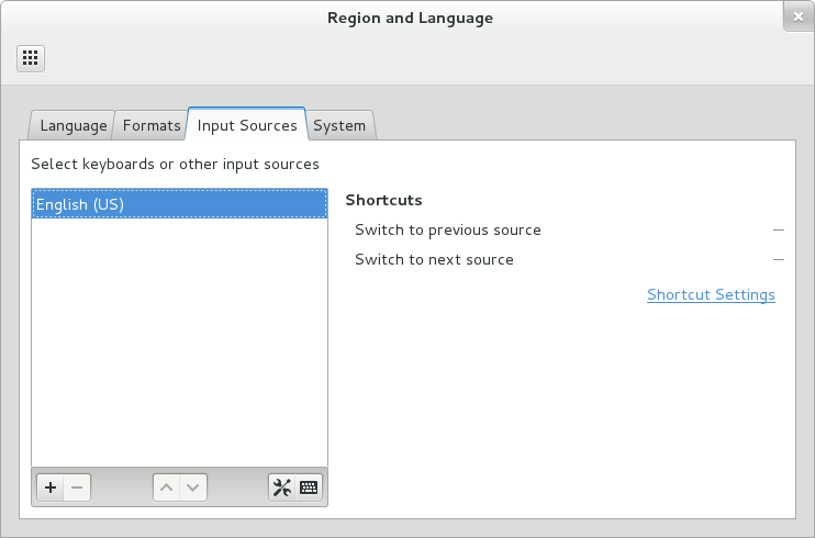
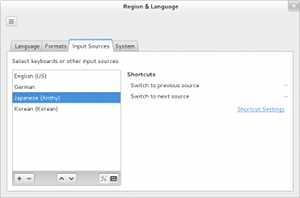
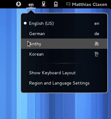
The initial support for presenting input methods alongside with keyboard layouts has landed in gnome-control-center,  gnome-settings-daemon and gnome-shell.

This feature has received a lot of attention already, and we expect lots of feedback – by all means, let us know what does not work right. But please keep in mind that we are still working on this, it is not 100% complete yet.

Pieces that are still missing are controls for changing keyboard shortcuts related to input sources, and for commonly used keyboard layout options, such as compose keys, 3rd level chooser keys, etc.

To learn more, follow the links in the feature page.


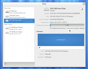
GNOME Disks (formerly known as palimpsest) has acquired a few features that people dealing with storage devices may appreciate. This screenshot shows it securely erasing a hard drive.

Such an operation can take quite a while, and if you are old and forgetful like me, you may have forgotten that this window was still open on some workspace.

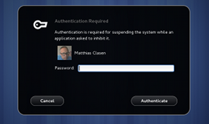
If your system is using a recent systemd (>= 183, to be precise), the new system inhibitor facility lets applications block powering off or suspending the system while such a long-running operation is underway.

GNOME Disks is using this, and gnome-session has also been updated to pass suspend inhibitors on to systemd. Shutdown and suspend request coming in via gnome-session or upower APIs get routed through systemd, so they all respect the system inhibitors.

Another bit of system integration is the new support for ‘offline updates’.

This requires recent systemd and PackageKit, F18 will have all the required pieces for this to work when the 3.5.4 updates land later this week.

To learn more about offline updates and how they are implemented, look at the Fedora feature page.

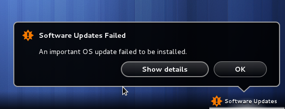
As my last screenshot shows, even when installed ‘offline’, updates can still go wrong 🙂

The sysadmin view on GNOME

A long time ago, we had a useful document that explained aspects of GNOME that are relevant to system administrators: GNOME Desktop System Administration Guide. Unfortunately, that document never made the jump from GNOME 2 to GNOME 3. In fact, it never made the jump beyond 2.14 or so…

With GNOME 3 is  a bit more than a year old now, it is high time that we this situation fixed. To kickstart this, I started a wiki page a while ago where I collect bits of information that should server as raw material for a new sysadmin guide. You can find it here:

http://live.gnome.org/SysAdminGuide

This is not my private playground – I would absolutely love contributions from others; there’s many areas I haven’t touched at all yet. E.g.

  • Is it possible to set up online-accounts for users in advance ?
  • What about hardware compatibility –  how to find out if gnome-shell will work ?
  • Lockdown

And if you are a system administrator, please add the questions that you ran into when trying GNOME 3.  Your input will not only improve the new sysadmin guide, it may also show us where we need to make things more manageable.

GNOME 3.5.3 sightings

Here is another collection of things I’ve seen appear in the tarballs that are coming in for the 3.5.3 development snapshot.

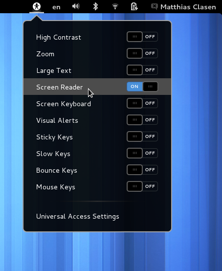
Accessibility is now ‘always on’. We’ve worked towards this goal ever since GNOME 3.0, and we’re finally at a point where we can have accessibility enabled by default without affecting stability or performance in a major way.

To celebrate this achievement, we’ve added a ‘Screen Reader’ item to the shell menu.

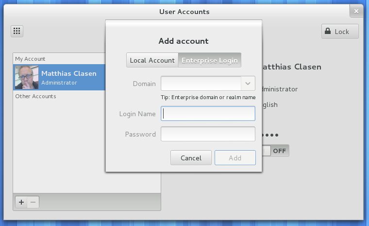
The first signs of ‘Enterprise Login’ (i.e. Active Directory) support can be seen in the user panel. This is first and foremost the achievement of Stef Walter, who has more information on his blog post.

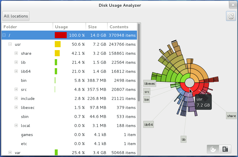
Some of our smaller applications and utilities are getting some love and attention. As an example, here is the reimplemented baobab disk usage analyzer.

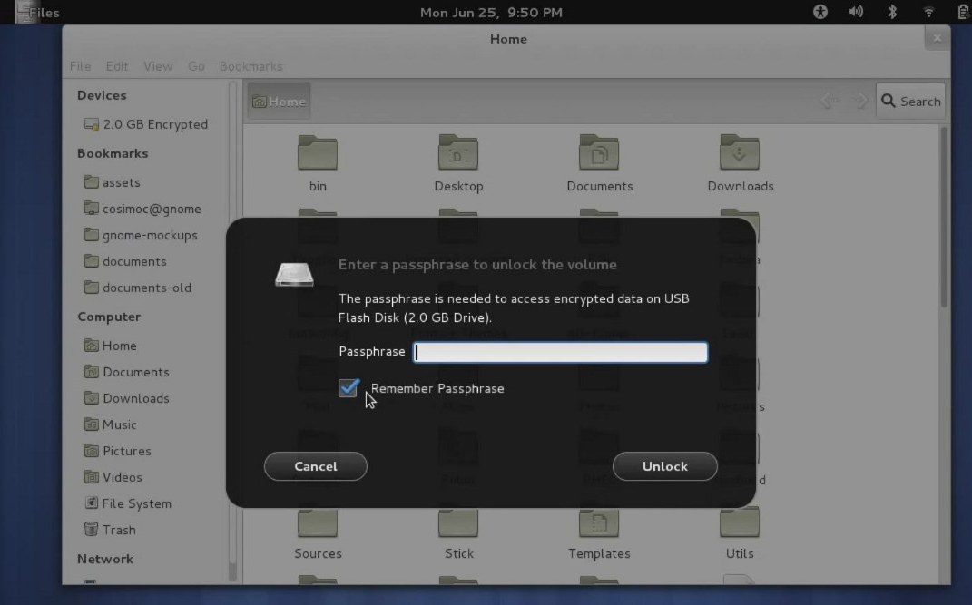
Mounting removable media is now handled with a shell-style dialog.

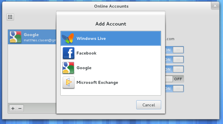
Finally, the list of supported online accounts keeps growing longer.

live cds

Just a quick service announcement: Ray has produced live cds of GNOME 3.5.2 for people who want to get a quick, painless glimpse of things that are coming in GNOME 3.6.  You can find them here.

…and now we’ve even managed to announce the 3.5.2 livecds before the 3.5.3 release comes out next week 🙂

GNOME 3.5.2 sightings

I’ve just completed the GNOME 3.5.2 development snapshot. It is still early in the cycle, and many of the planned changes are either still being developed in branches, or are still ‘under the hood’. However, while smoke-testing the release, I managed to capture a few glimpses of improvements that I wanted to share:

Application menus are now very well adopted.

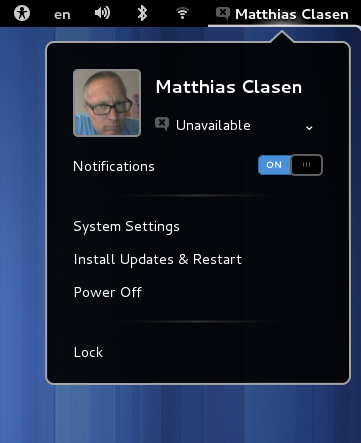
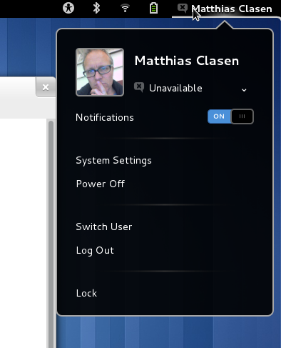
The user menu has been streamlined. We don’t show ‘Online Accounts’ separately anymore, you can just use ‘System Settings’ to get there. ‘Power Off’ is back. The ‘Switch User’ and ‘Log out’ items are only shown when they make sense.


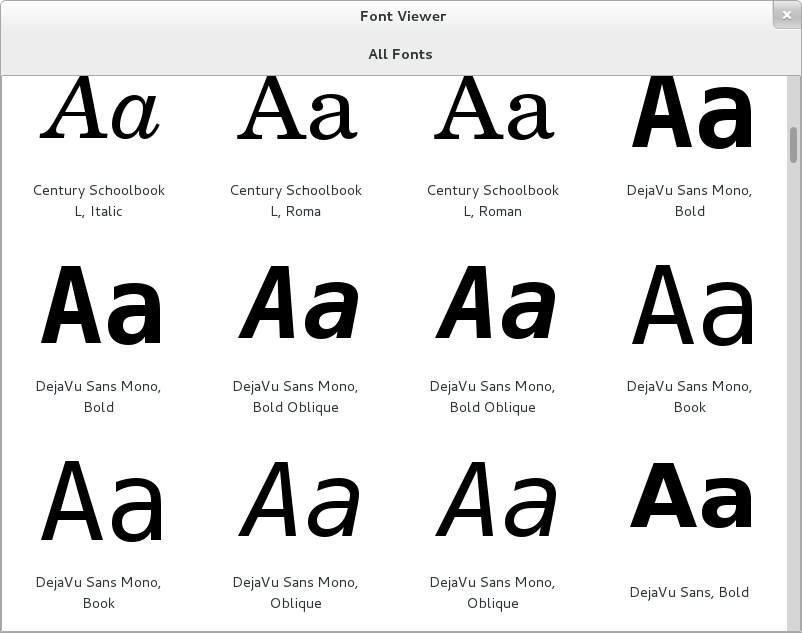
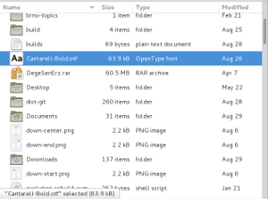
A rewritten font viewer application has appeared. It uses the same patterns that we have seen in other GNOME 3 applications: An overview with a top bar, optimized for maximized windows, a detailed screen for individual fonts, etc.


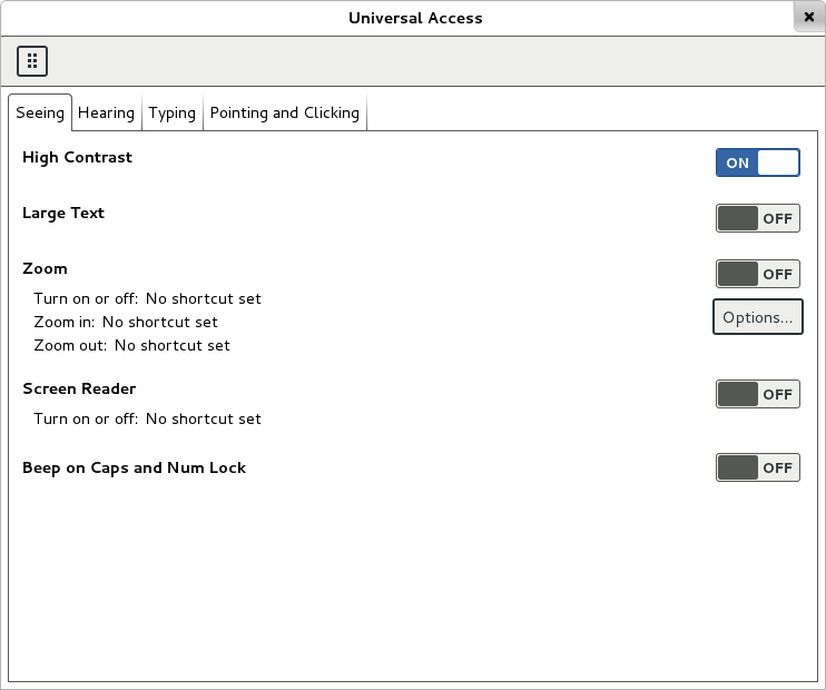
The accessible high-contrast theme has been greatly improved.

Finally, the beginning of Input Sources support has landed.

See the feature list some other things that will appear in GNOME 3.6, if things go as planned.