I’ve not been very good about posting updates on this GNOME development cycle. I was busy with other things, and all of a sudden, we’re already at the beta – I’ve just released 3.9.90, which is the first beta release.
High time to show some of the nice new things that will come in GNOME 3.10.
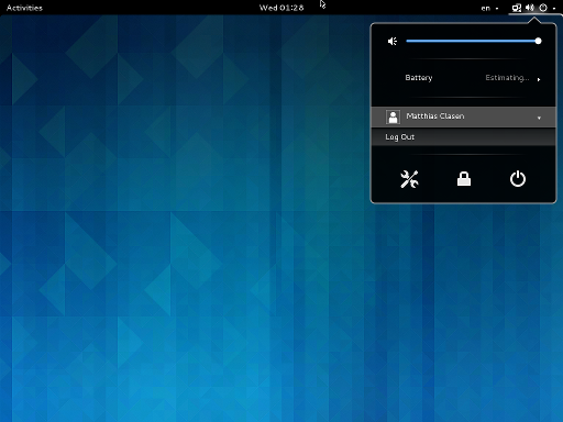 First, we have a new combined system status menu. This addresses a number of complaints about our previous system status area, such as the user name taking too much space on top bar, and privacy concerns about showing it prominently on the screen.
This screenshot does not really do the work justice, for a full impression, you should try it yourself or study the design.
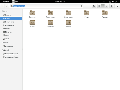 Next, many applications are using header bars instead of traditional titlebars.
Our previous approach of hiding titlebars on maximized windows had the problem that there was no obvious way to close maximized windows, and the titlebars were still using up vertical space on non-maximized windows. Header bars address both of these issues, and pave the way to the Wayland future by being rendered on the client side.
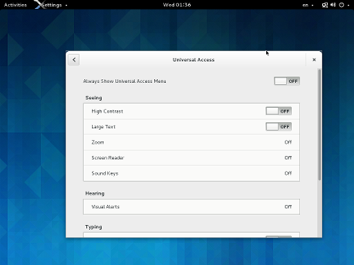 Somewhat unexpectedly, the control-center has seen quite a bit of work this cycle, too. There is a new Universal Access panel…
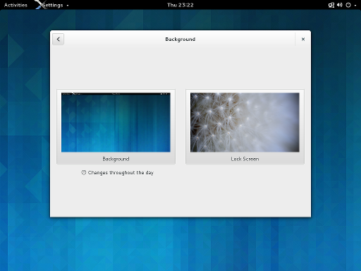 …the background panel lets you configure the lock screen image now…
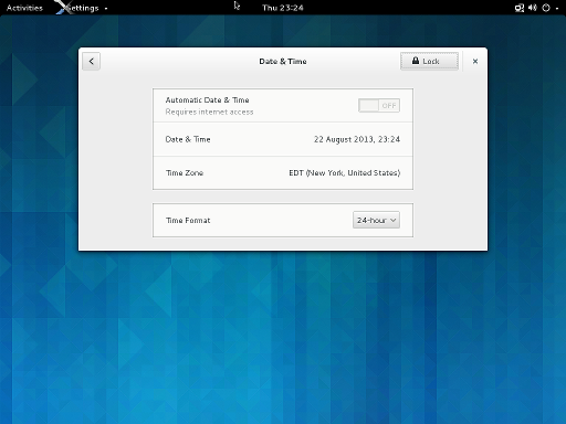 …and finally, there is a new Date & Time panel.
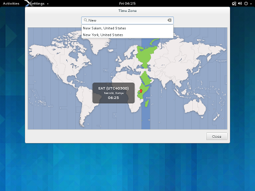 The map is still there, if you manually configure your timezone. I hope we can enable automatic detection for 3.10, so you won’t have to, anymore.
Speaking about maps, I should mention at least one new application:
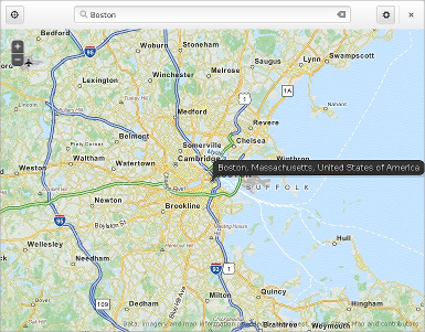 GNOME maps will be a preview in 3.10.
That’s it for now. There’s a lot more new to discover in GNOME 3.9.90, like a completely redesigned tweak tool, the note-taking application Bijiben, support for hi-dpi displays, etc.
If you find the right branches of mutter and cogl, you even use most of this under Wayland instead of X – our porting effort is making steady progress.
