Keeping gnome-shell approachable

One aspect that I always found very appealing about gnome-shell is that you could just go in /usr/share/gnome-shell/js, make a few changes, hit Alt-F2 r and try them out. This was a very low barrier to entry – no development environment needed, no days of jhbuilding dependencies. This is at least part of the explanation why shell extensions exist in large numbers. Sure, you still have to make yourself familiar with the internal and external APIs that are used in gnome-shell, and if you are unlucky, then Alt-F2 r will show you not your cool hack, but the fail whale.

I was a bit sad to see that we’ve lost a bit of this newcomer friendliness in 3.12, when all the JavaScript and css files were wrapped up in resources and included in the gnome-shell binary (to be exact, they are located in /usr/lib64/gnome-shell/libgnome-shell.so, not in /usr/bin/gnome-shell itself). Why was this done ? I guess having everything in one file and not spread across the file system makes gnome-shell start up a tiny bit faster (although I’m not sure if anybody has measured this).

But how do I now try gnome-shell changes quickly ? Let see…

For some background, gnome-shell is using the GResource mechanism for embedding the js files in the binary. Under the covers, this puts the files in a separate ELF section and makes their content available in a filesystem-like structure. The application itself can get at the resources e.g.  by constructing GFiles from resource:// URIs, like this:

file = g_file_new_for_uri ("resource:///org/gnome/software/gtk-style.css");

To access the embedded resources from the outside, you can use the gresource utility that is shipped with GLib. It can list the resources and also extract their content. Sadly, there is currently no easy way to replace existing resources with newer versions, since that requires recreating the ELF section and relinking the application.

gnome-shell has quite a few resources; the list looks like this:

gresource list /usr/lib64/gnome-shell/libgnome-shell.so
/org/gnome/shell/extensionPrefs/main.js
/org/gnome/shell/gdm/authPrompt.js
/org/gnome/shell/gdm/batch.js
/org/gnome/shell/gdm/fingerprint.js
/org/gnome/shell/gdm/loginDialog.js
/org/gnome/shell/gdm/oVirt.js
/org/gnome/shell/gdm/realmd.js
/org/gnome/shell/gdm/util.js
...

Here is how I used the gresource tool to get back to gnome-shell tweakability. Since the gresource commandline is not very versatile, I wrote this little script:

#! /bin/sh

gs=/usr/lib64/gnome-shell/libgnome-shell.so

cd $HOME/gnome-shell-js

mkdir -p ui/components ui/status misc perf extensionPrefs gdm

for r in `gresource list $gs`; do
  gresource extract $gs $r > ${r/#\/org\/gnome\/shell/.}
done

After running this script, all the js files that make up the gnome-shell UI can be found in $HOME/gnome-shell. Now I can point gnome-shell at these files with the (undocumented) GNOME_SHELL_JS variable:

GNOME_SHELL_JS=$HOME/gnome-shell-js gnome-shell

And – voila! – gnome-shell is as hackable as it always was.
Dialogs in GTK+ 3.12

Dialogs are getting a face-lift in GTK+ 3.12.

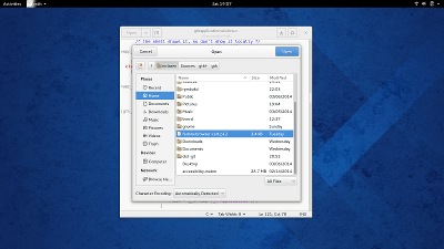
Most of the work on this was done by Jon McCann, I’ve only helped out here and there. The main visible change is the switch to client-side decorations and headerbars.

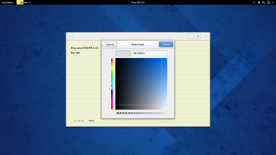
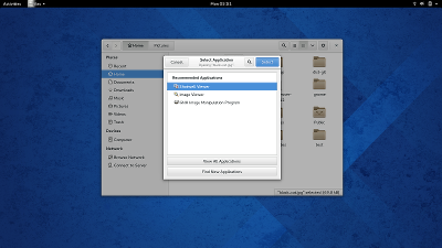
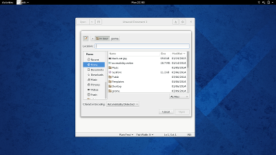
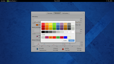
Here are some examples of GTK+’s built-in complex dialogs with their new look:

File Chooser

Color Chooser

The application chooser has had a bit more work done – we have a search button in the header bar, which makes a search bar appear when clicked.

Application Chooser

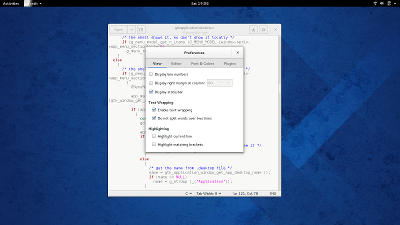
The most common dialogs in applications are preference dialogs. gedit shows how these can look with client-side decorations.

Preferences

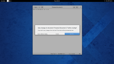
And then there are simple prompts.  GTK+ has the GtkMessageDialog class for these.  Their new look is maybe the boldest part of this refresh.

Prompt

Of course, GTK+ is used in many places, and client-side decorations may look foreign in some of them. Together with these changes, we introduced a dialogs-use-header setting. Built-in dialogs will fall back to a more traditional appearance if it is not set:

Traditional File Chooser

Traditional Color Chooser

Note that some of the details in my screenshots, such as the blue color for suggested actions, depend on the theme. What you see here is how dialogs will appear with the Adwaita theme in GNOME 3.12.

The GNOME HIG contains a lot of helpful advice on how to make best use of dialogs in your application.

New in GTK+ 3.12: popovers

In the third part of my recap of the GNOME 3.12 development cycle, I’ll talk about some of the changes in GTK+ that I have been involved in.

Popovers have already been discussed quite a bit. Most of the popover implementation has been done by Carlos Garnacho, generalizing his earlier work on touch selection popups that has been in GTK+ since 3.8.

One of the nice things about popovers is that they are just normal containers – you can put any widget into them, and keyboard navigation and input works like everywhere else. This is a marked contrast to menus, which are very specialized. Attempts to put entries, sliders or buttons into menus usually end badly.

I recently acquired a laptop with a touchscreen, so I can say with confidence that popovers are also much easier to use with touch than menus.

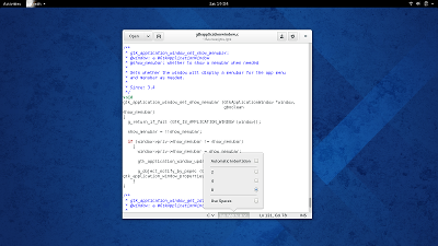
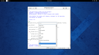
Here are some examples of popovers in gedit:

PopoverPopover

My own contribution to popovers has been to convert GtkVolumeButton to use a popover:

Popover

I also made it possible to populate popovers from a GMenuModel, giving you instant popover menus:

Popover

Popovers are still very new, so their adoption in GNOME 3.12 will be somewhat limited. But we are in the lucky position that we already have quite good design guidance for popovers, so this will probably change soon.

App folder configuration

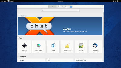
Continuing my 3.12 recap, this post is about gnome-software. I’ve done much less work on it this cycle than the previous one. All the heavy lifting has been done by Richard. The one feature that I did add to gnome-software this cycle is app folder configuration.

GNOME SoftwareGNOME has been moving away from hierarchical menus for applications. It is problematic for many reasons. One problem is the need for a global, hierarchical classification (‘categories’) – the world is just not that simple, and applications don’t always fit into these predefined categories. Another problem is that menus don’t really scale beyond a single level of submenus or beyond more than 10-15 items per menu.   Not to mention that menus are hard to use on touch devices.

The transition from menus and categories to a scrollable grid for applications was pretty much complete in 3.10. But there is still some need for grouping of related applications, and this is where app folders come in. In 3.10, we provided predefined folders for ‘Utilities’ and ‘Sundry’.

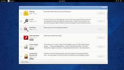
In 3.12,  we are adding an easy way for users to create  their own folders.  We chose to add this feature in the application that always shows you a list of all installed applications anyway, gnome -software.

Installed appsThe alternative would be do implement this directly in the shell overview, but that would be pretty complicated, requiring either a selection mode or complex drag-and-drop, so we decided not to do this (at least for now).

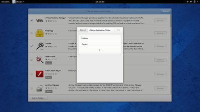
Once you’ve selected the apps you want to group, you can select an existing folder in the ‘Add to Folder’ dialog:

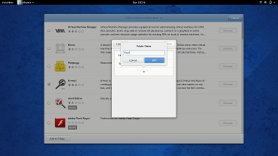
Add to FolderOr you can click on the ‘+’ button to create a new folder:

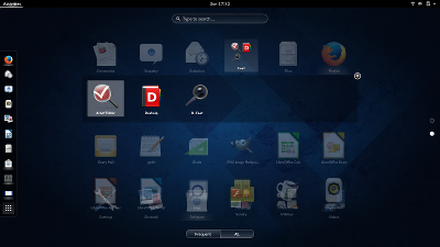
New FolderOnce you have done this, the new dialog will show up in the GNOME shell overview:

OverviewAnd that’s all there is to this feature!

If you are not using gnome-software, the app folder configuration is also available via gsettings.  It is using relocatable schemas, so the required gsettings command-line looks a little different from the usual, and may be worth showing. First,

$ gsettings get org.gnome.desktop.app-folders folder-children
['Utilities', 'Sundry', 'Feet']

will show you the list of defined app folders. Then,

$ gsettings get org.gnome.desktop.app-folders.folder:/org/gnome/desktop/app-folders/folders/Feet/ apps
['dconf-editor.desktop', 'd-feet.desktop', 'devhelp.desktop']

will list the apps that are in the folder named ‘Feet’. The folder schema has a few more settings that you can explore or change with similar commands.

The new gnome-initial-setup

As the development cycle for 3.12 is winding down, I want to take the time to look back at some of the things I’ve worked on this cycle.

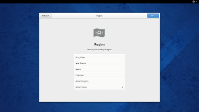
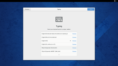
First, gnome-initial-setup has received a design overhaul that I’ve implemented together with Jasper. The pages now look a lot more uniform and polished. We use headerbars and we are consistently using list boxes for selections.

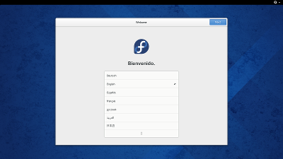
The first few pages are about language, region and input.

Language

Region

Input

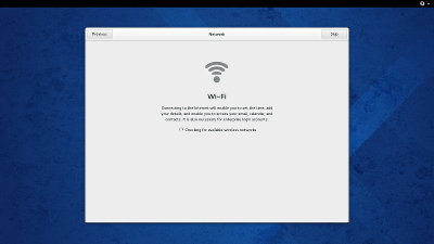
The network page is skipped if a we have a connection.

Wifi

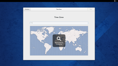
The timezone map is now properly sized.

Timezone

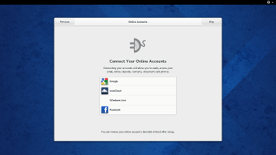
Online accounts have been moved earlier.

Online Accounts

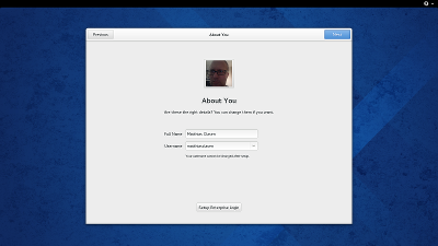
This lets us pick up avatar and name for the account page from a configured online account, which is something we’ve wanted to do all along:

Account

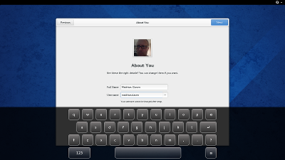
The on-screen keyboard works during initial setup now:

On-Screen Keyboard

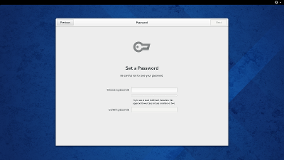
Setting a password has been separated from the account creation:

Password

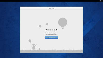
And thats all!

Summary