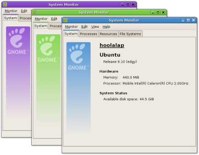
A couple of days ago, thos wrote about the branding of the GNOME System Monitor; soon after that, a bug was opened about the image – how the colour was off for every non-blue theme, and how it went against the GNOME logo branding rules – and the image was removed. I liked the branding, though; and so did Luca Cavalli – so much, actually, that he wrote a patch for having the image coloured depending on the theme and with a full GNOME logo:
According to him, the patch still needs some clean ups, but I think now it would really be a great thing to have in the System Monitor for GNOME 2.18. Update@2007-01T09:44: the patch has been attached to bug #377144.


It looks nice. But I think so much branding is not suited for the system monitor. I would prefer to have it in the gnome-control-panel (It’s been worked on right?). Or in the app wizards.
This looks awesome!
Thank you !
I like it. It’s a nice place to put some branding without cluttering things up.
I like the new branding. I think it would be great having it in the final 2.18
It looks great. I think that it should be included in gnome 2.18
Excellent solution. The result looks really good.
Please don’t add this. This is the very definition of a slippery slope. What about the next guy who decides to add some color to his application? What about people who want to run GNOME System Monitor in KDE? If you want to, add some bling to gnome-about.
I really can’t see the slope, let alone it being slippery or not.
if the rules of accessibility and branding are followed, then I don’t see why it can’t be done.
what about them? if they are running an hybrid system this is the least they can expect; and KDE already has system monitoring tools.
This is so cool, I hope it gets included! :)
even officially endorsed and carefully craftd Gnome branding like this is a bad idea. it only encourages the distributions to make more branding changes of their own.
@alan: that is a problem for the distributors of GNOME – they are entitled to do whatever branding they want. they already change the upper left logo in the main menu applet; add vendor-specific menu items and applications; apply vendor-specific patches to the packages. it’s not like branding doesn’t already exist.
If you’re having a love in with the system monitor and regardless I think we should have system information in the system monitor, could you do something about bug #328101
To make the actual system monitor look more like this