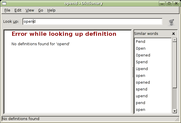
this week end I decided to work full time on the dictionary; I ended up fixing a bunch of bugs and RFEs, namely
- no more dialogs in case of word not found
- a visual indicator of progress inside the main window
- the re-addition of the “speller” widget
- themed icons and bugzilla version inside the launcher
the error dialogs have been switched to an inline error message inside the defbox; I’d like to add an icon too, but there’s no direct placement of a pixbuf inside a GtkTextView: if you want pixel-positioning you must use a GtkImage widget.
I’ve added a throbber widget, using the same code nautilus and epiphany use. while I’d like for the “spinner” widget to get into gtk+, I don’t really like the idea of having it on the dictionary UI: it makes the dictionary look like a browser or something, which is not. on the other hand, I don’t know what to use to visually indicate that the dictionary is working and it’s not blocked; if you have an idea (even though code would be better) please let me know.
and, finally, I’ve re-done the infamous speller widget, the list of similar words that comes up when no words have been found. it’s like the old widget, for the time being, but I intend to twist it a little bit more. it remebers its state across sessions (like the whole dictionary does), and I’ll add a knob for disabling it in case you want your own personal grammar nazi on the desktop. <sarcasm>thanks to all the people that bitched about it on bugzilla and never felt the urge to move their collective asses and help instead</sarcasm>. really – if half of the energy some people spend bitching on Bugzilla about missing features could be transformed in electricity we wouldn’t need to make wars for oil anymore.
anyway, here’s the obligatory screenshot:
the code needs to be cleaned up a little bit, and some cvs surgery is needed as I changed some of the layout of the files; I expect to land my development trunk on cvs.gnome.org this weekend.


Just wondering, but why does the ‘open’ appear three times in the list of Similar words? (Pend appears twice, etc.)
søren: because I queried multiple databases, which have multiple results; one of the “tweaks” I’m adding is to visually separate the matches depending on the database, and when double clicking on one, you’ll get the definition from the database to which it belongs, instead of all the definitions.
While I appreciate that code is better than suggestions, I can’t hack on the dictionary thing because I’m a Python guy, not a C guy, I’m afraid. Anyway, what might be better than the throbber is a progress bar showing how long it will be before you get some results?
stuart: thanks for the idea; I’ve considered a progress bar, but in the end it would have had the same “issue” of the throbber: it makes the dictionary look like a browser. the other problem is that there’s no way to know how much time it will take to carry out a DICT request – and to make things worst, the dictionary assumes nothing about how we are getting data: it’s all an implementation detail completely hidden from the UI (it makes adding backends easier and makes the code more reliable).
I think the throbber is a fine idea. It just needs a better graphic. Something like pages flipping in a book. I believe that would be enough to distinguish the dictionary as a dictionary and not a browser… and I guess its sorta a dictionary browser anyway =)
I have no problem with a throbber in the dictionary app, as long as it doesn’t actually throb. Apple, for example, has an “Asynchronous progress indicator” (http://developer.apple.com/documentation/UserExperience/Conceptual/OSXHIGuidelines/XHIGControls/chapter_18_section_5.html#//apple_ref/doc/uid/TP30000359-TPXREF106) that can appear in pretty much any window. As long as you’re waiting on something, it’s perfectly acceptable (and encouraged!) to provide subtle visual feedback.
Of course, Apple’s spinner is subtle. A big throbbing foot is not. :-)
Well, I think you could use something like the “pseudo progress bar” thing that file-roller uses when extracting something. It’s not a progress bar because you can’t guess the time remaining to the extraction but you know that file-roller is extracting the files.
You know what i mean?
Good work!!!
Ugh, throbbers. Hate ’em. They dont really give you any better sense of progress than turning the cursor into an hourglass/beachball bu they are slightly less distracting.
Why not use one of those little progress bars you can stick in the status bar like Mozilla does?
Thank you, thank you!!!! for bringing the “speller” back.
test