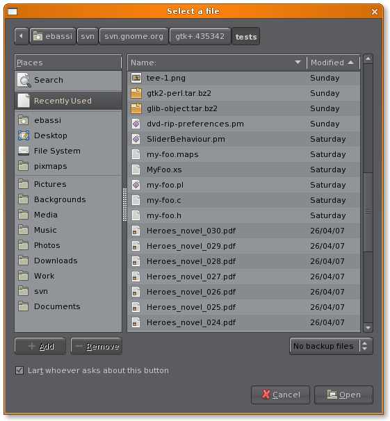
Today I gave the final touches to a patch based upon the patch for search capabilities in the GtkFileChooser embeddable widget, adding the “Recently Used” shortcut:
there are still a few missing bits (the icon for the shortcut is one of them) but it’s already working remarkably well. I’ll work toward implementing what’s left in the next few days, while I also fix some of the warts of the search support.


UR FILEMANGR IZ ARE STRONG
Why are the icons for Recent and Search 22×22, while the others are 16×16? It looks odd.
@sen
because the logic id used is GTK_ICON_SIZE_SMALL_TOOLBAR instead of GTK_ICON_SIZE_MENU; just a small change. :-)
Will it be possible to have this pane only show files from the application that calls the filechooser, or that are open’able with that application ?
Looks good! Might I suggest replacing the location widget with something that makes sense when looking at Recent Documents? Maybe a “In /path/to/currently/selected/file” or even just the title, “Recently Used.” Or maybe “/Computer/Recent Documents/” ? I’m not sure what the URL is for “Recent Documents.” :)
I hope that the name for search and recently used is changeable, so that program writers can put different names, like recently played (for audio files) or recent documents etc for word processors and the like. Just a thought…
Will you guys implement granularity of where to search? eg:
http://media.arstechnica.com/images/tiger/spotlight-find-metal.jpg
http://www.drunkenblog.com/drunkenblog-archives/i/wtfbspot_01.jpg
You see in that photo the different granularities of where to search– whole hard drive, or the current folder (you see in the second photo). I hope this is in the feature list for gtk file chooser. Nautilus has a similar widget to this in the search, it’s the blue area under the address bar: http://z.about.com/d/linux/1/0/F/4/6naut_search_results.png
On another note…what about being able to open apps, right click, and drag and drop and move things from within gtkfilechooser, I always find myself wanting that functionality…It’s in Mac OS Finder, Windows Explorer, and KDE file chooser btw…
1. applying the filtering capabilities of the file chooser to the search and recent files list is on the list of things to fix.
2. the path bar was a bug: it’s not meant to be shown outside the browse mode.
3. changing the name depending on the application would a violation of the consistency of the dialog.
4. locality would be a good feature: open a bug or leave a comment on bug #435343 so that developers don’t forget.